

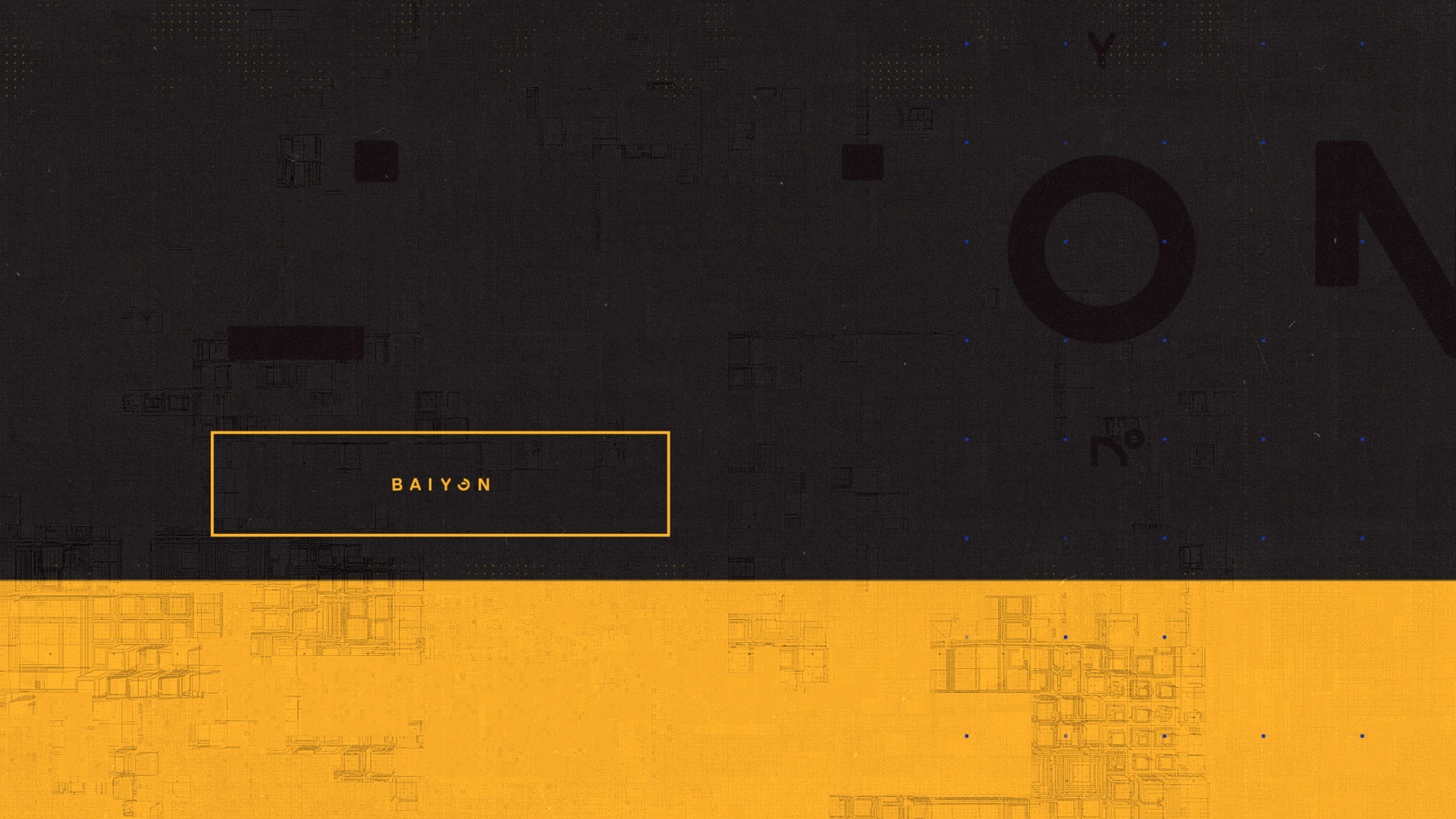
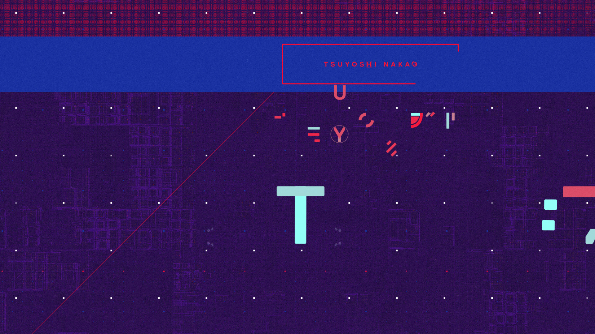
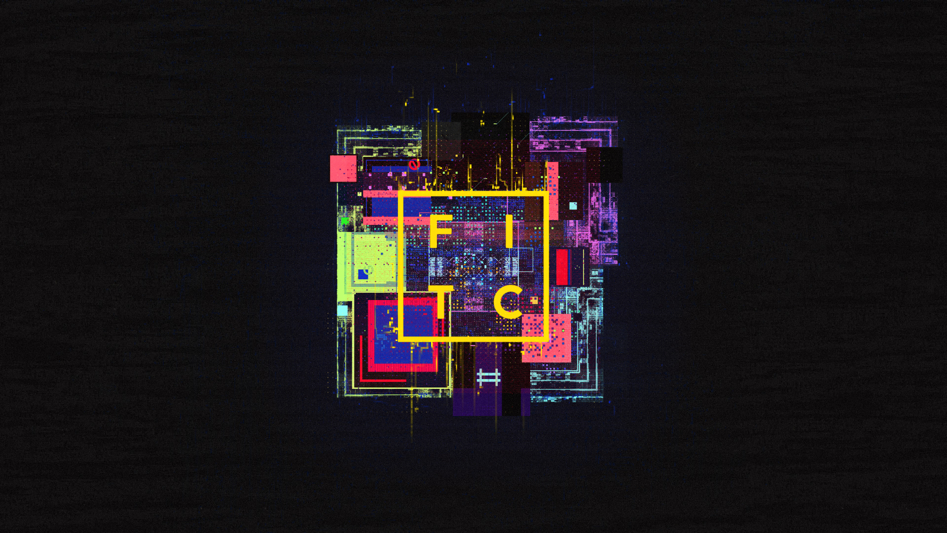
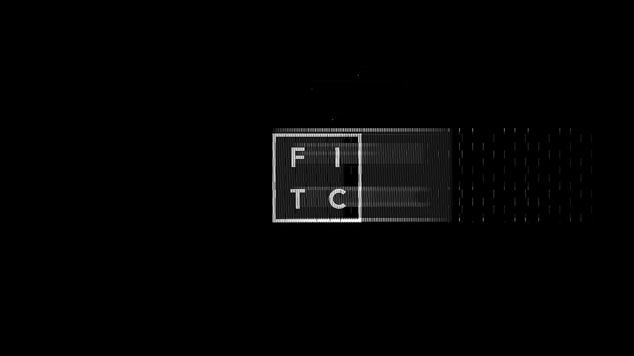
FITC TOKYO 15 TITLES
ALT CREATIVE INC
Role: Art Direction, Design, Animation
Conference Titles / 2:00 / 2015
Now in its sixth year, FITC Tokyo 2015 consists of presentations from some of the most interesting and engaging digital creators from all around the world. To commemorate FITC Tokyo’s inaugural title sequence we sought to encapsulate the city itself—distilled to graphic form. Aiming to contrast the harmonies of traditional Japanese culture against the backdrop and sensory overload of present-day Tokyo, we meticulously crafted elegant typographic forms to collide with abrasive, overstimulating glitch—giving way to a progressive journey where moments of extreme chaos fold into temporary tranquility.
CREDITS
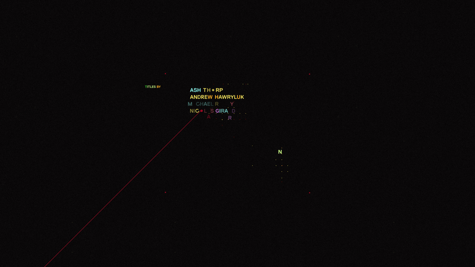
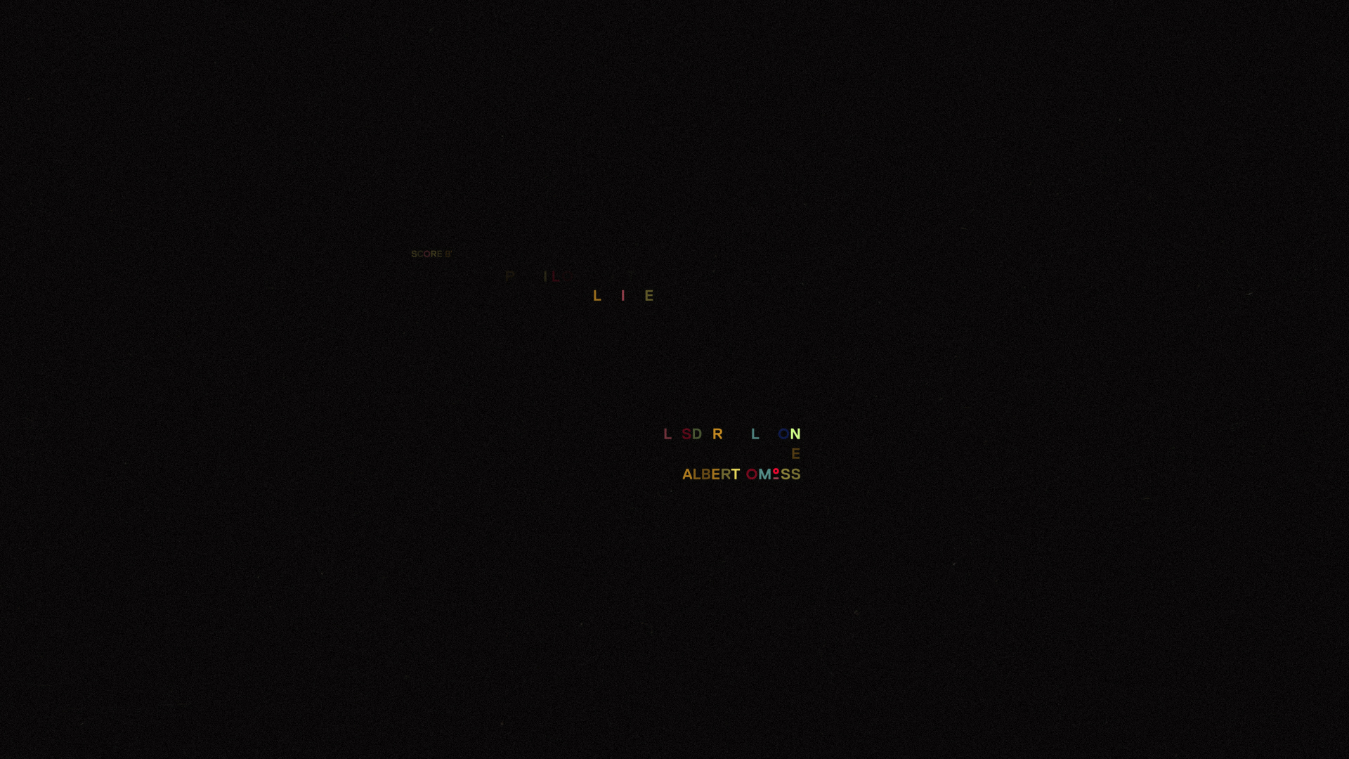
Client: FITC
Director: Ash Thorp
Producer: Andrew Hawryluk
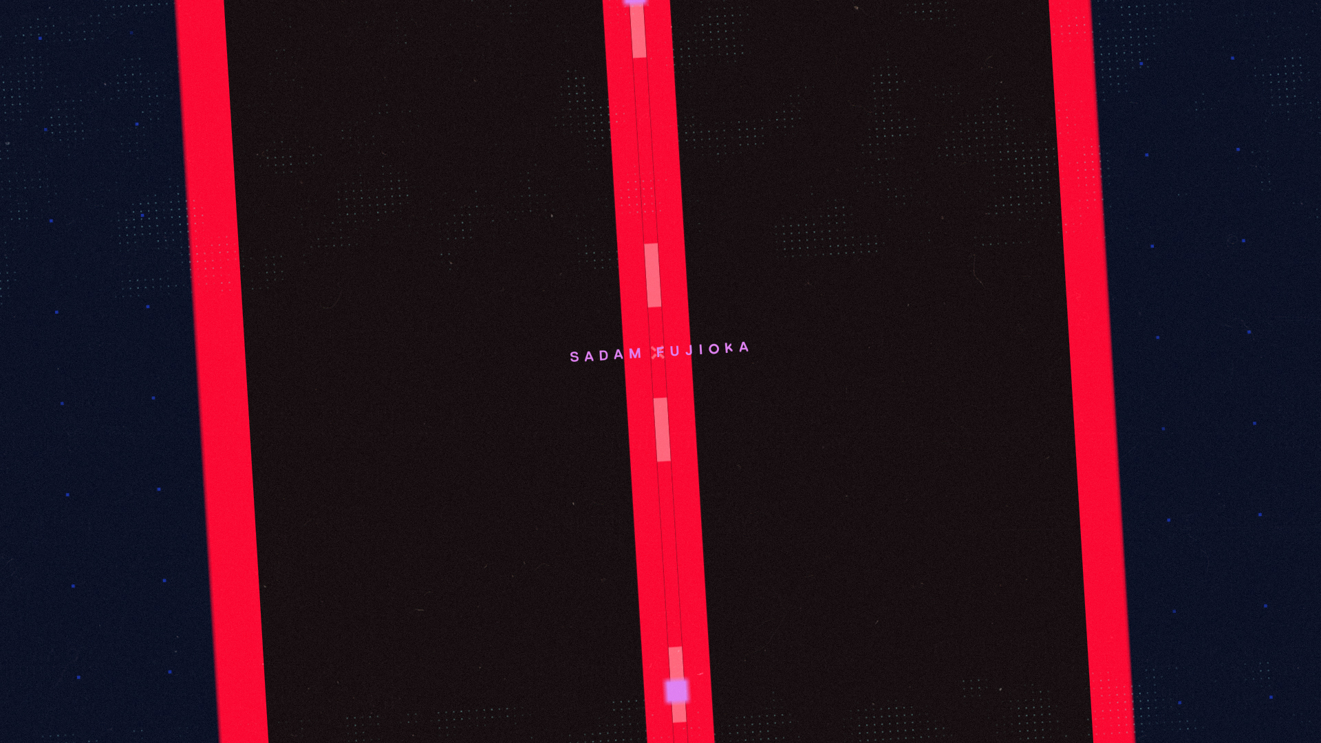
Art Director: Michael Rigley
Type Designer: Nicolas Girard
Designers: Ash Thorp, Michael Rigley, Nicolas Girard
Type Animators: Nicolas Girard, Alasdair Willson
Animators: Michael Rigley, Chris Bjerre, Andrew Hawryluk
Computational Artist: Albert Omoss
Process Reel Editor: Franck Deron
Composer: Pilotpriest
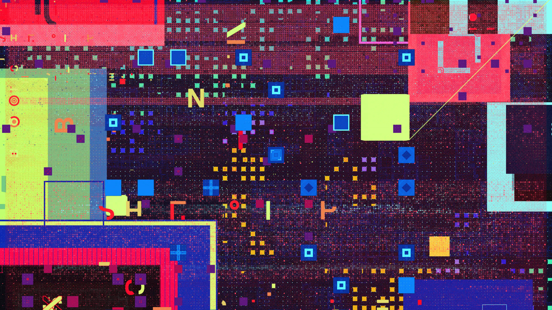
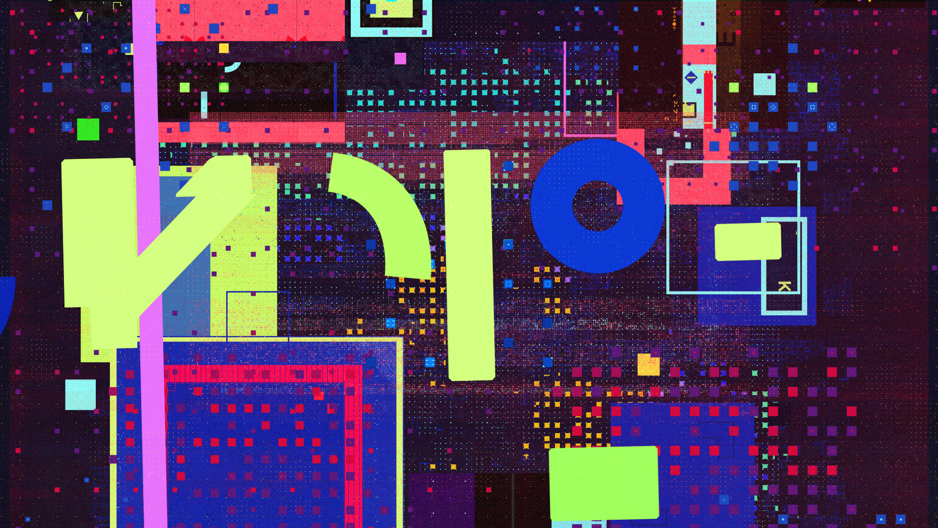
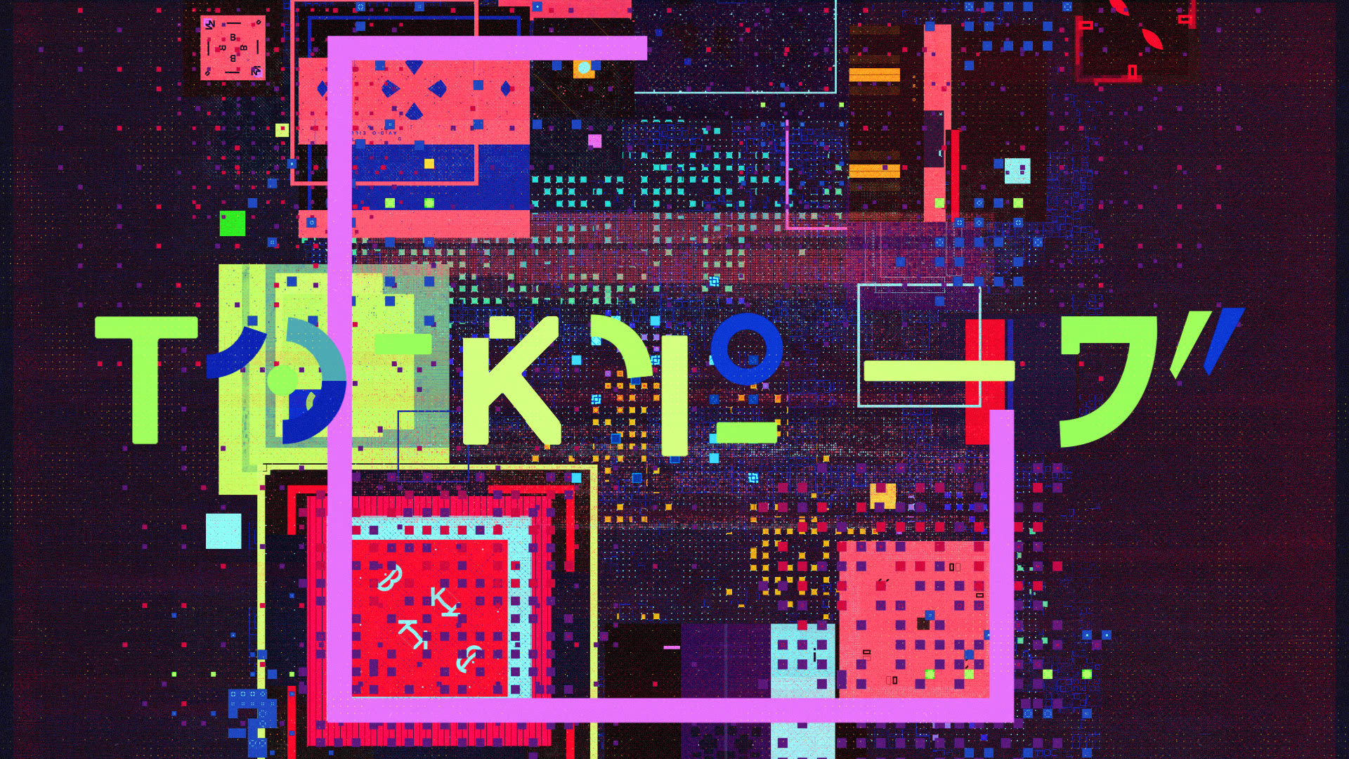
STILLS


DESIGN PROCESS
FITC founder Shawn Pucknell reached out to Director Ash Thorp in late 2014 to create a set of posters promoting FITC Tokyo 2015. Inspired by the foundation laid in the posters, Collective Podcast co-conspirator Andrew Hawryluk sought to take the project a step further and provide FITC Tokyo its first title sequence.
Ash and Andrew brought me on in the early stages of the project to help with initial style frame design and later art direction and animation. The team quickly grew into a force of creatives, designers, typographers, animators and programmers spanning three countries and timezones.
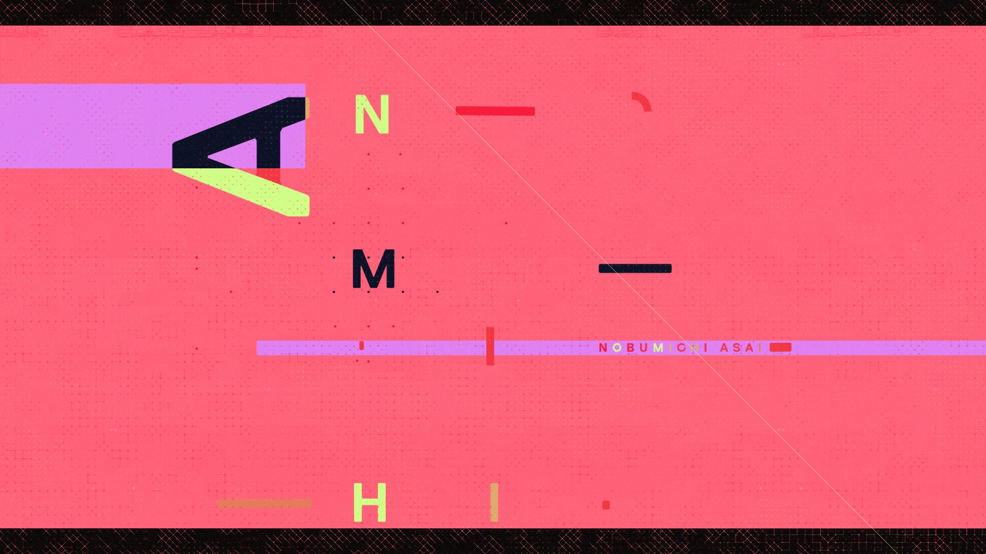
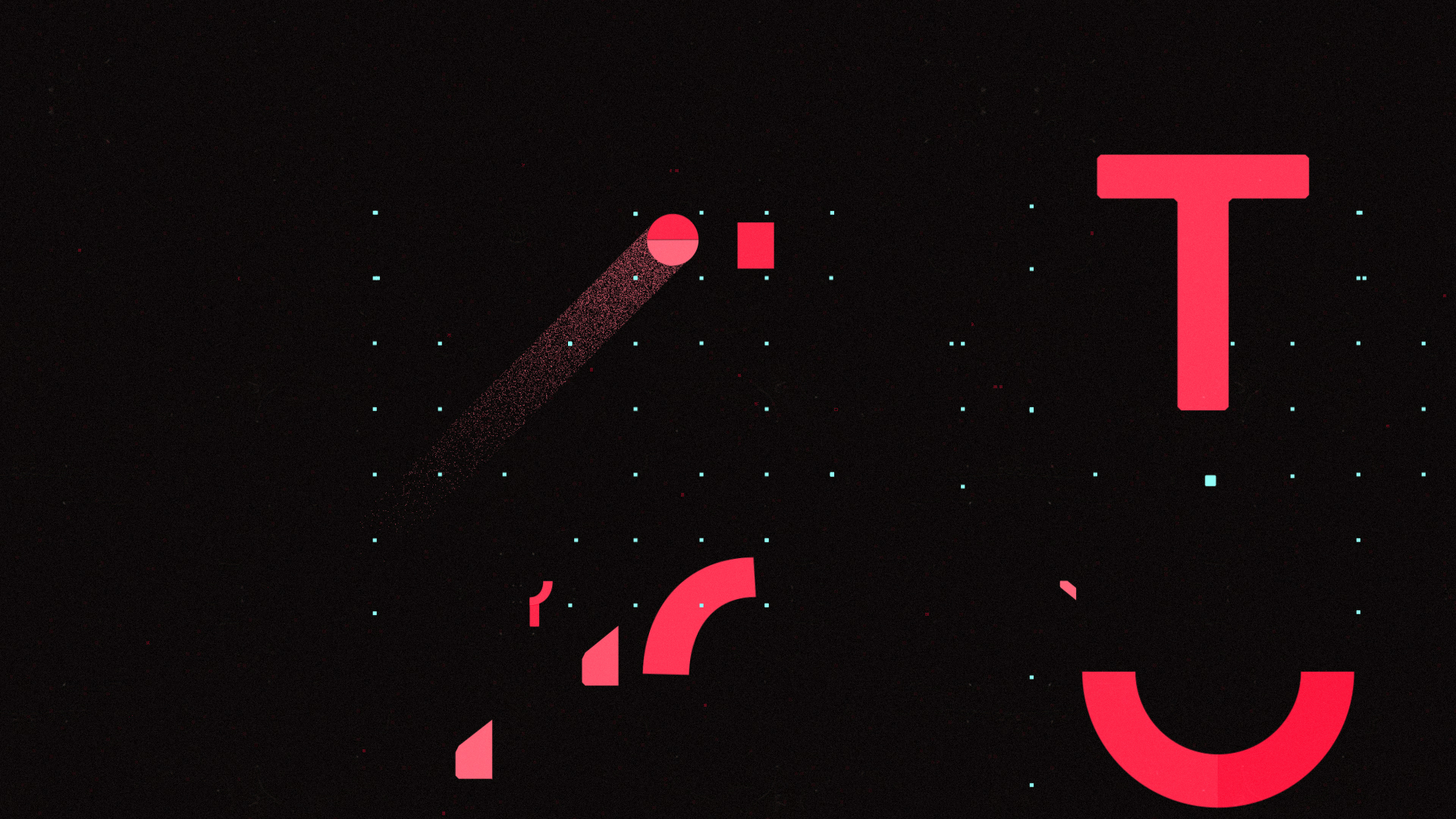
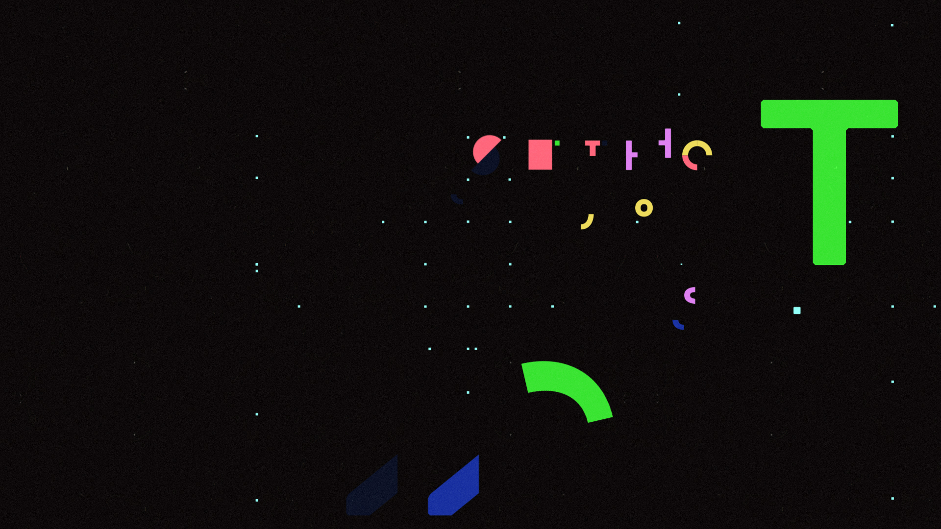
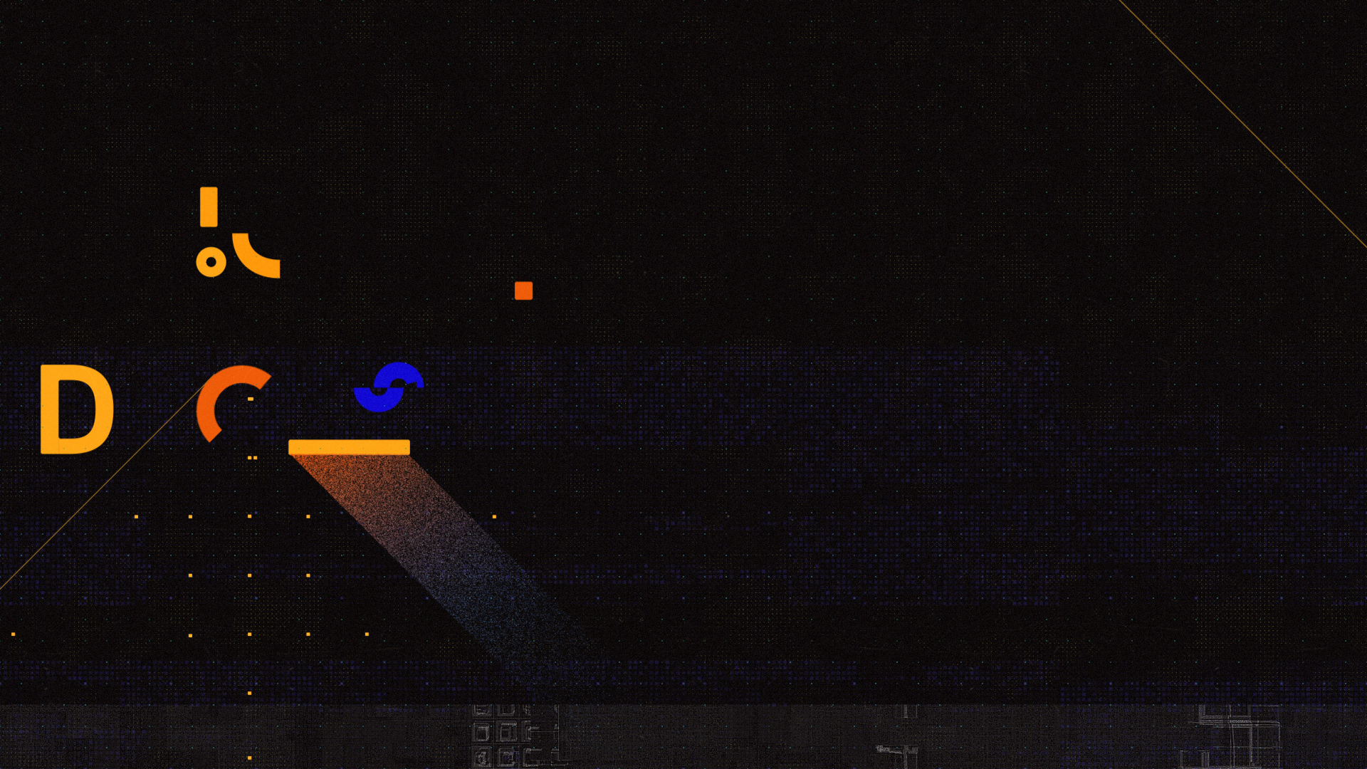
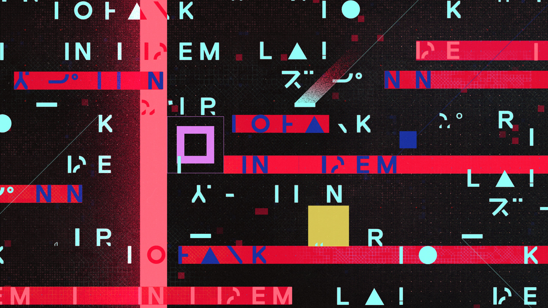
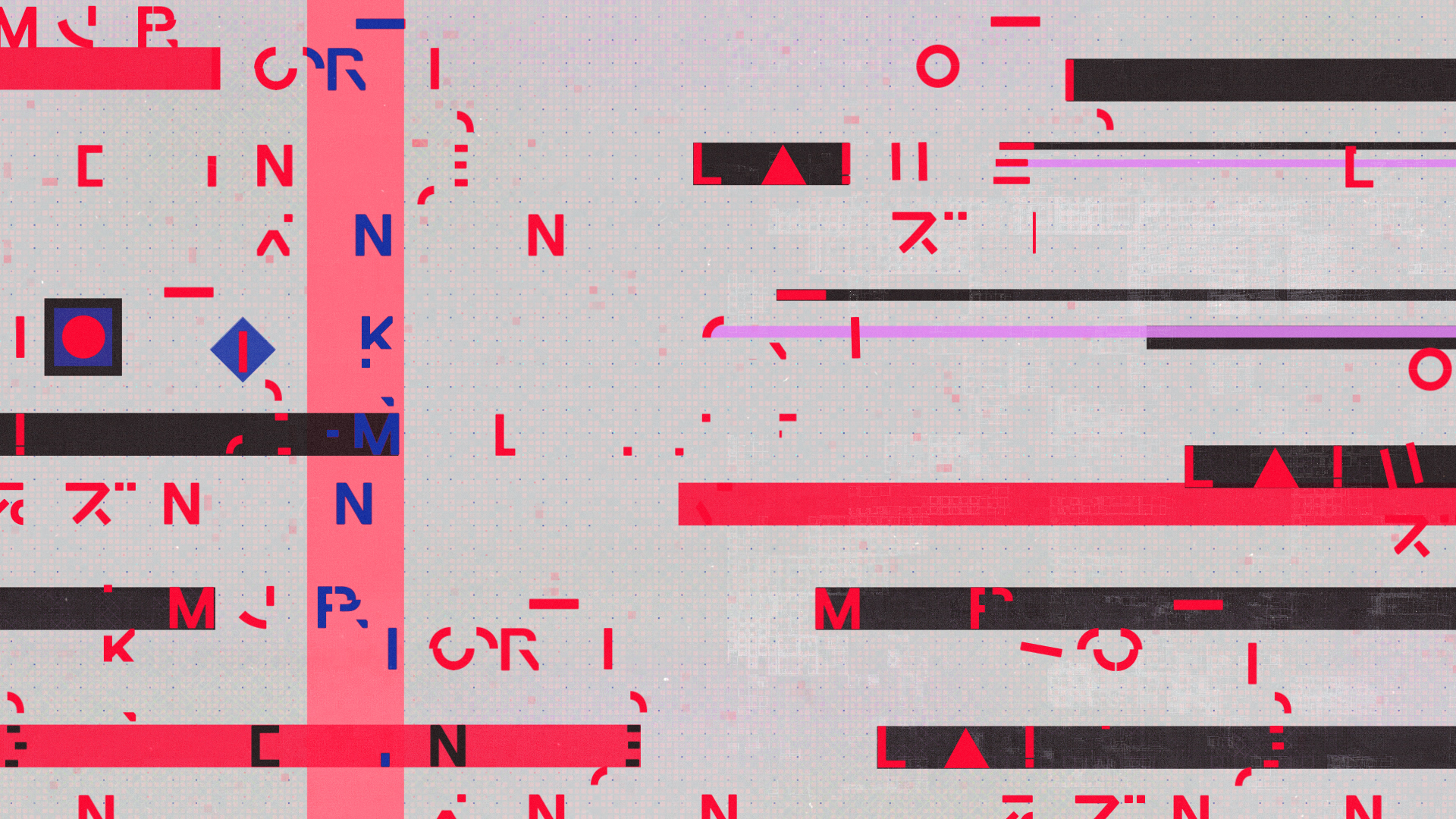
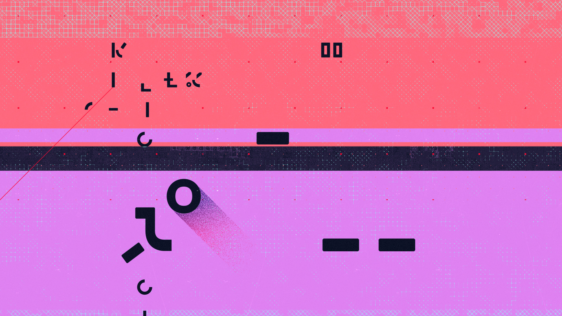
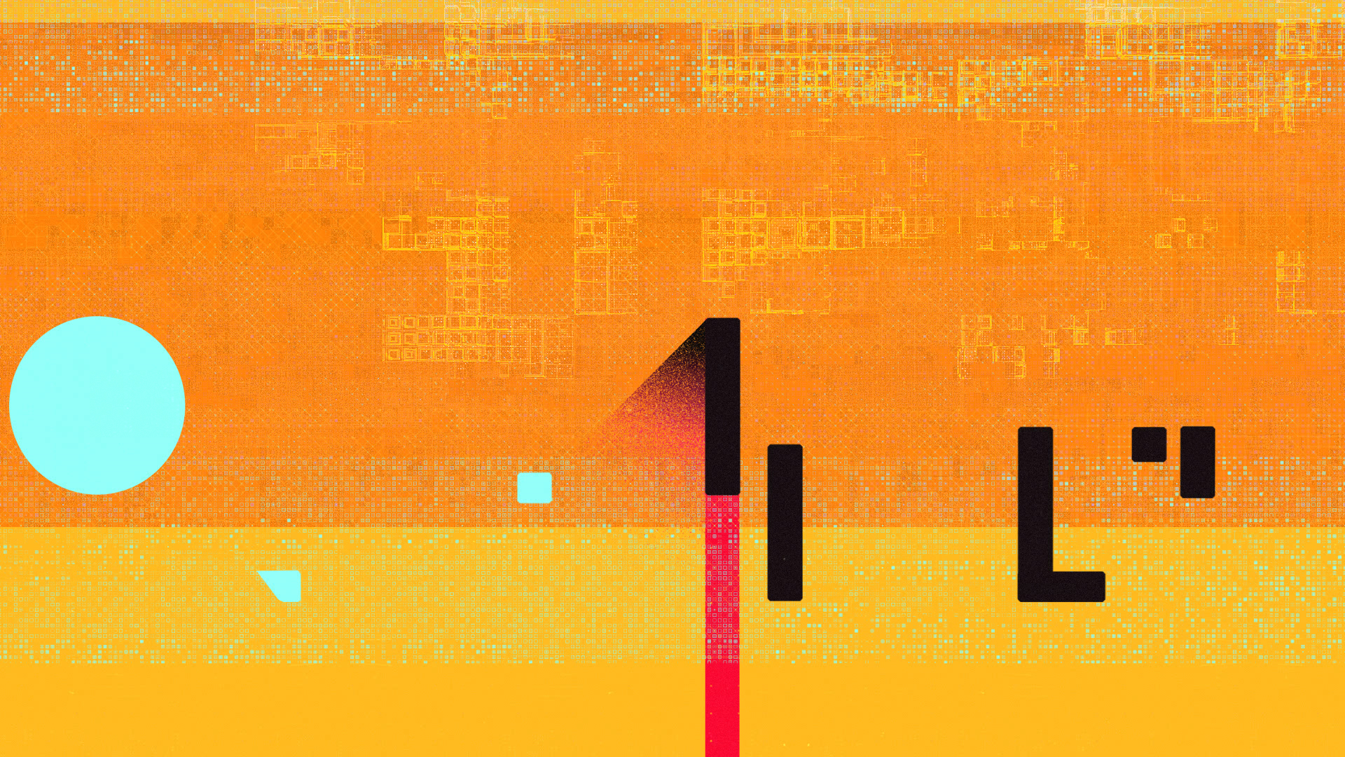
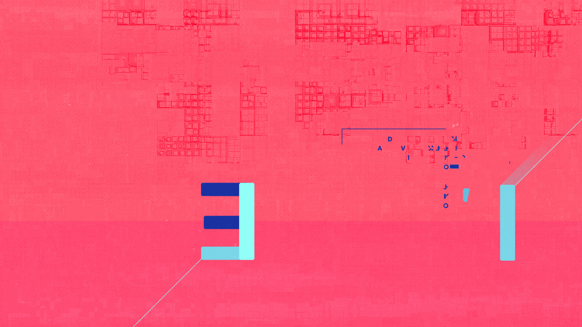
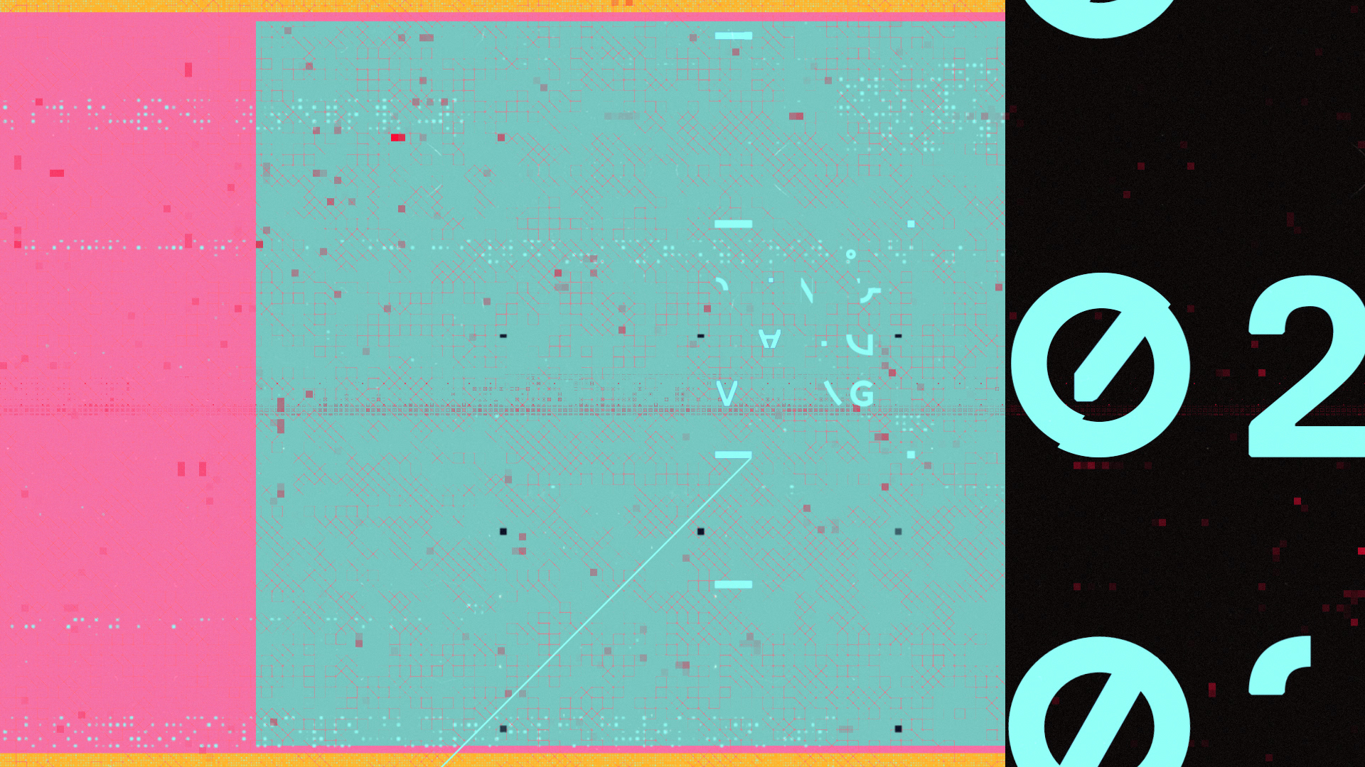
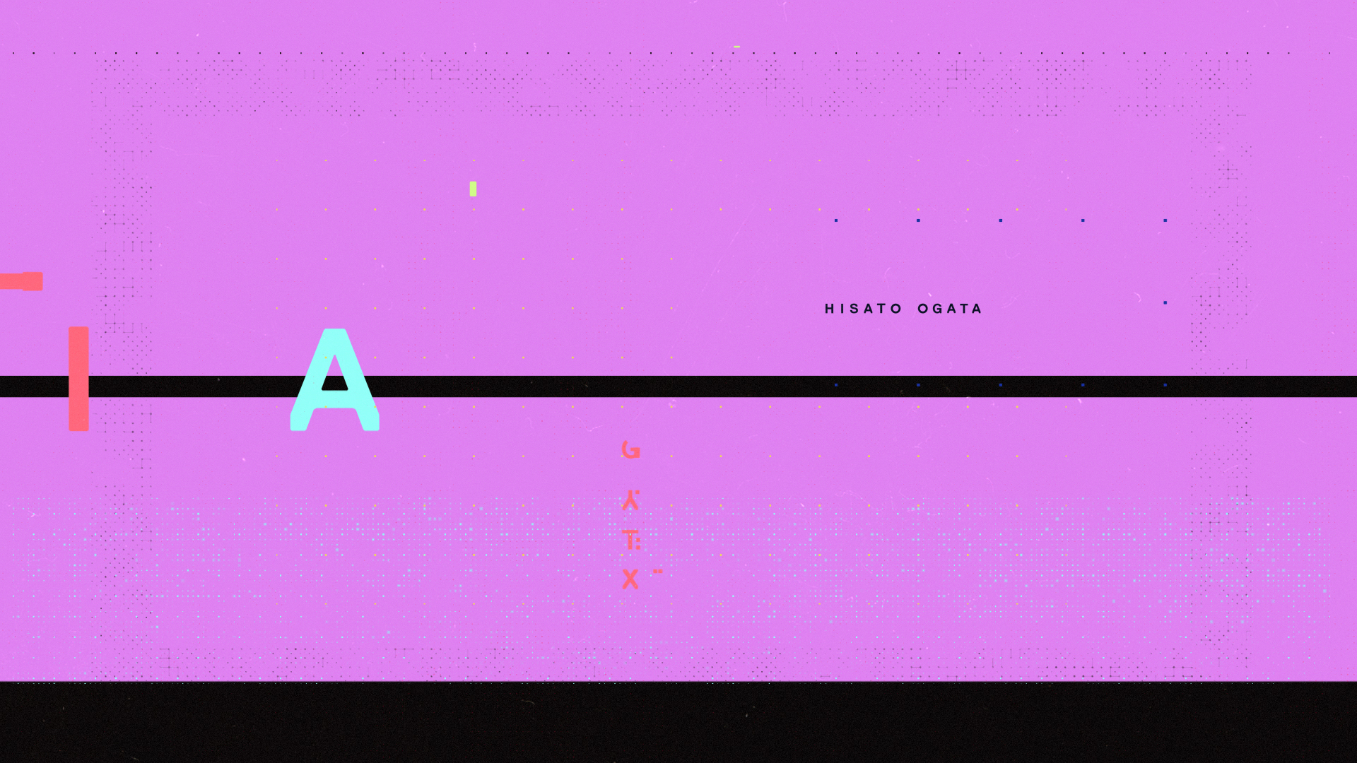
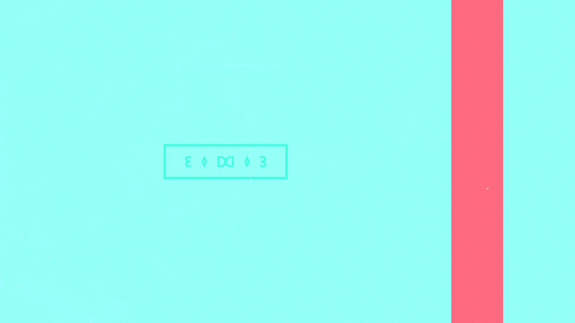
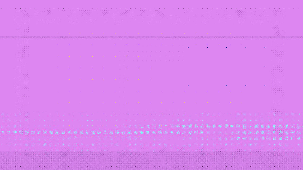
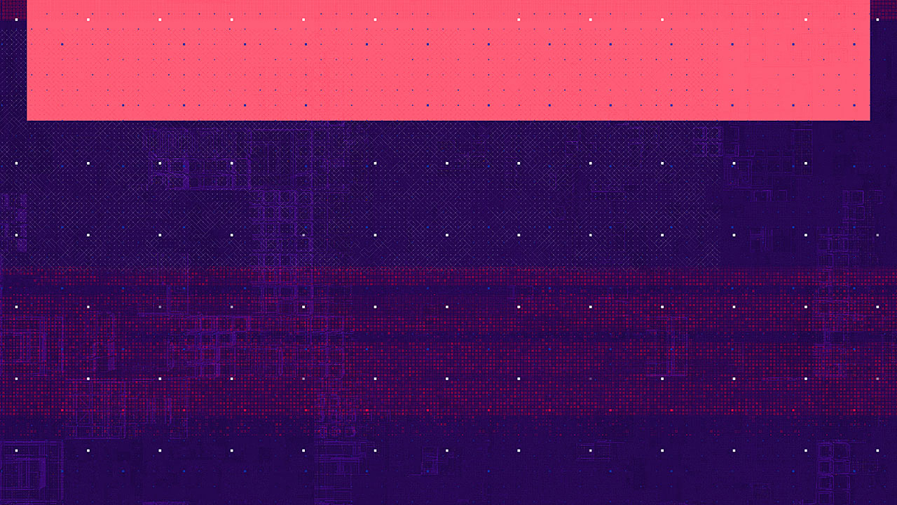
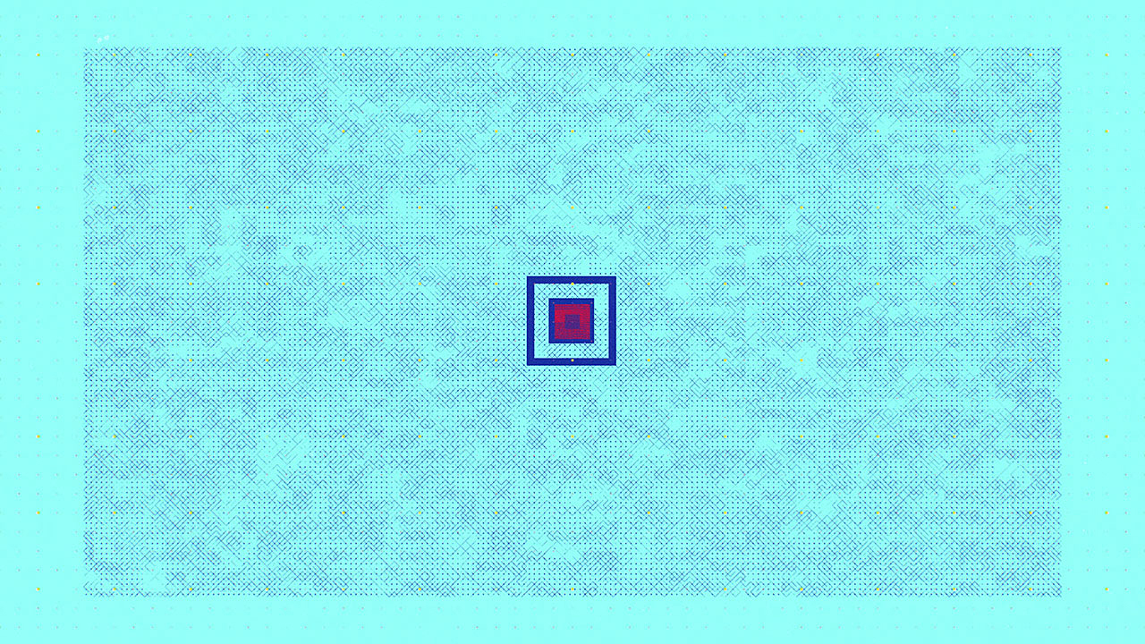
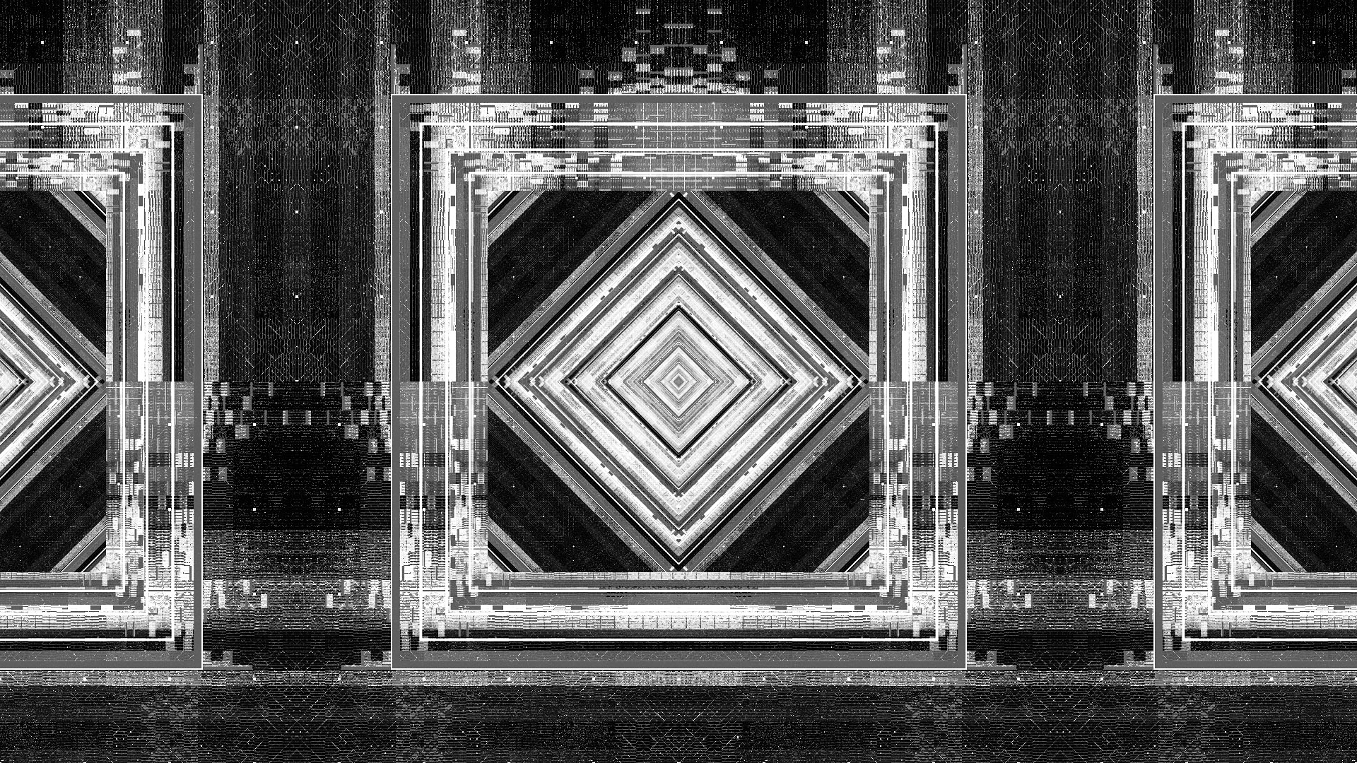
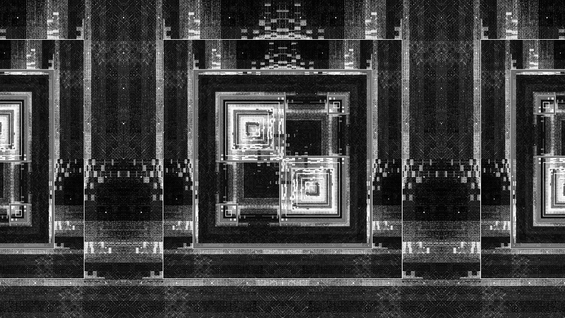
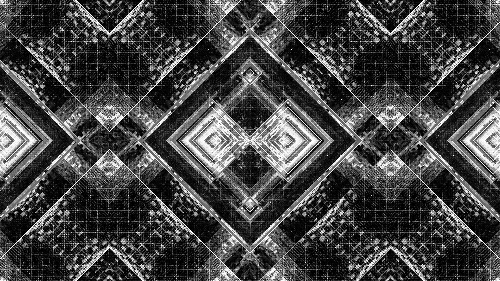
STYLEFRAMES
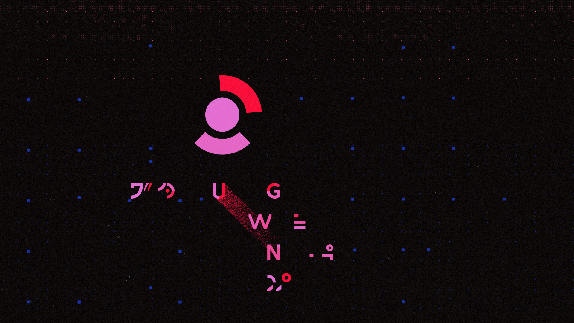
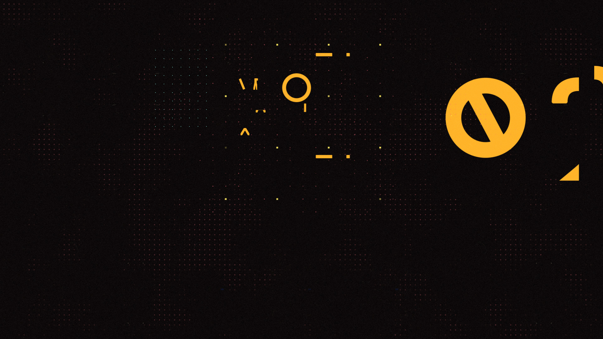
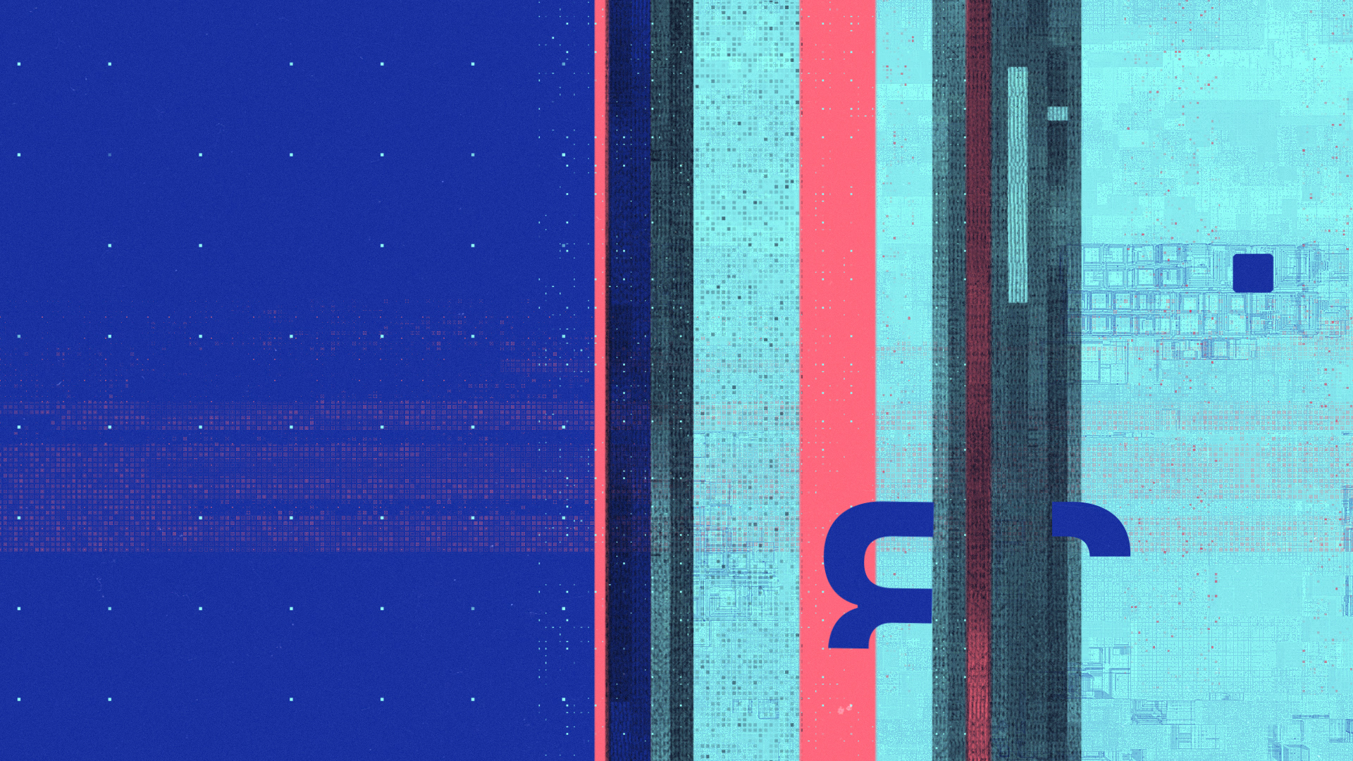
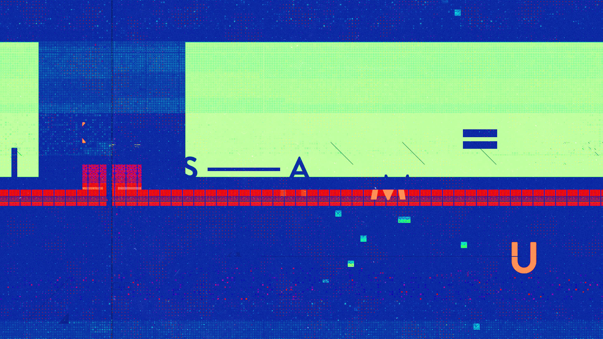
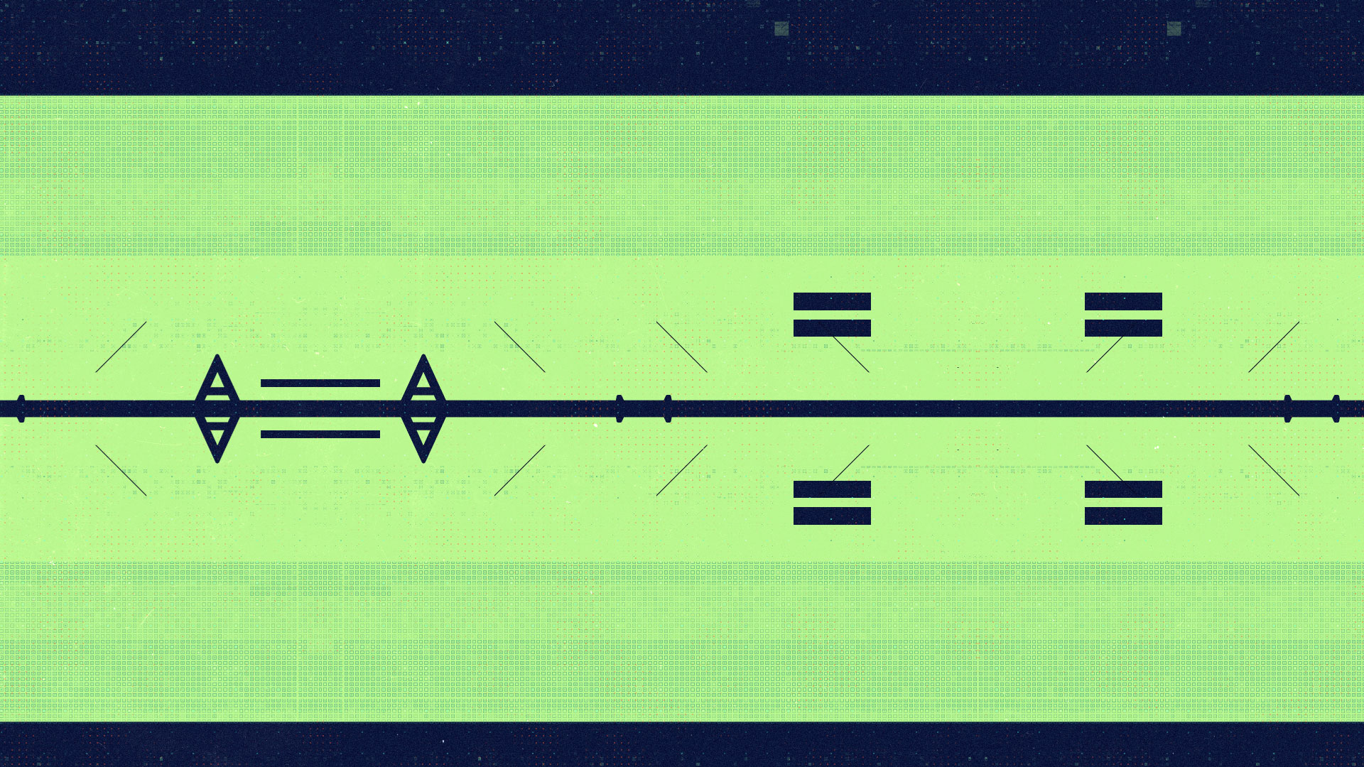
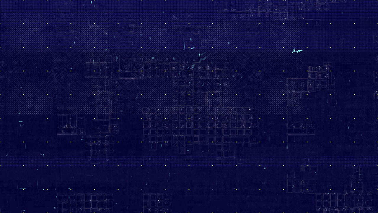
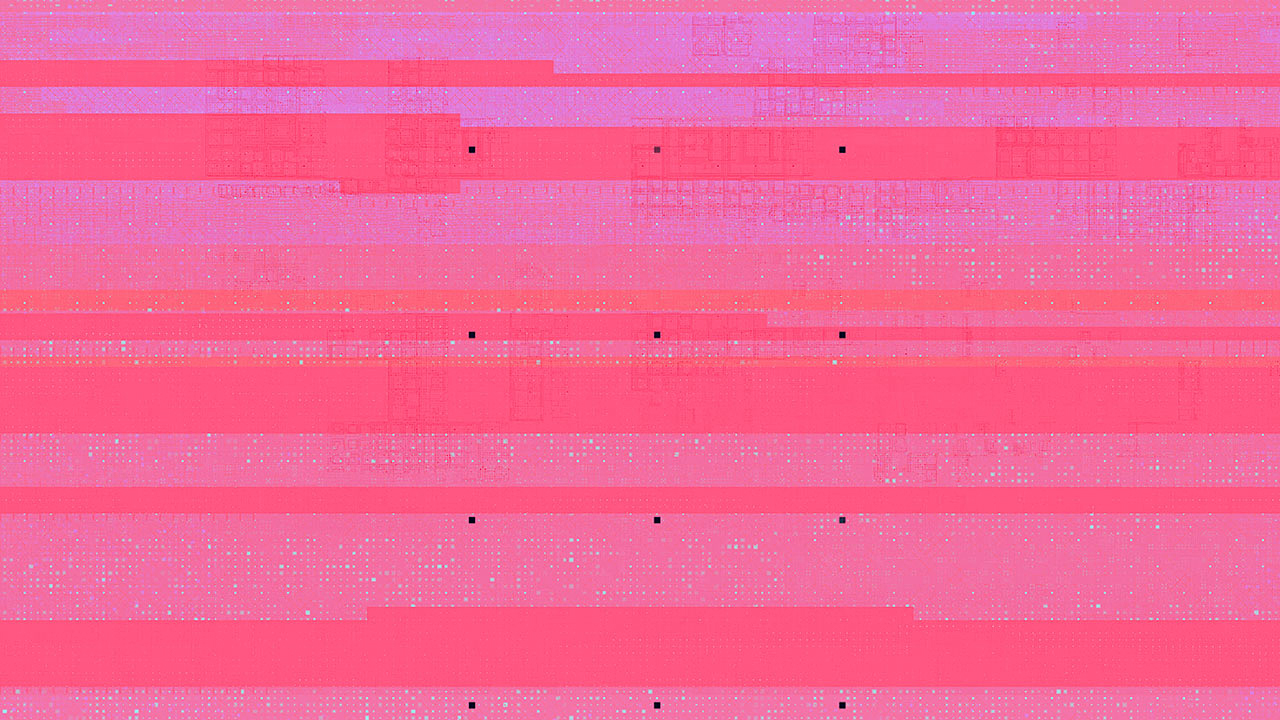
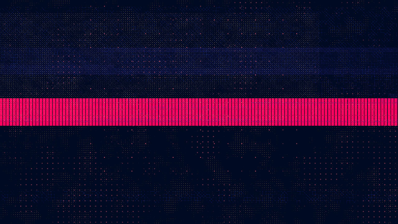
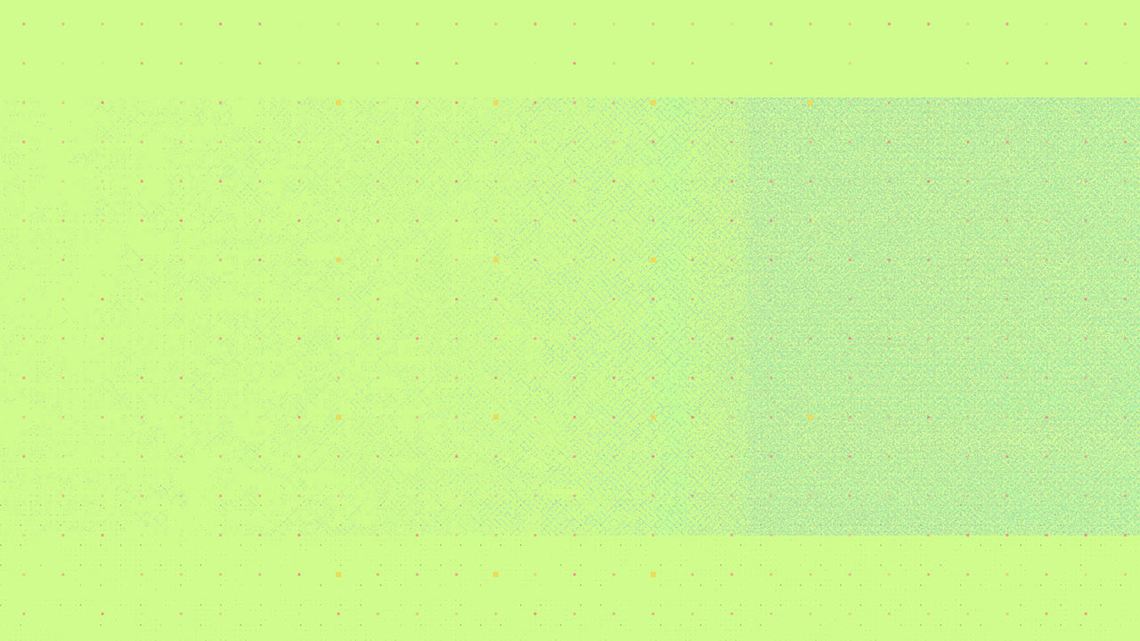
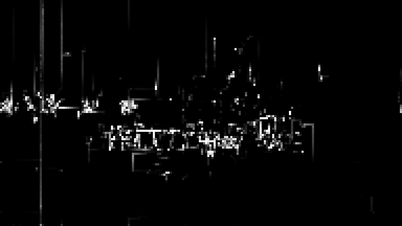
I was able to jump on design early in the process, helping to establish a style for the glitch elements / textures, experimenting with symmetries and creating a stockpile of assets to design with.

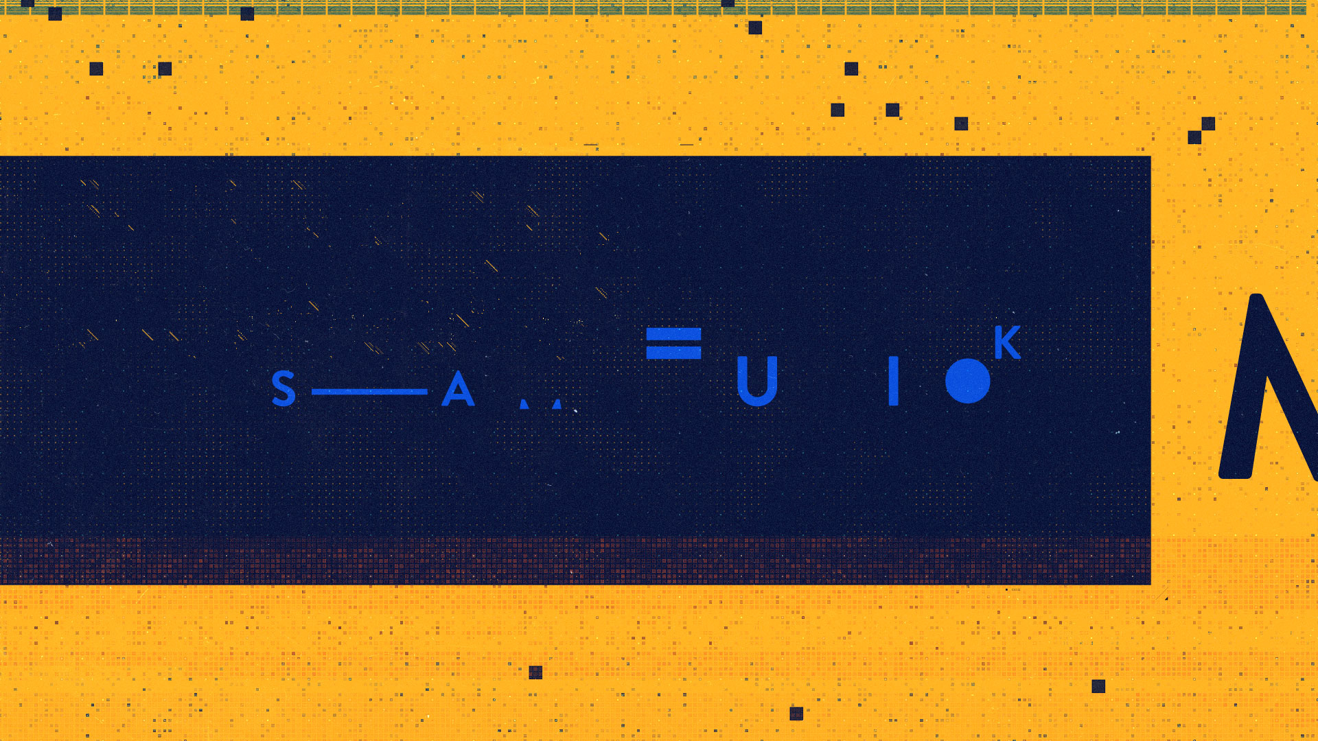
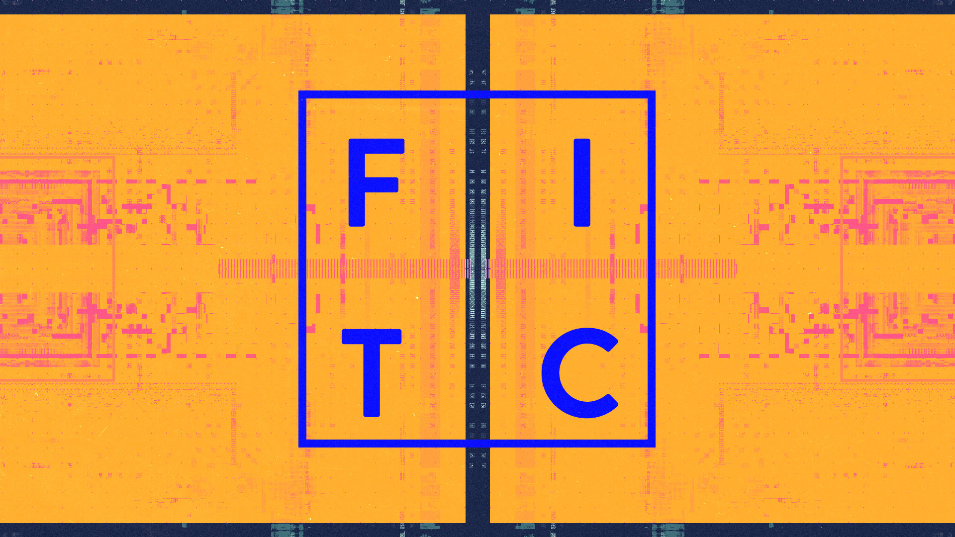
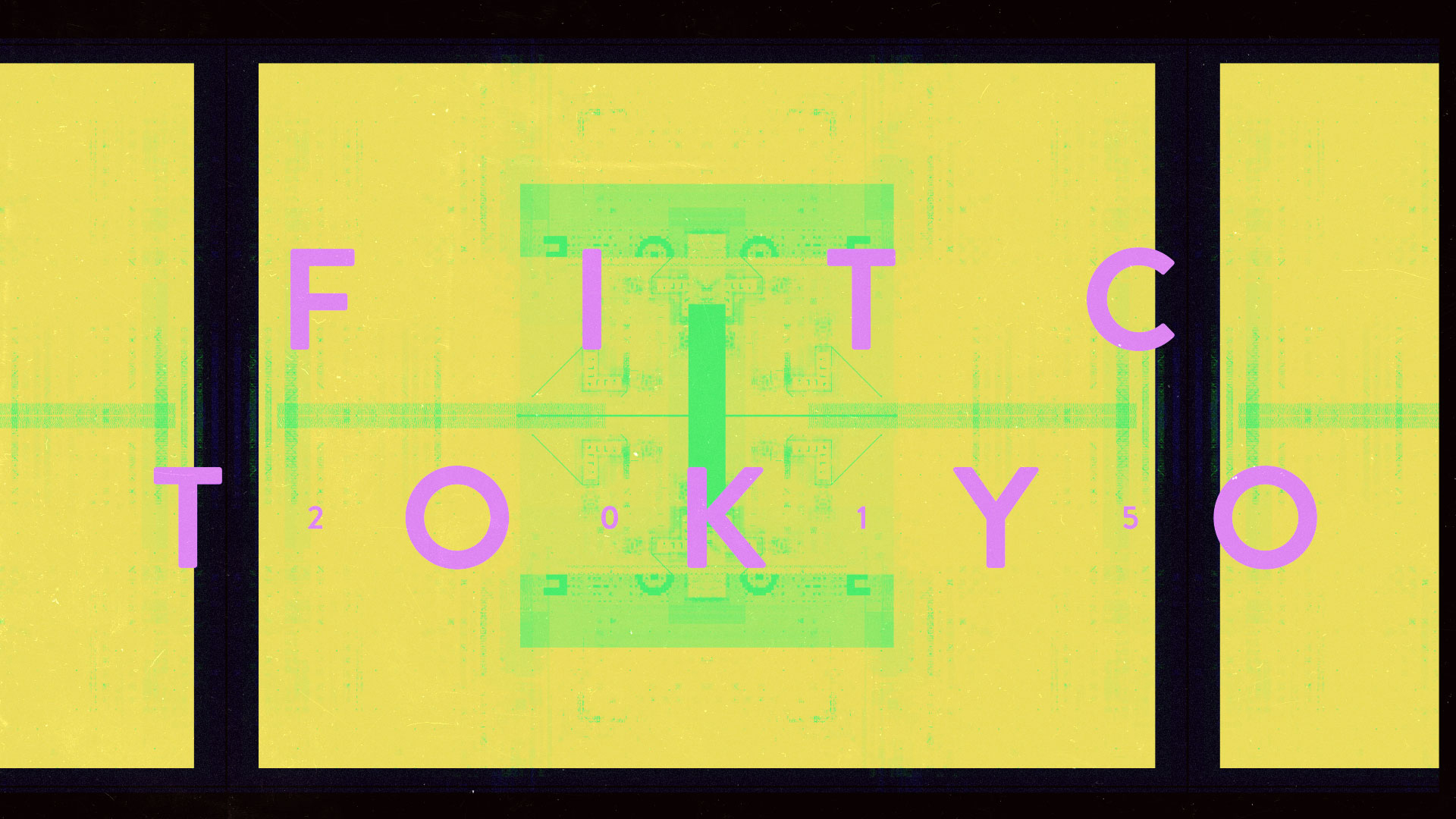
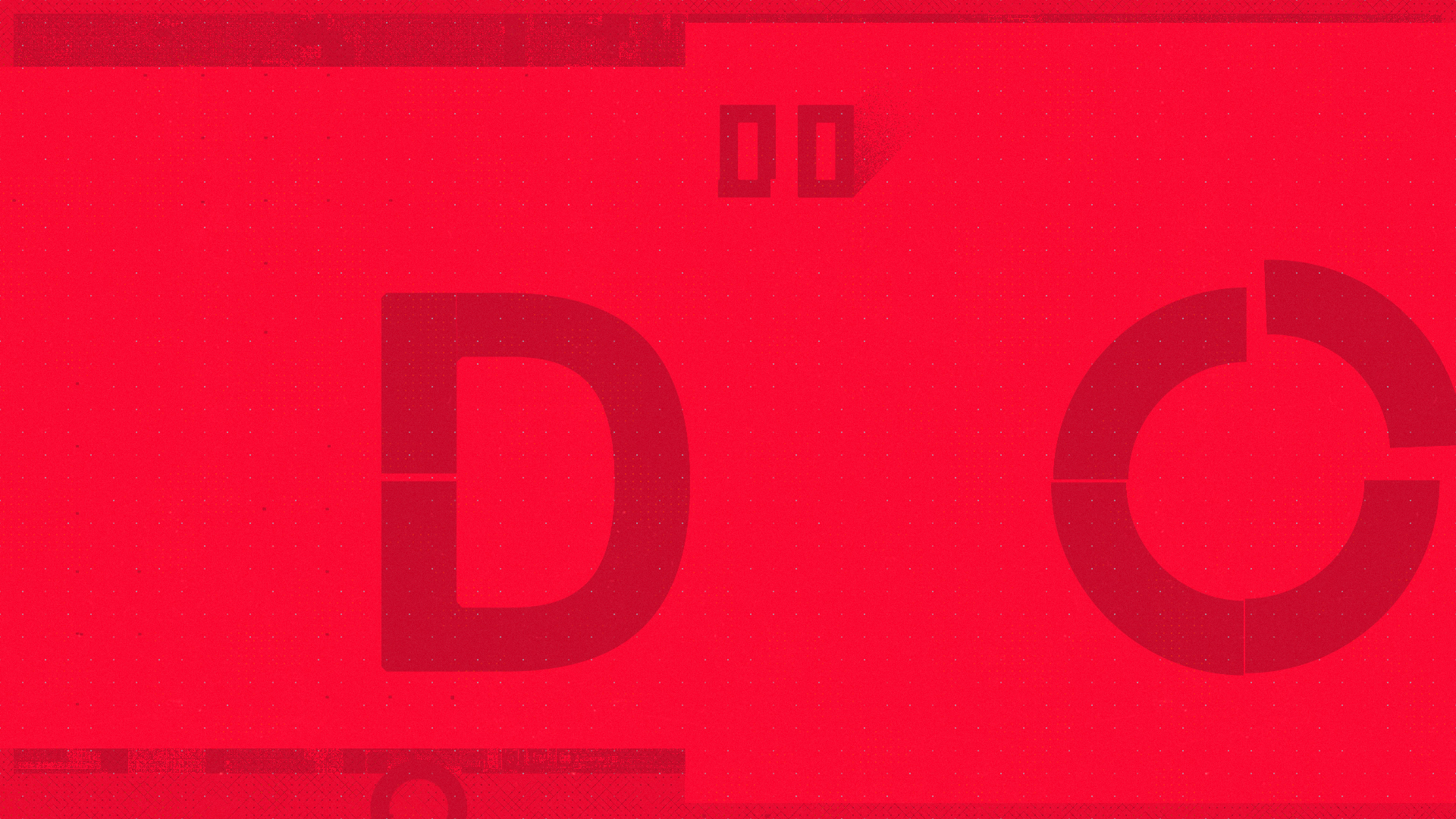
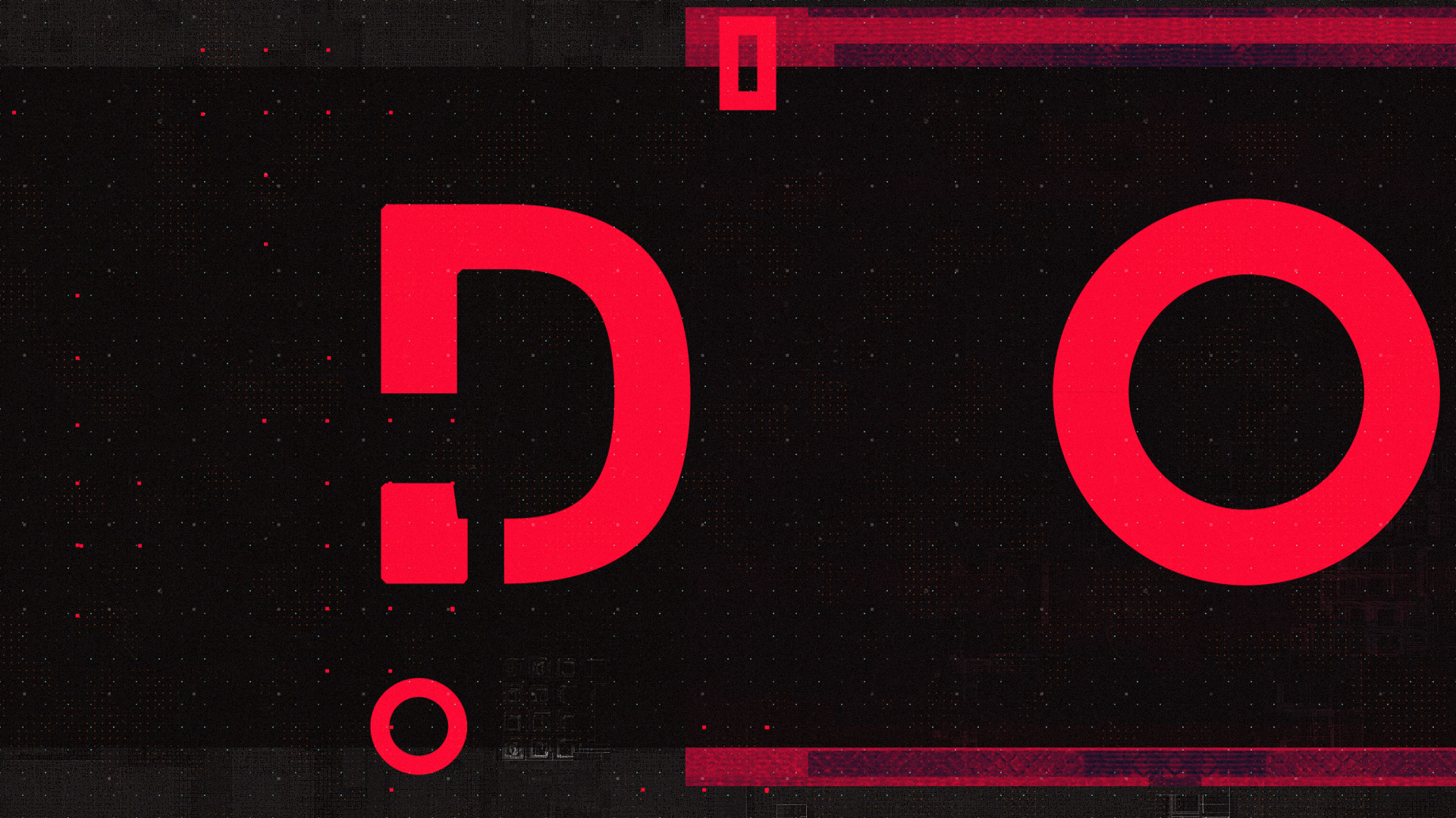
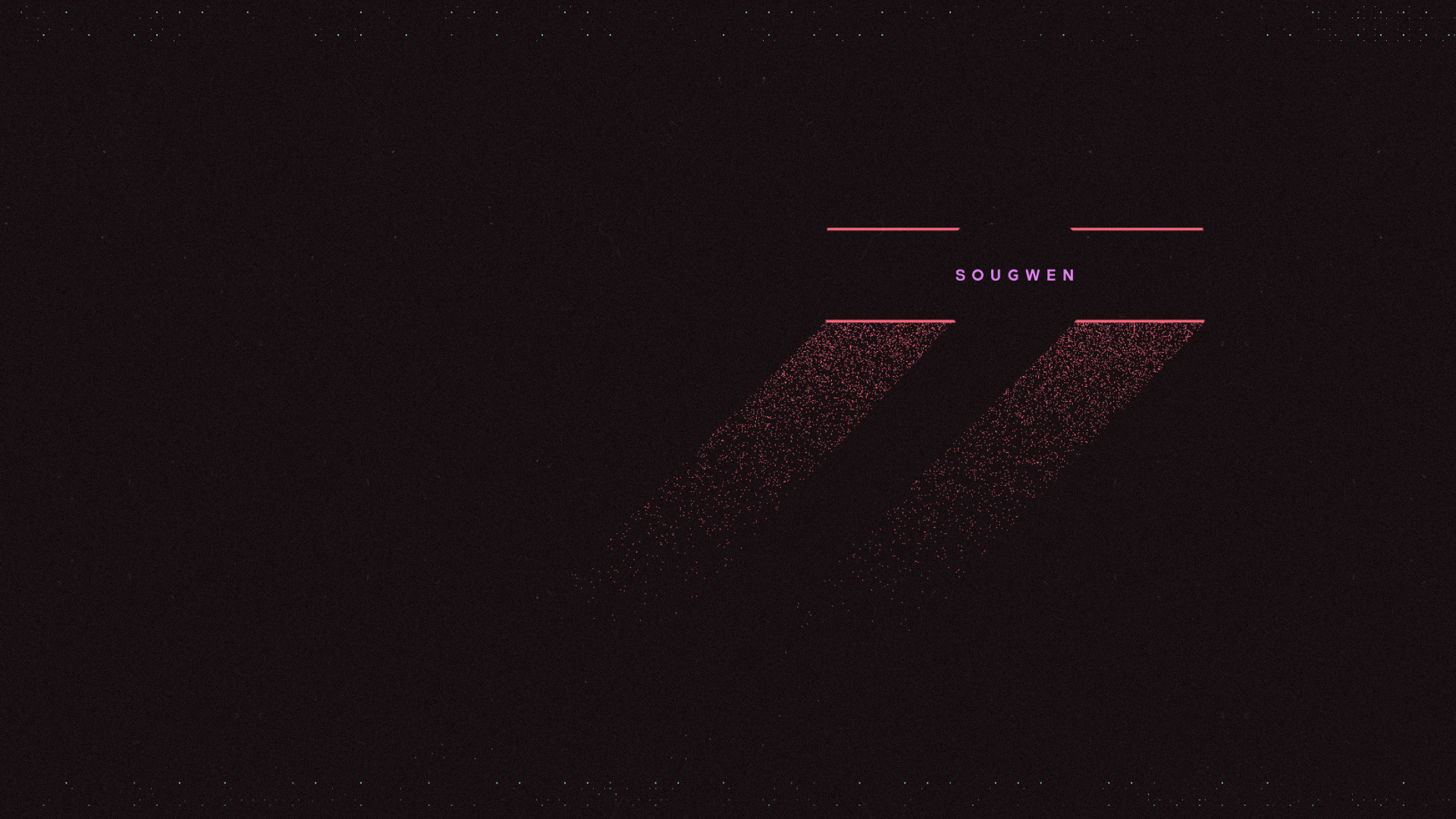
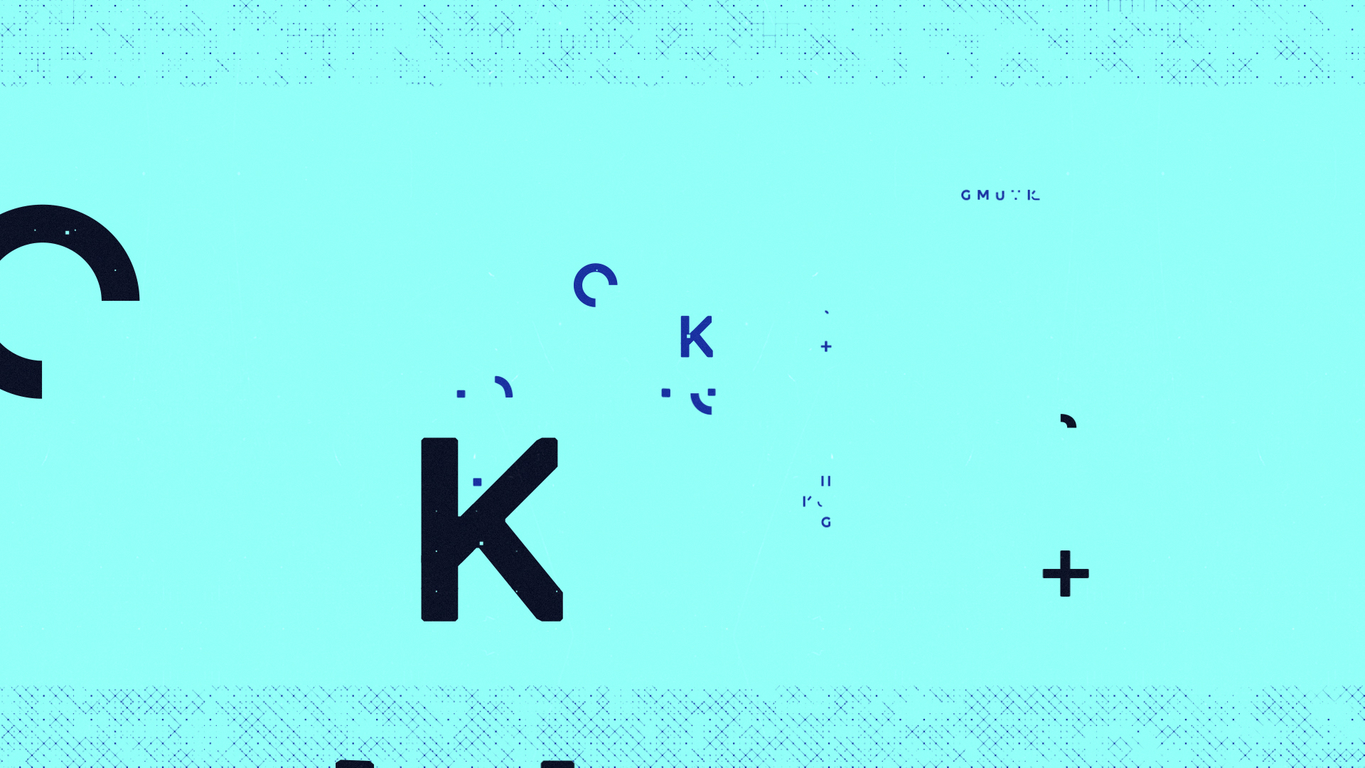
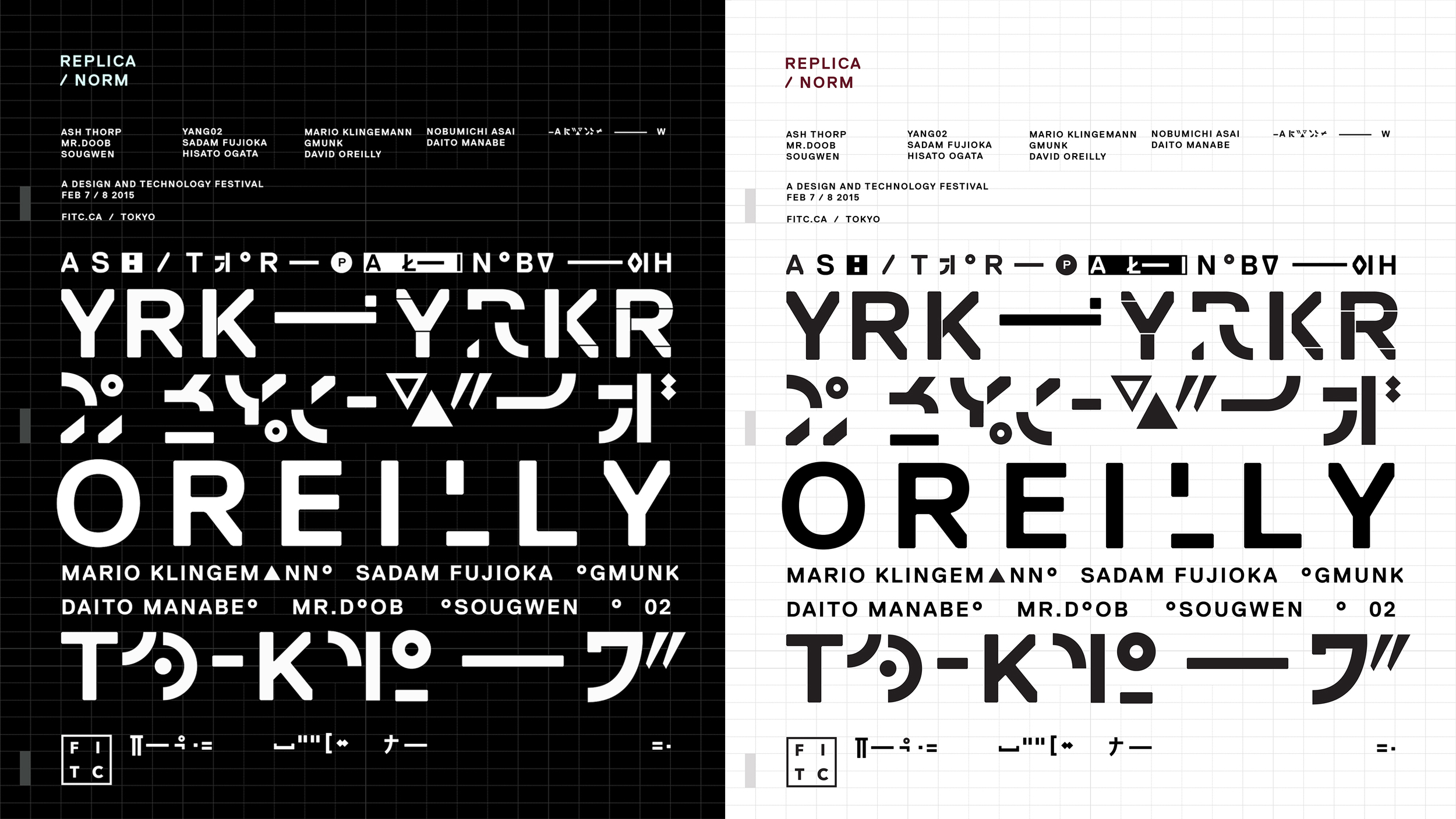
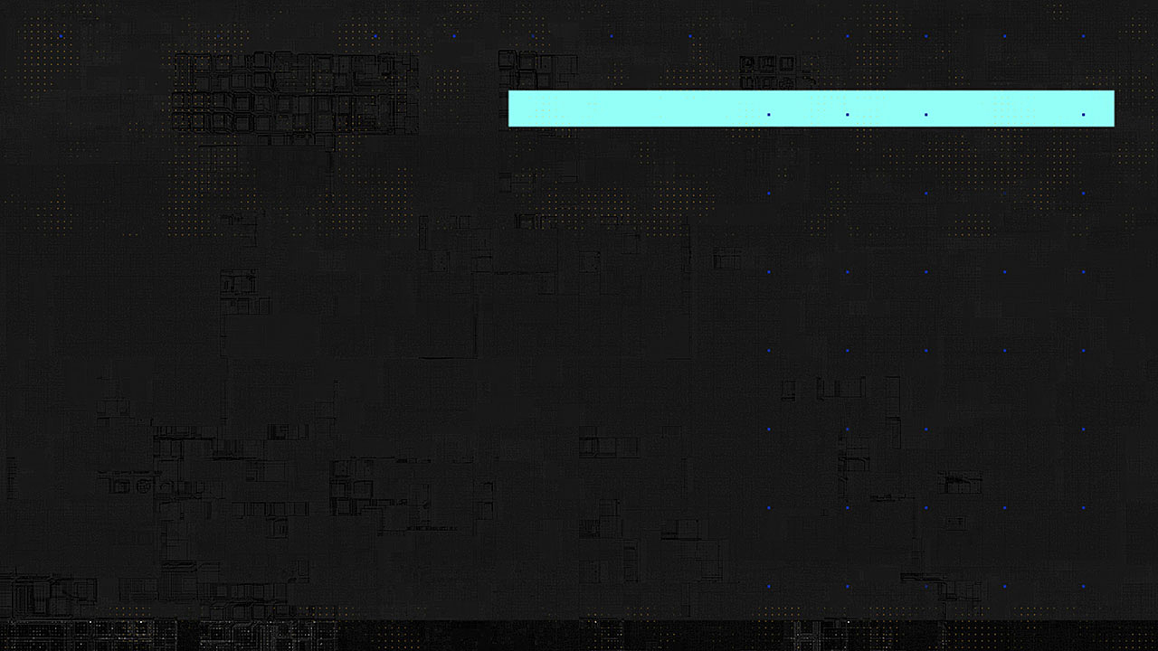
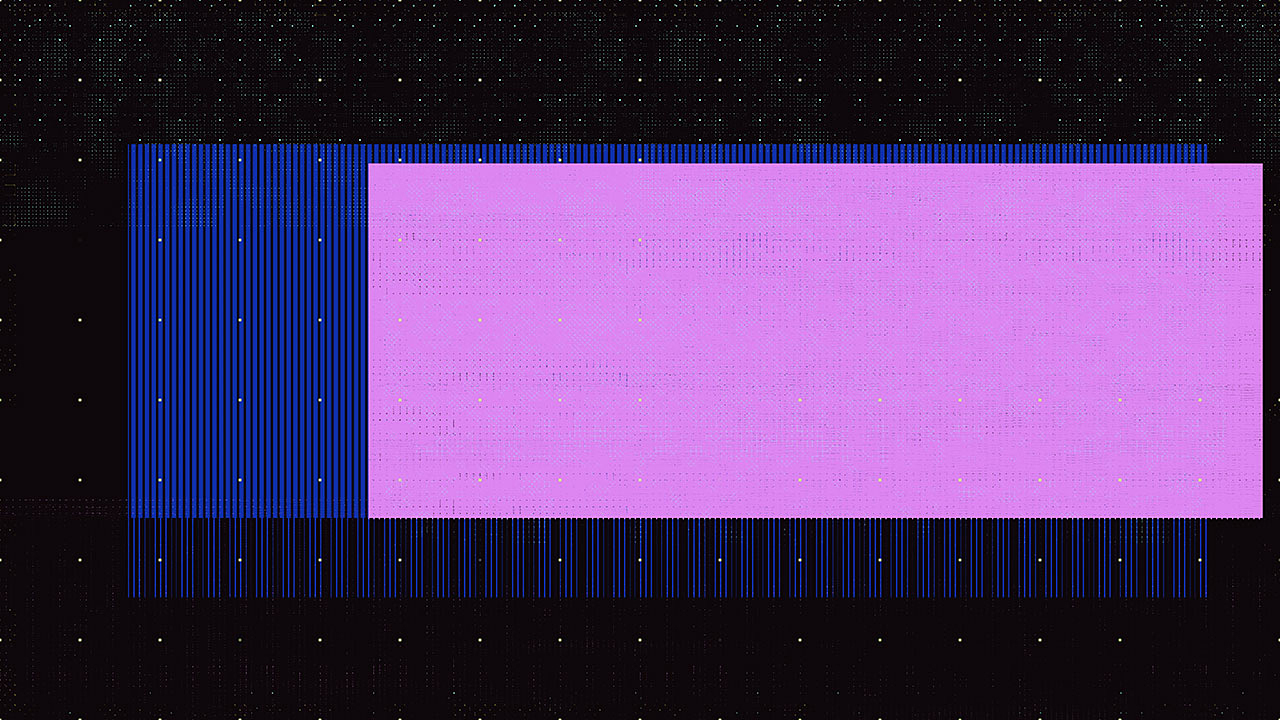
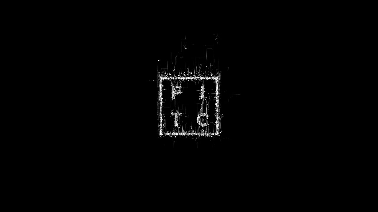
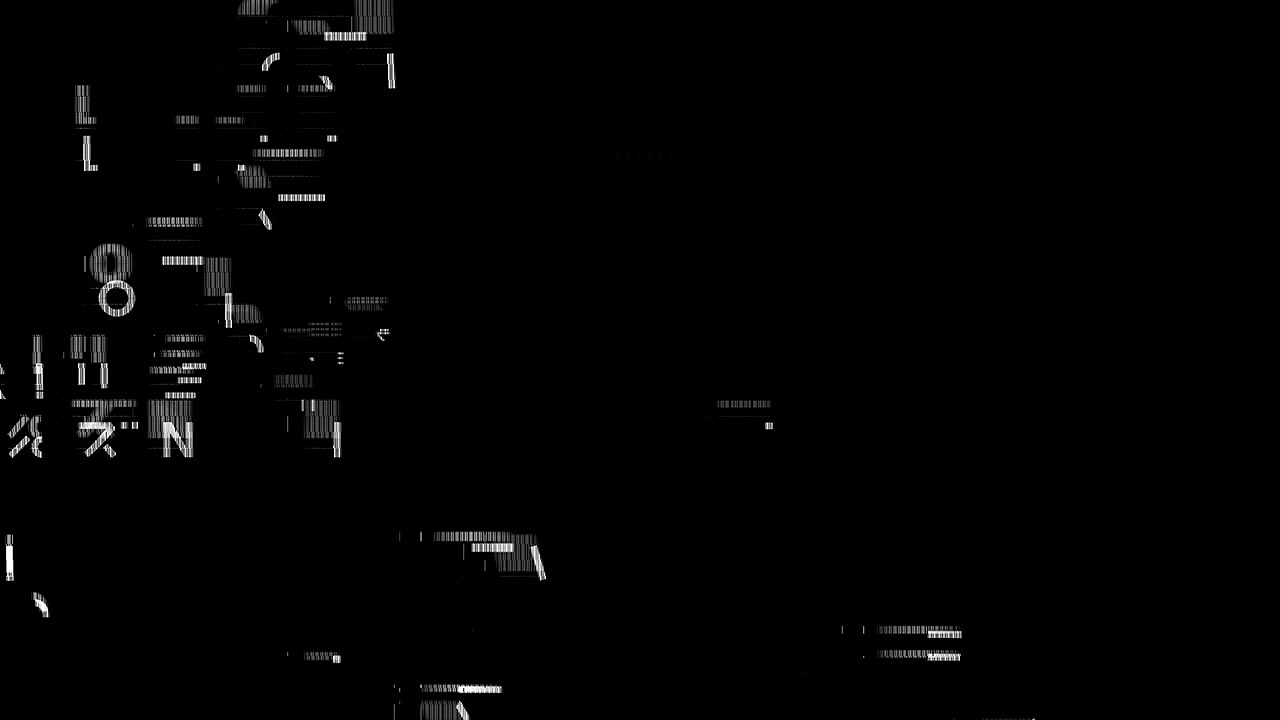
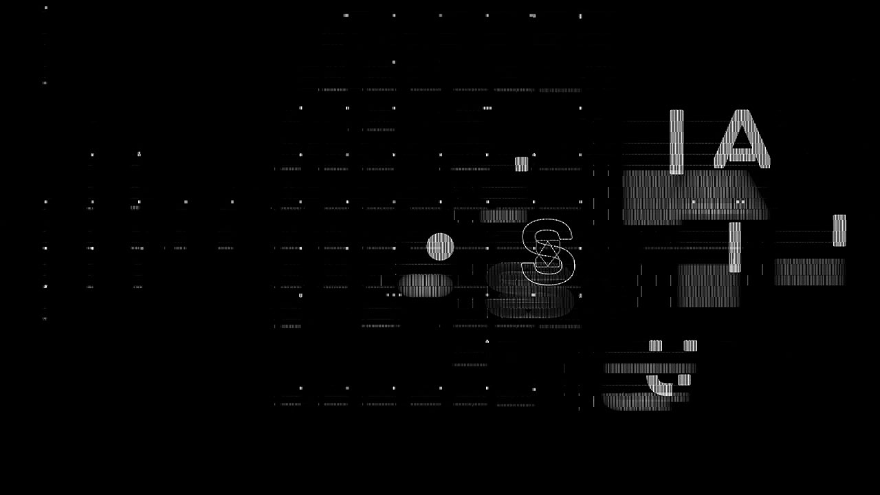
TYPOGRAPHY
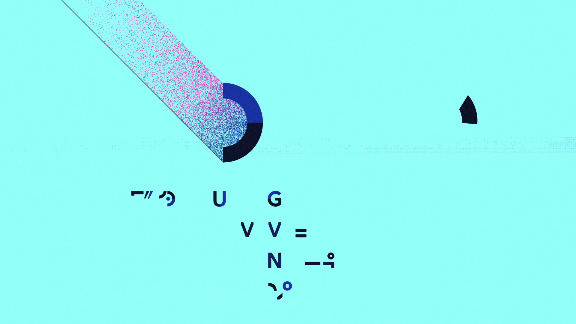
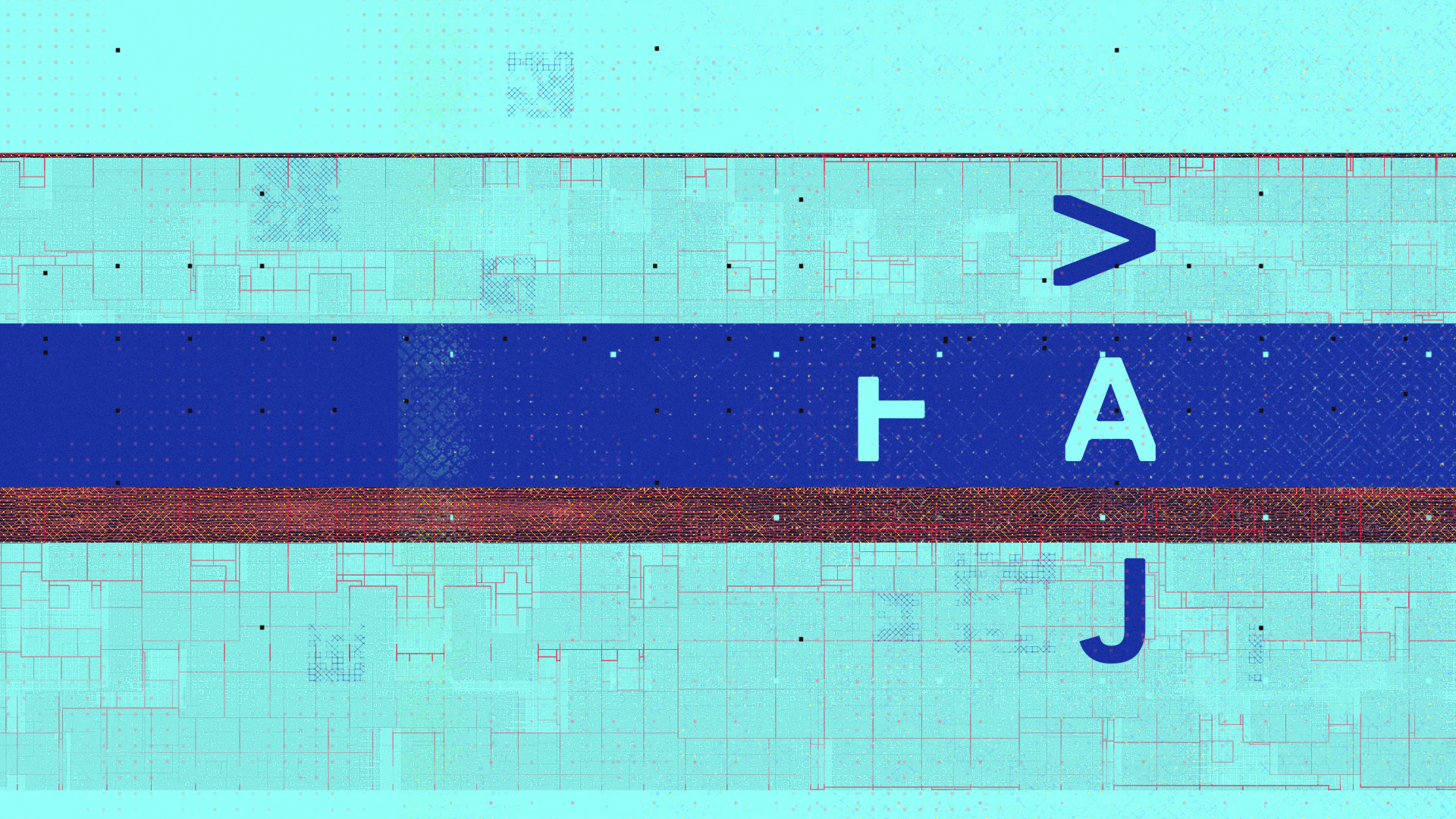
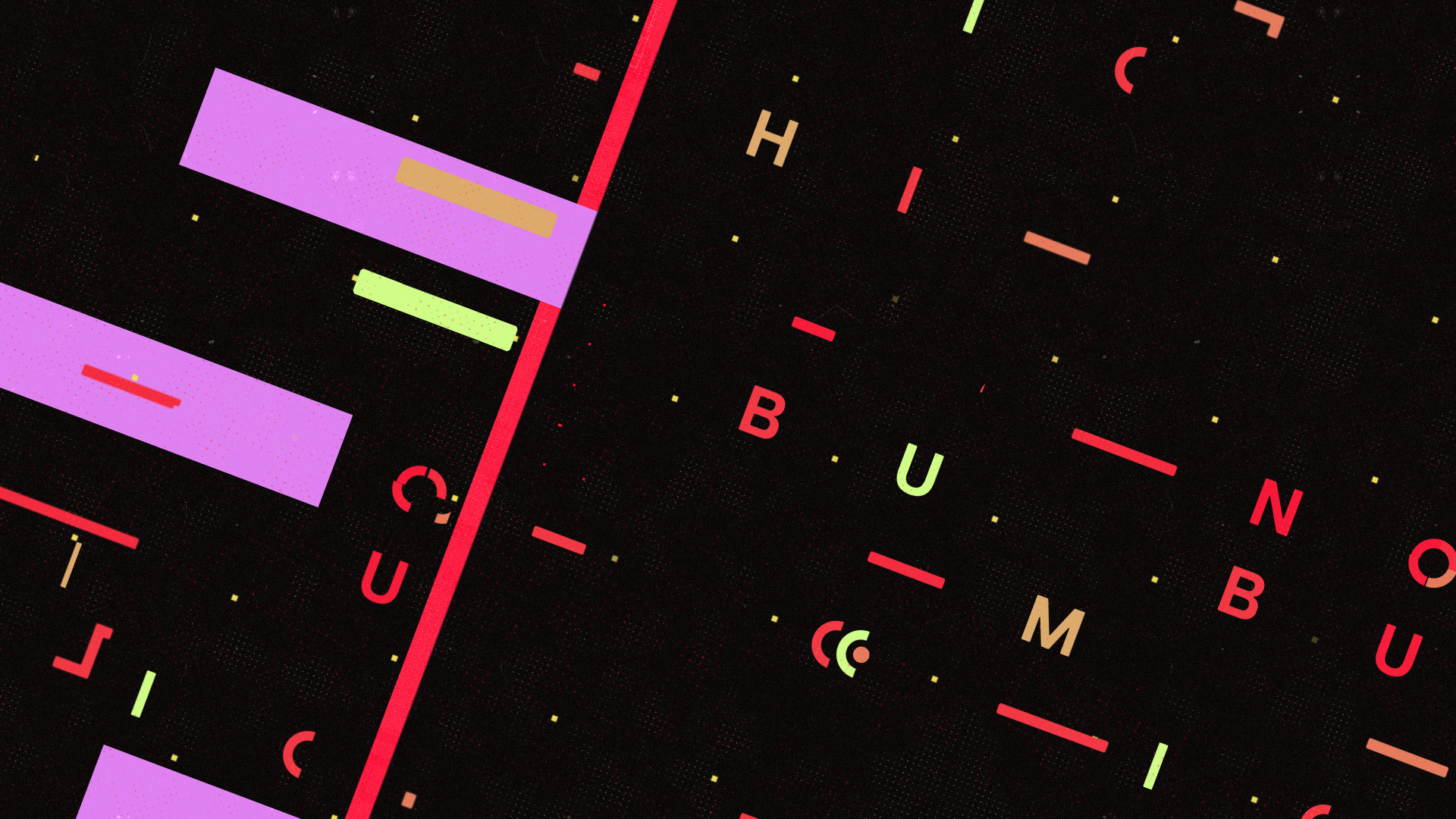
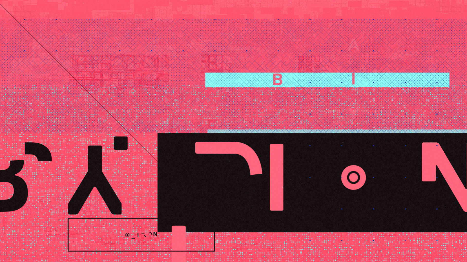
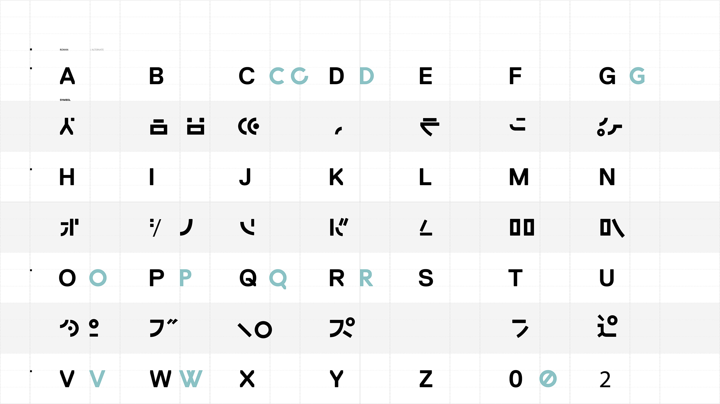
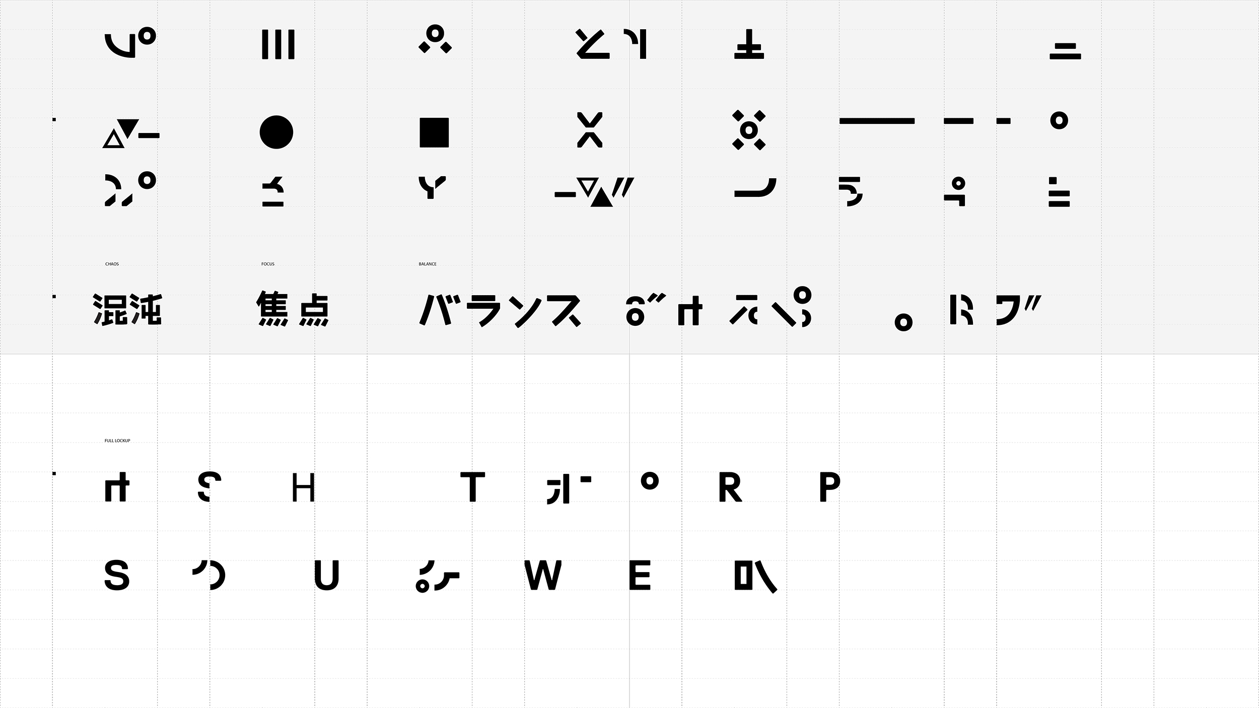
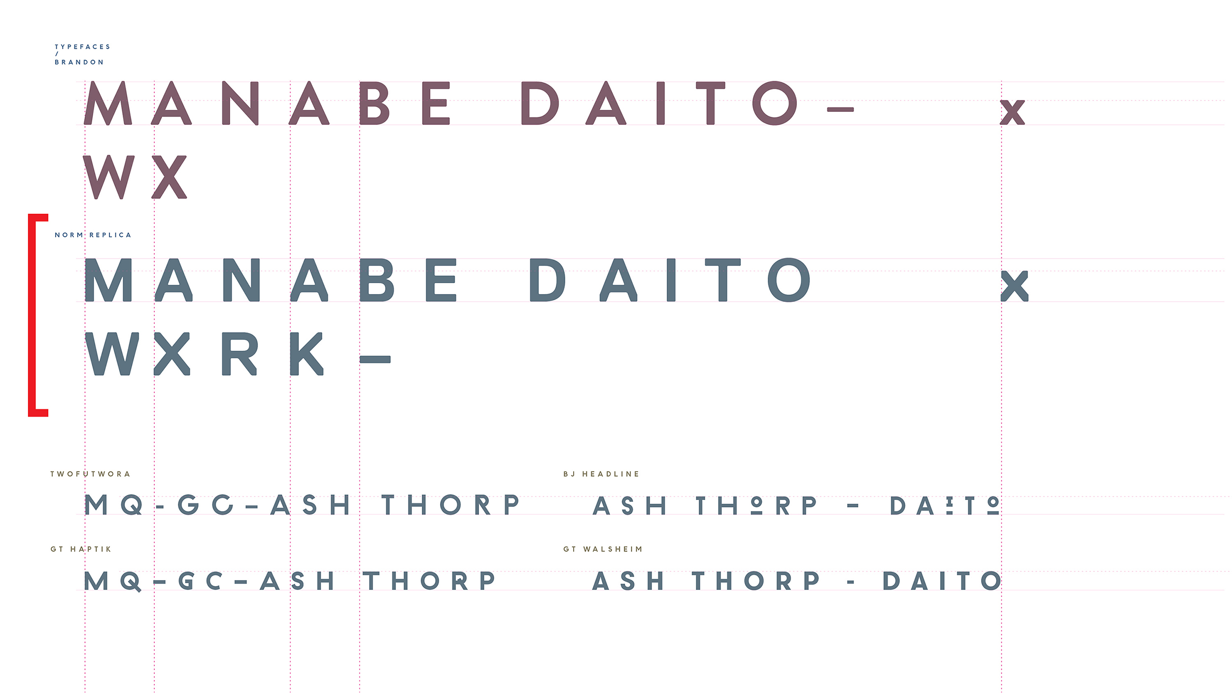
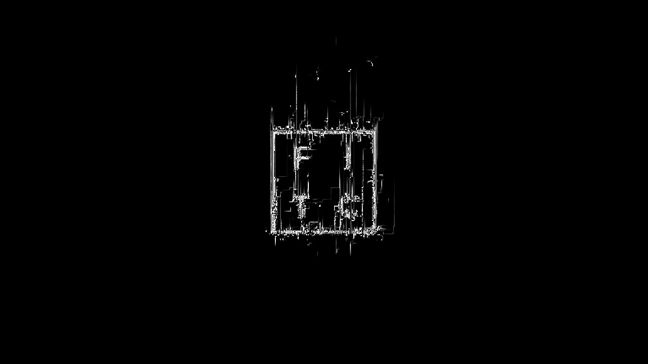
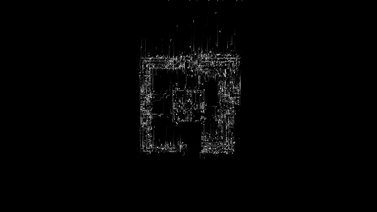
Type being one of the key components to this piece, we were in need of something special that could carry a lot of weight—able to be both abstract shapes that glitch and color fields could live on, as well as legible text for each speakers’ name. Master typographer and animator, Nicolas Girard, lead the way on font design. Expanding massively on the initial type direction set forth in the style frames, Nic crafted a custom font and glyph set based on Norm: Replica.
By taking inspiration from the typographic forms of both Kanji and Norm: Replica he was able to generate a seemingly endless set of shapes for animation that could evolve from simple geometries to legible text without repetition. Armed with this set of glyphs, Nic and keyframe veteran Alasdair Willson animated the entirety of the type in the spot.
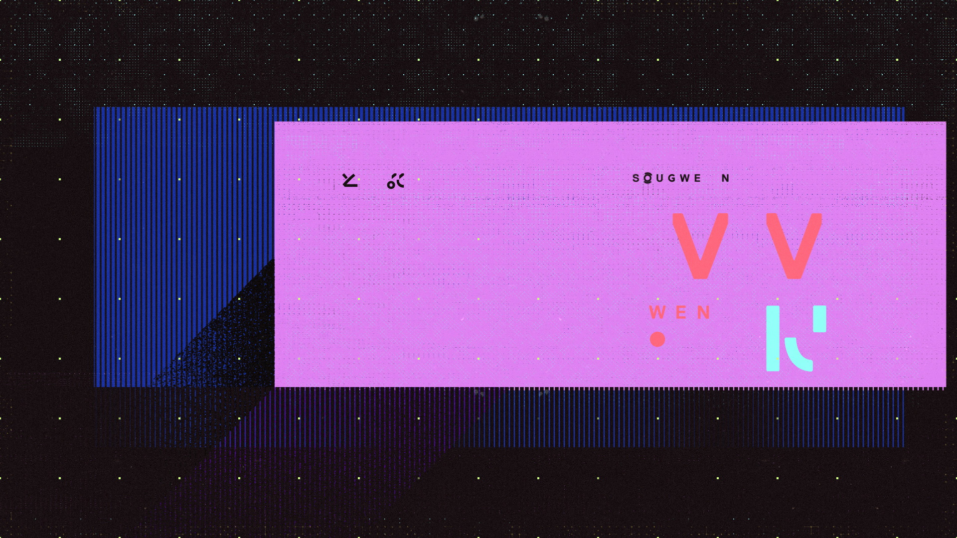
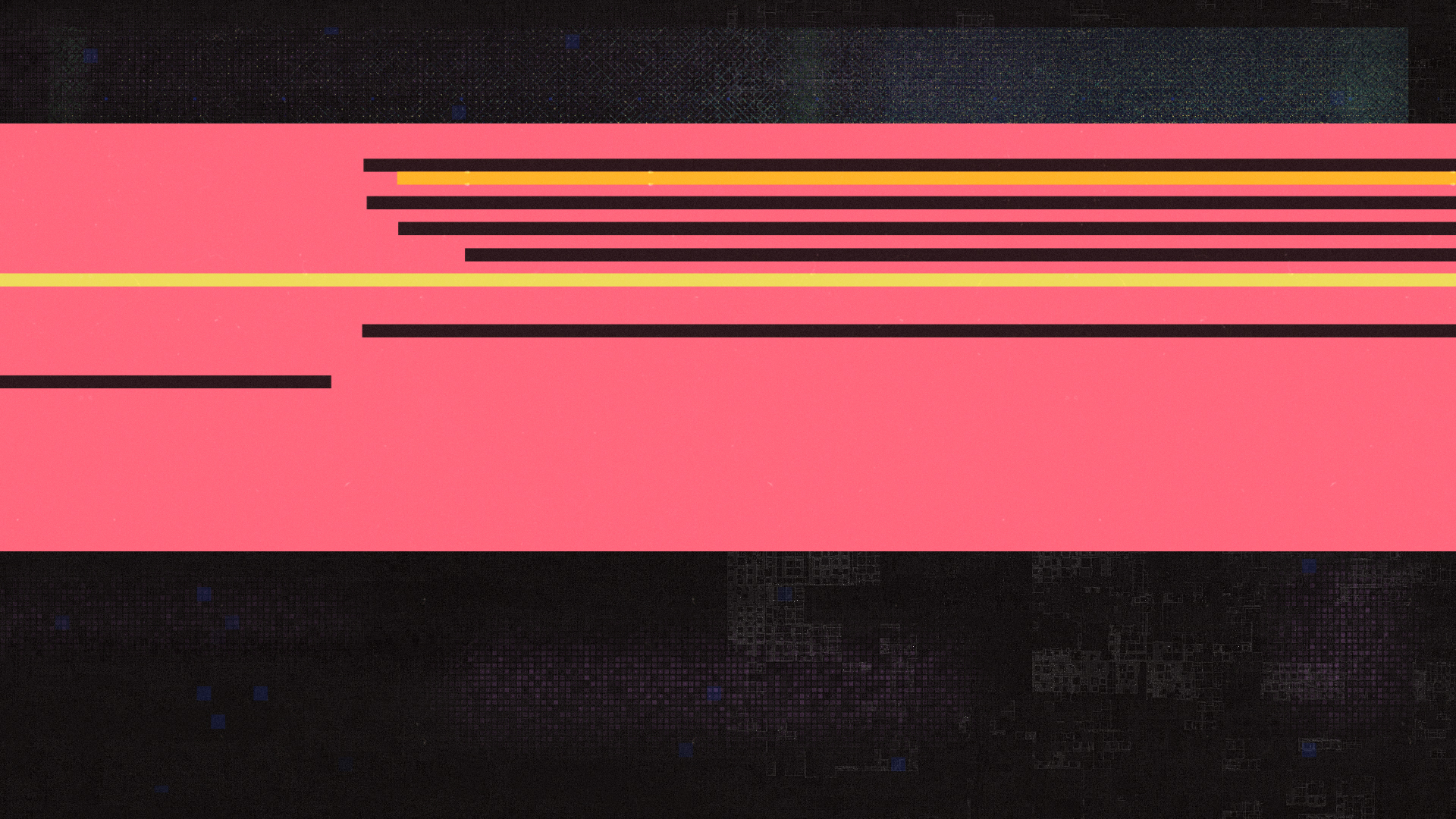
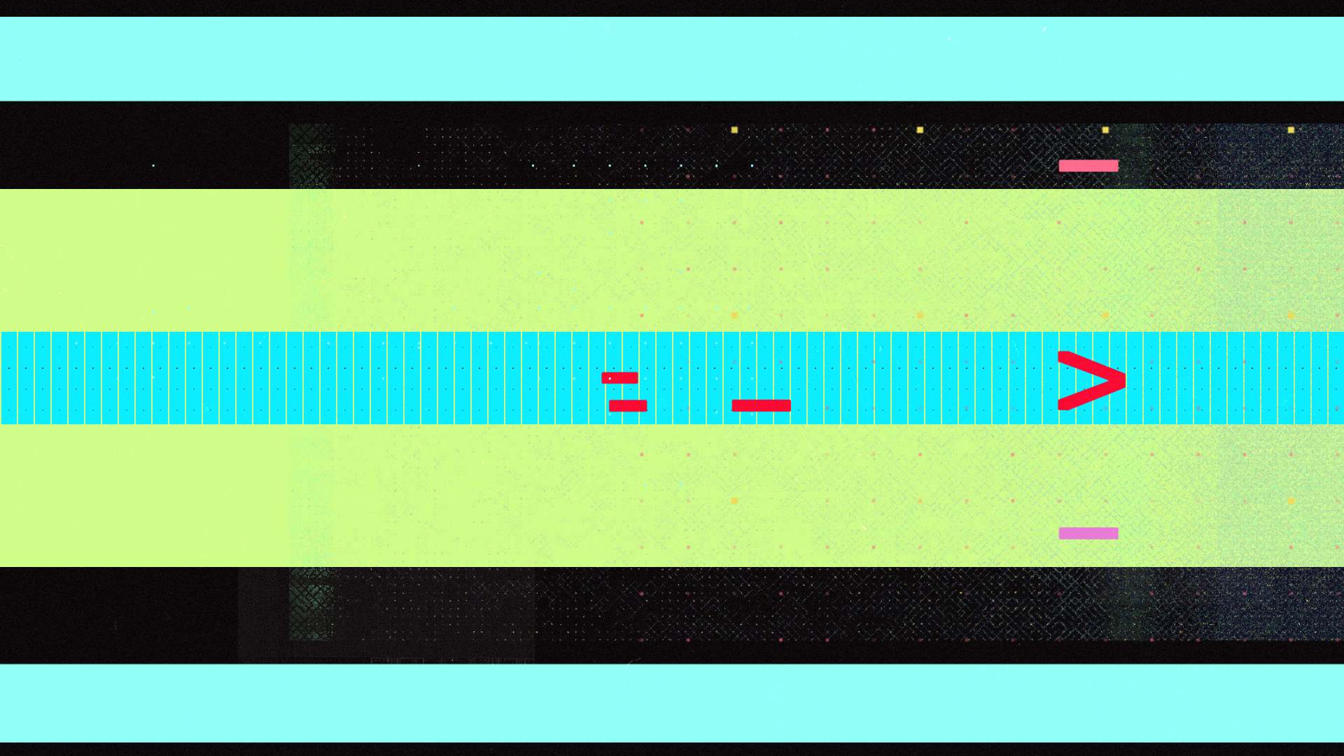
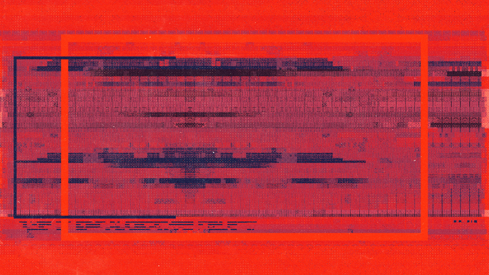
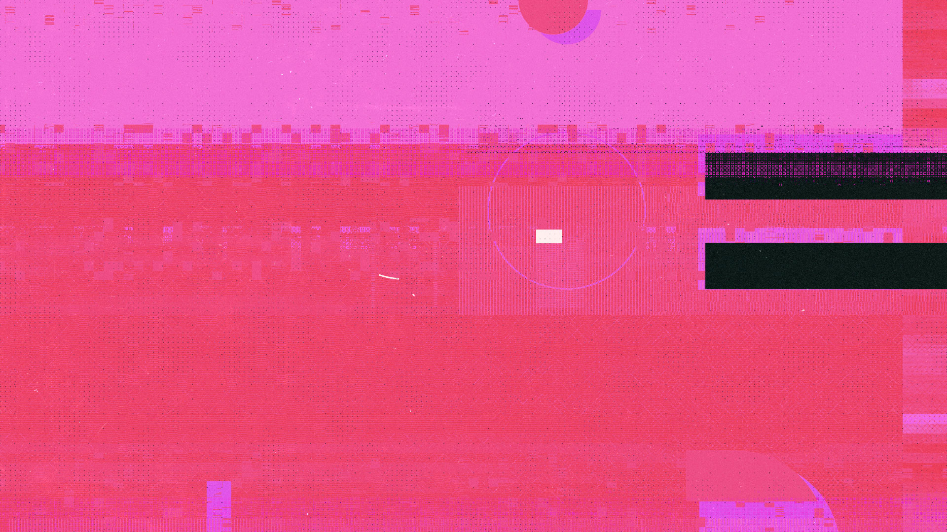
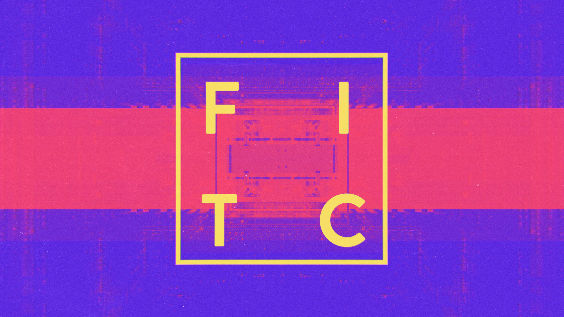
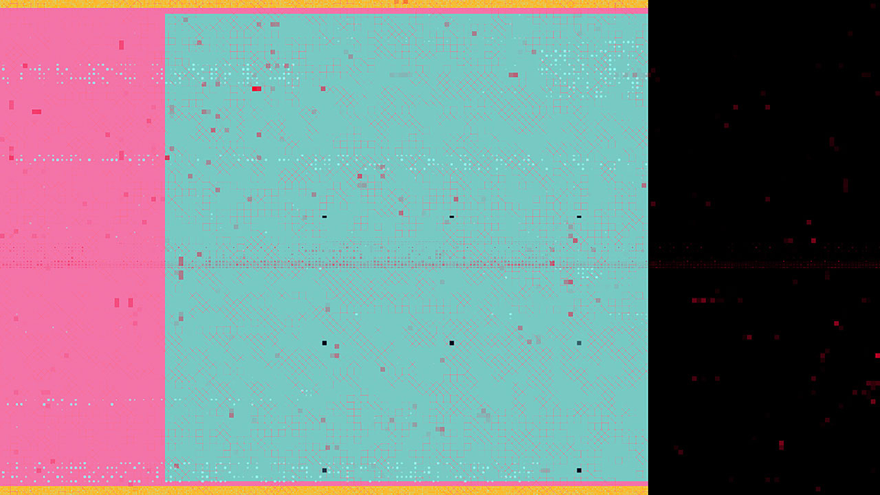
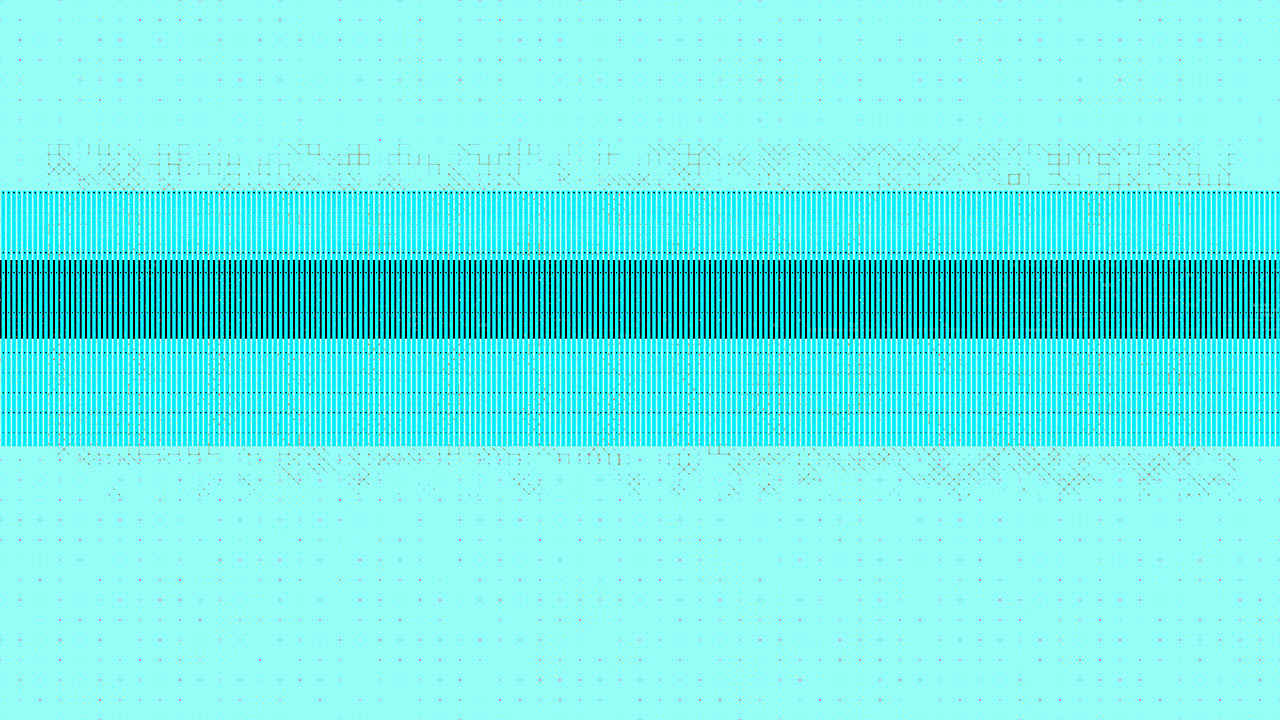
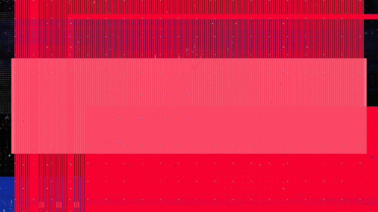
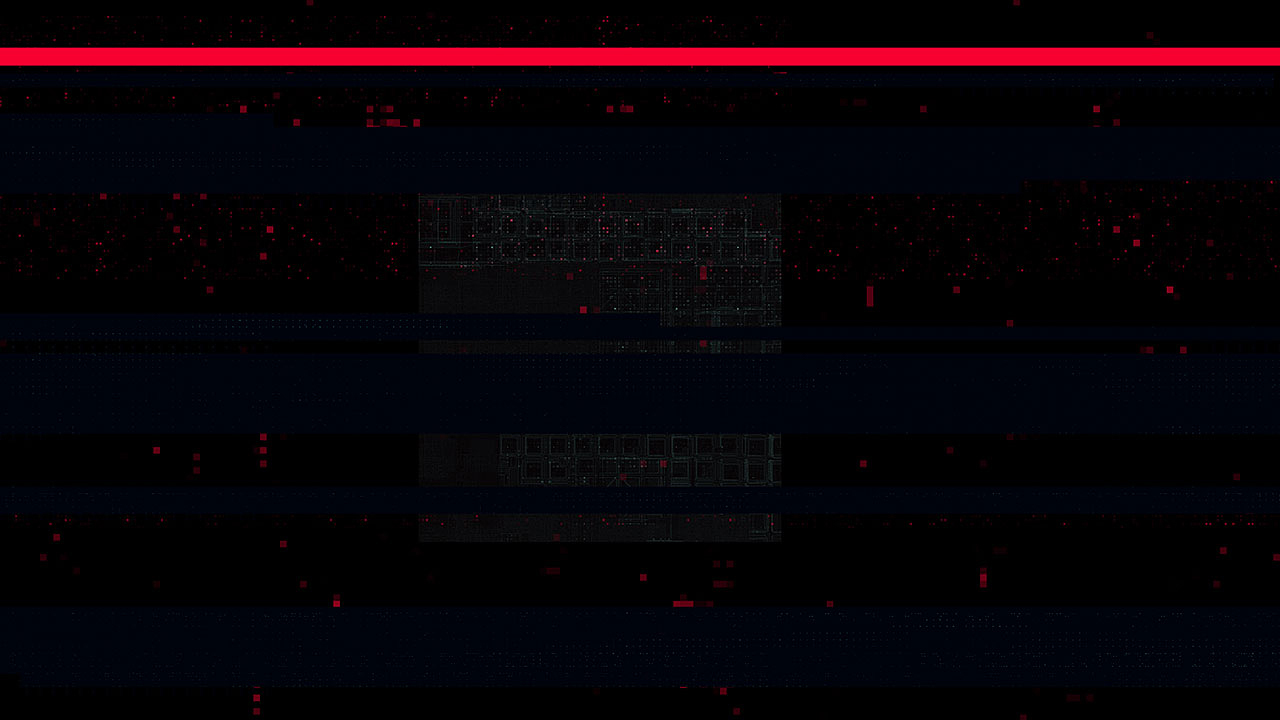
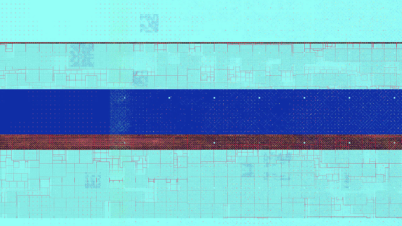
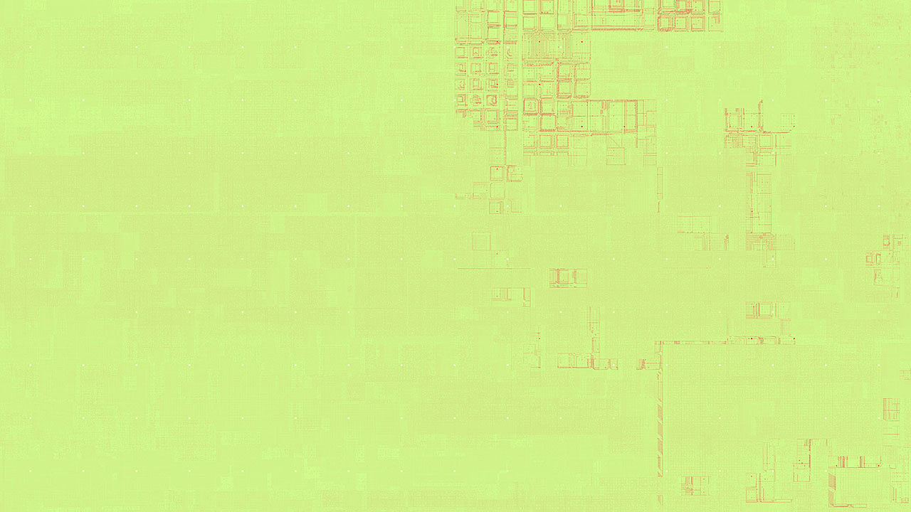
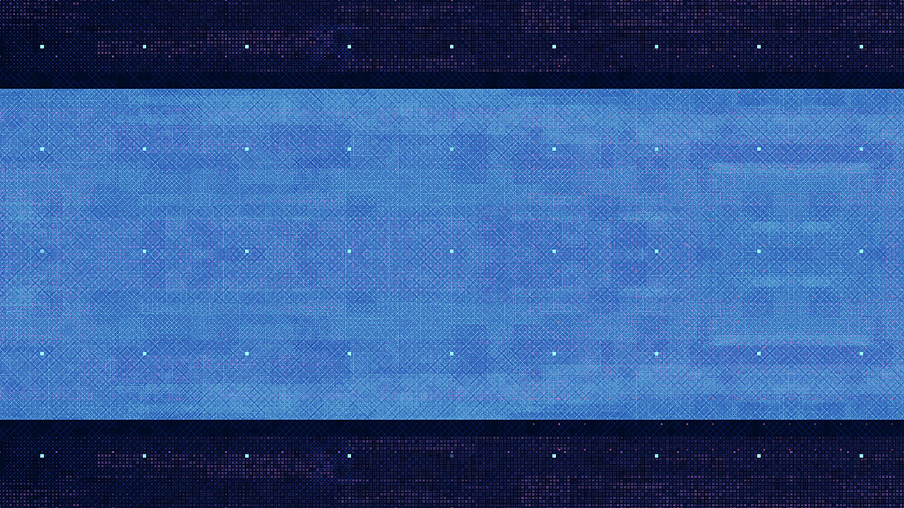
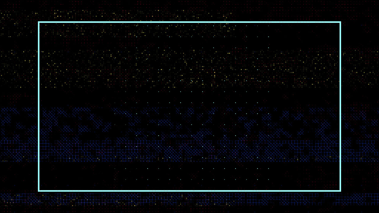
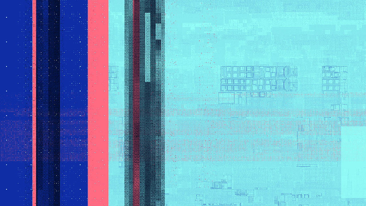
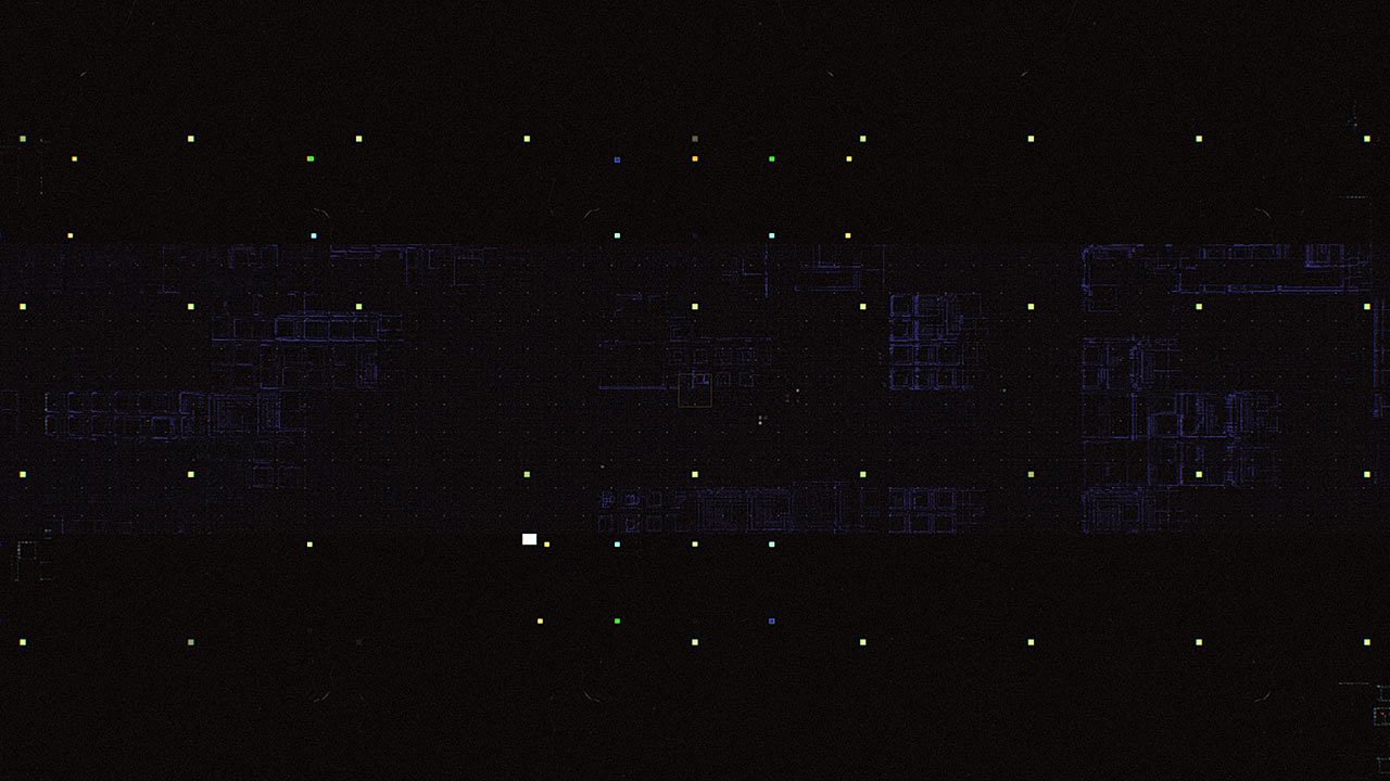
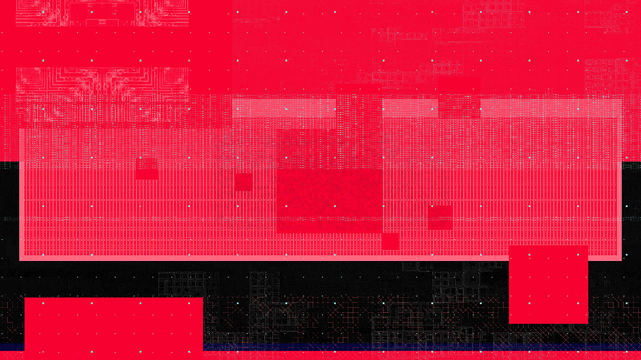
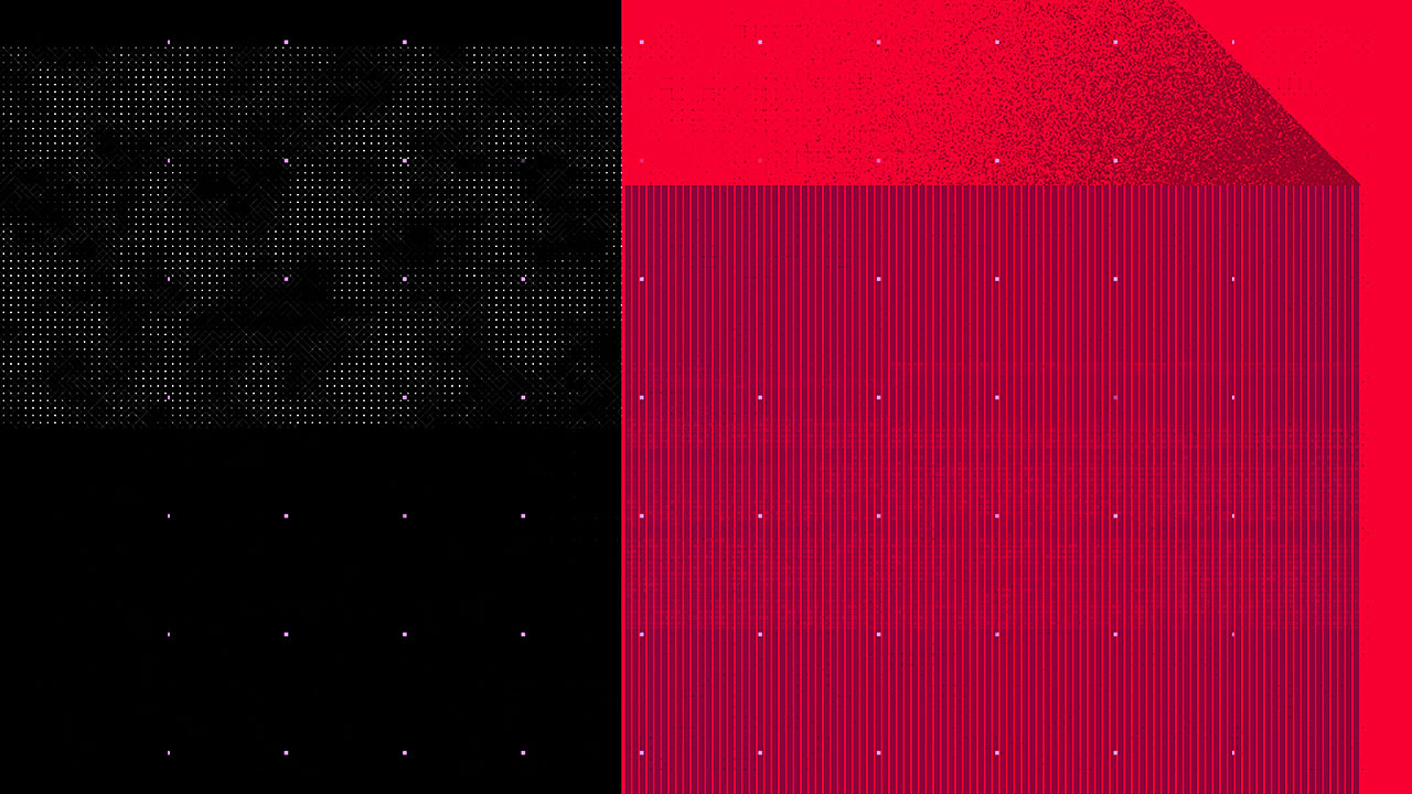
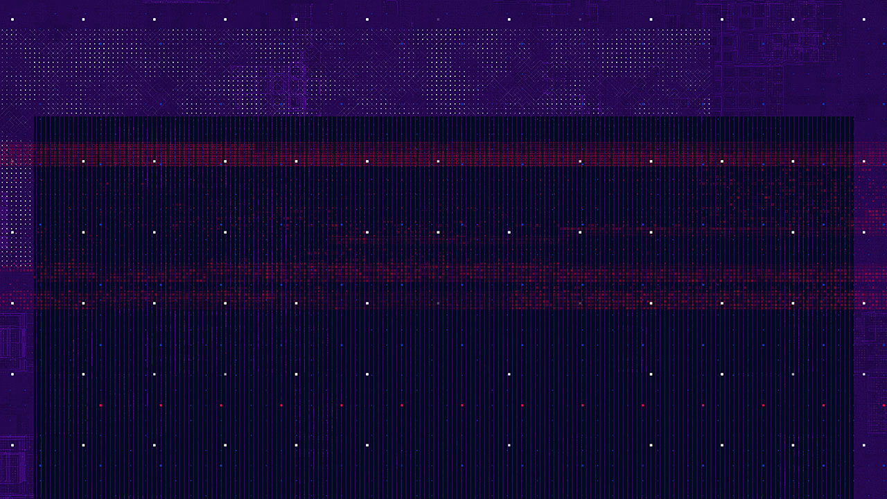
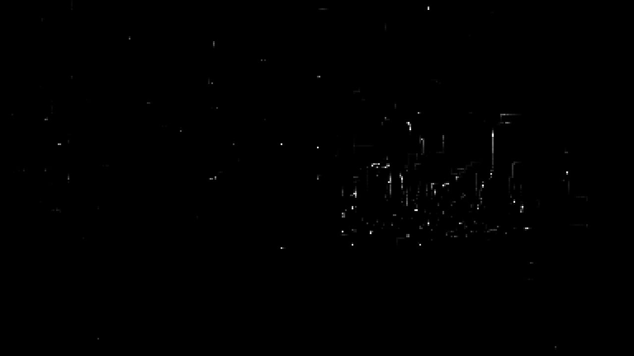
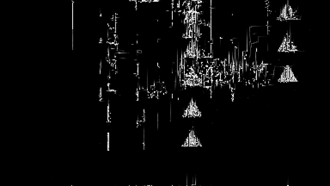
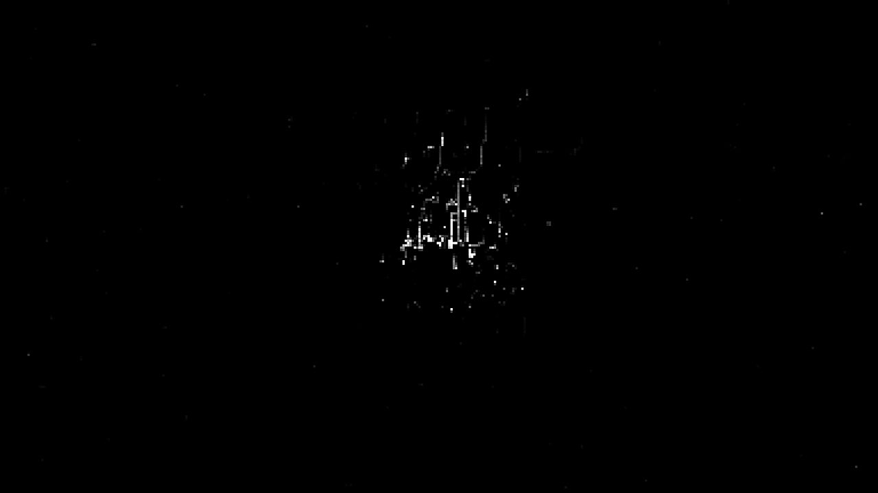
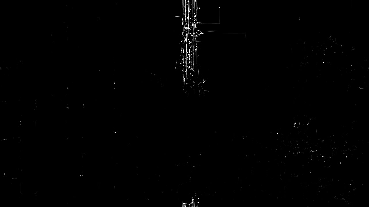
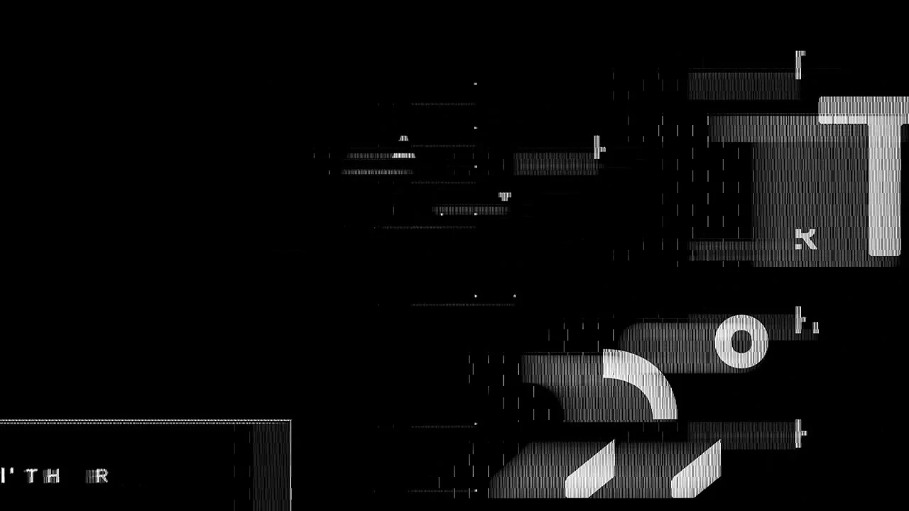
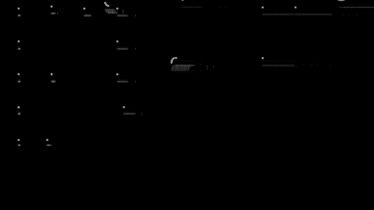
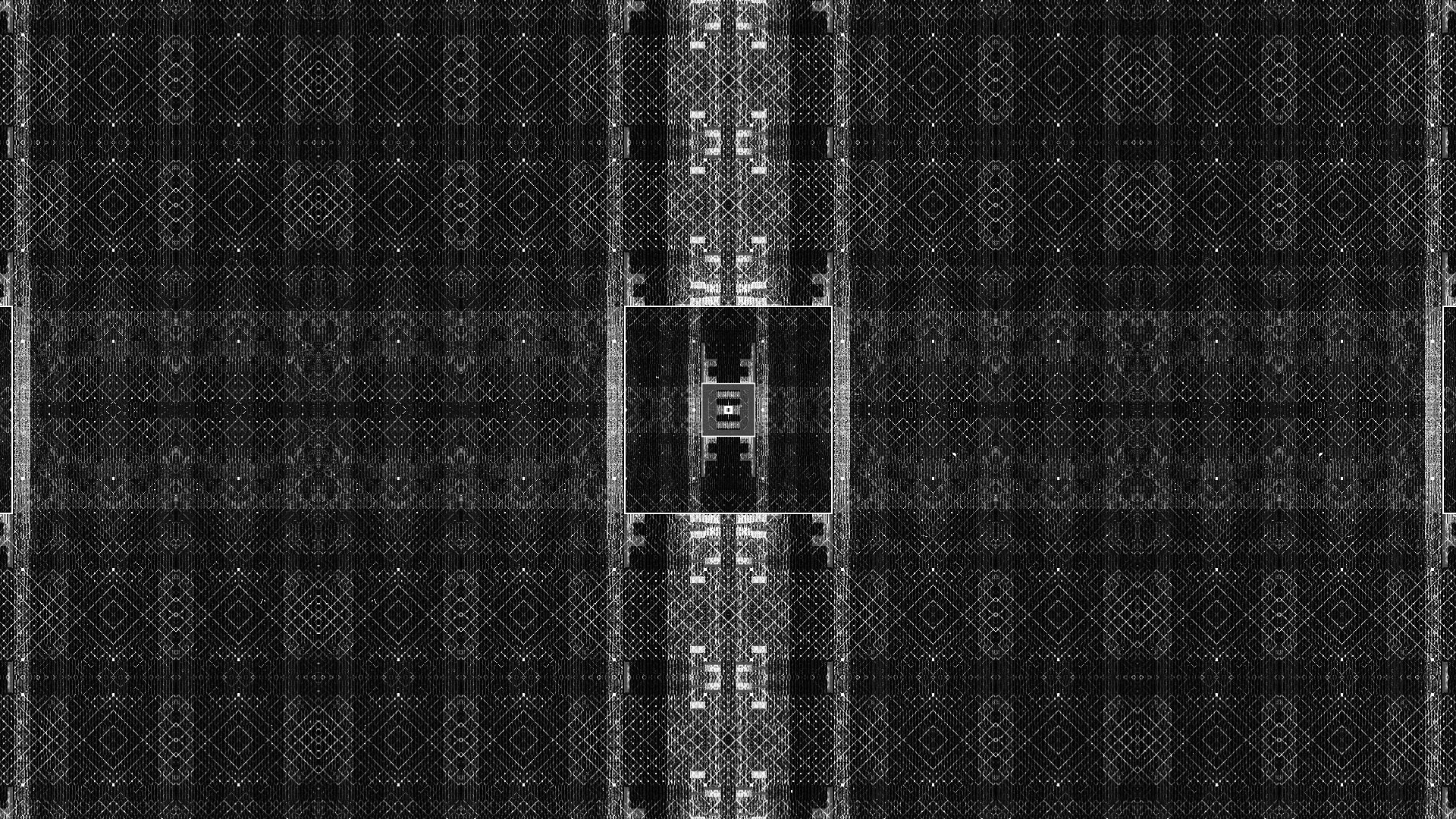
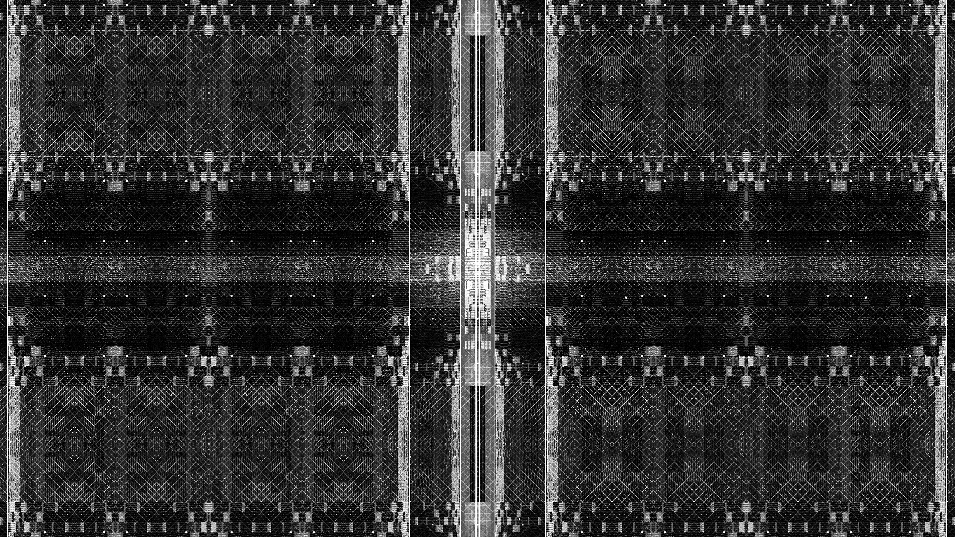
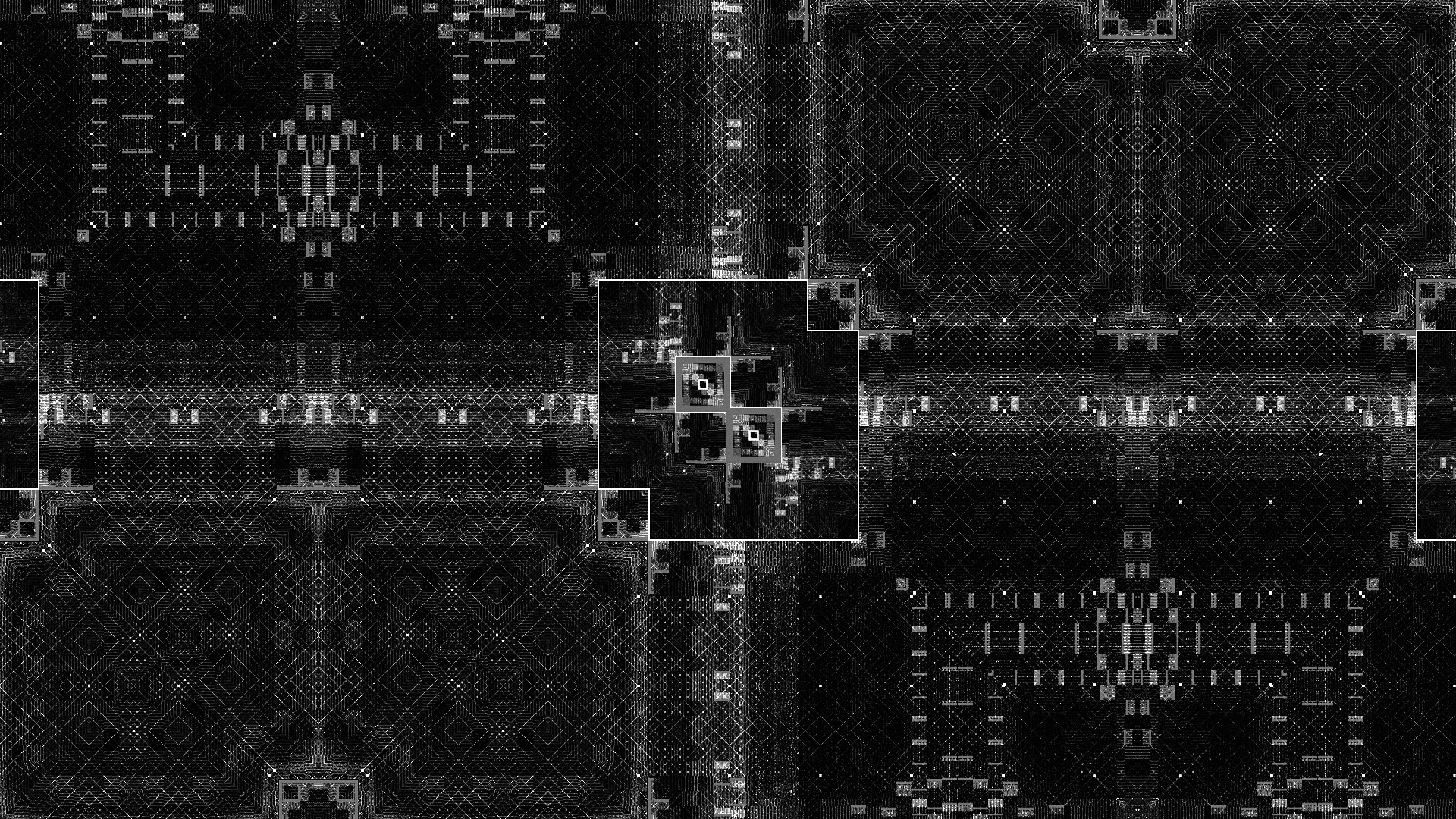
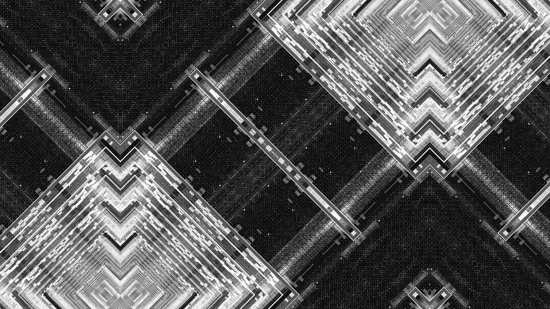
GLITCH TEXTURE
The biggest part of producing the glitch effects was building up a massive library of textures and mattes that could be repurposed throughout the piece. The glitch we were aiming for was an editorial style glitch generated from cutting together a mass of simple graphic shapes and textures that together create more complex compositions. In the early stages of the project I was able to create a fairly dense library that we repurposed throughout the piece.
I lead the glitch animation effort with support from Andrew and later Chris Bjerre, who came on board to get us across the finish line. We would import Nic and Alasdair’s black and white text animations—cutting up, layering, coloring and stylizing them into nearly frame-by-frame compositions that would shift in tight sync with the audio.
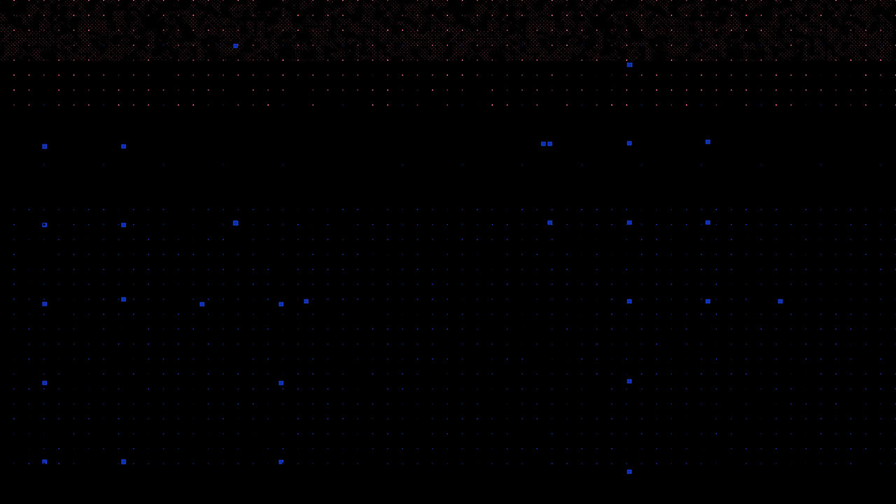
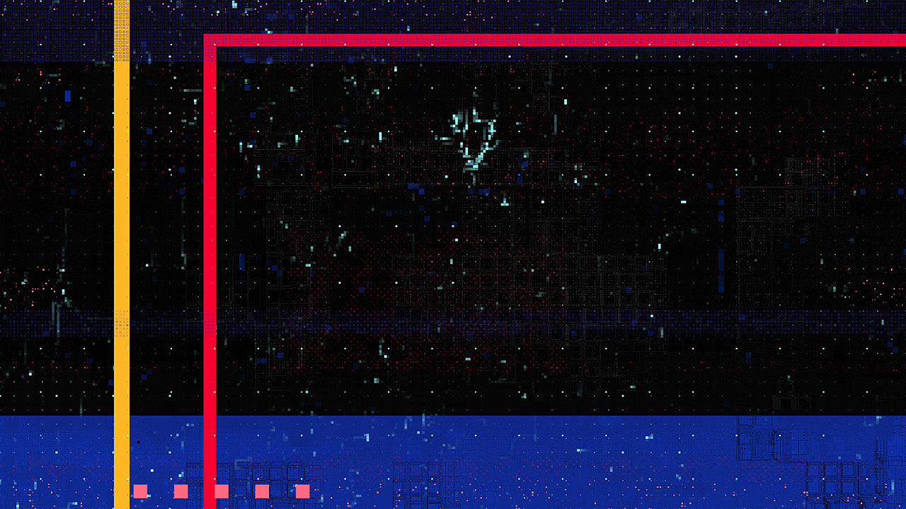
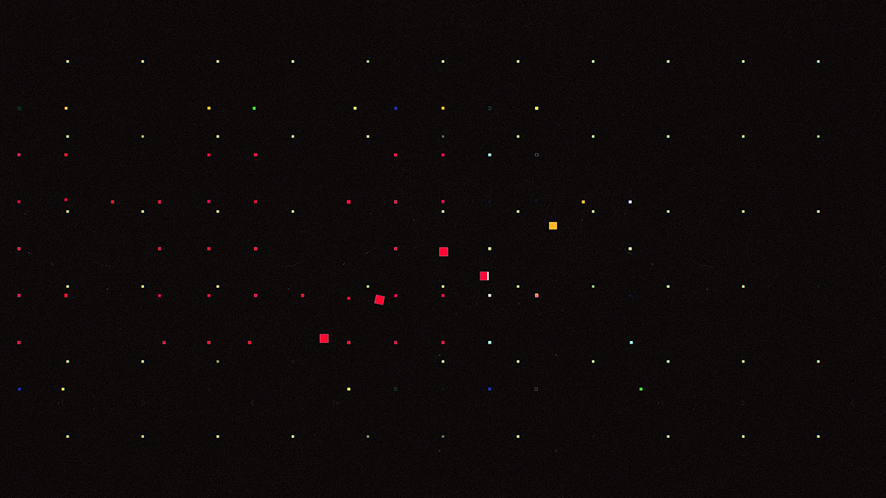
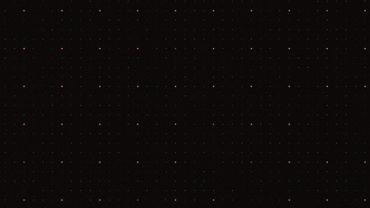
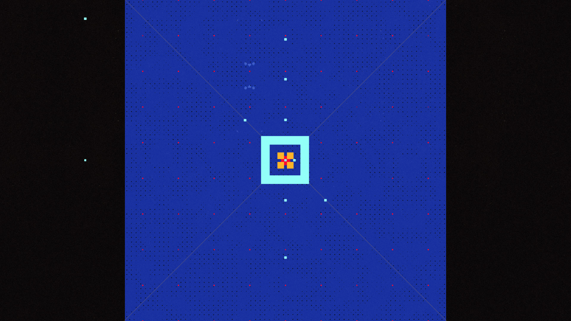
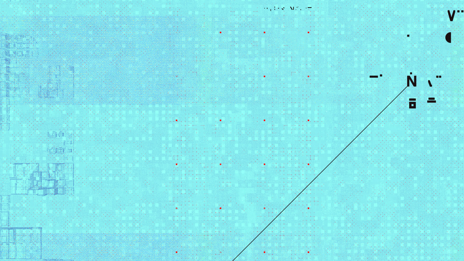
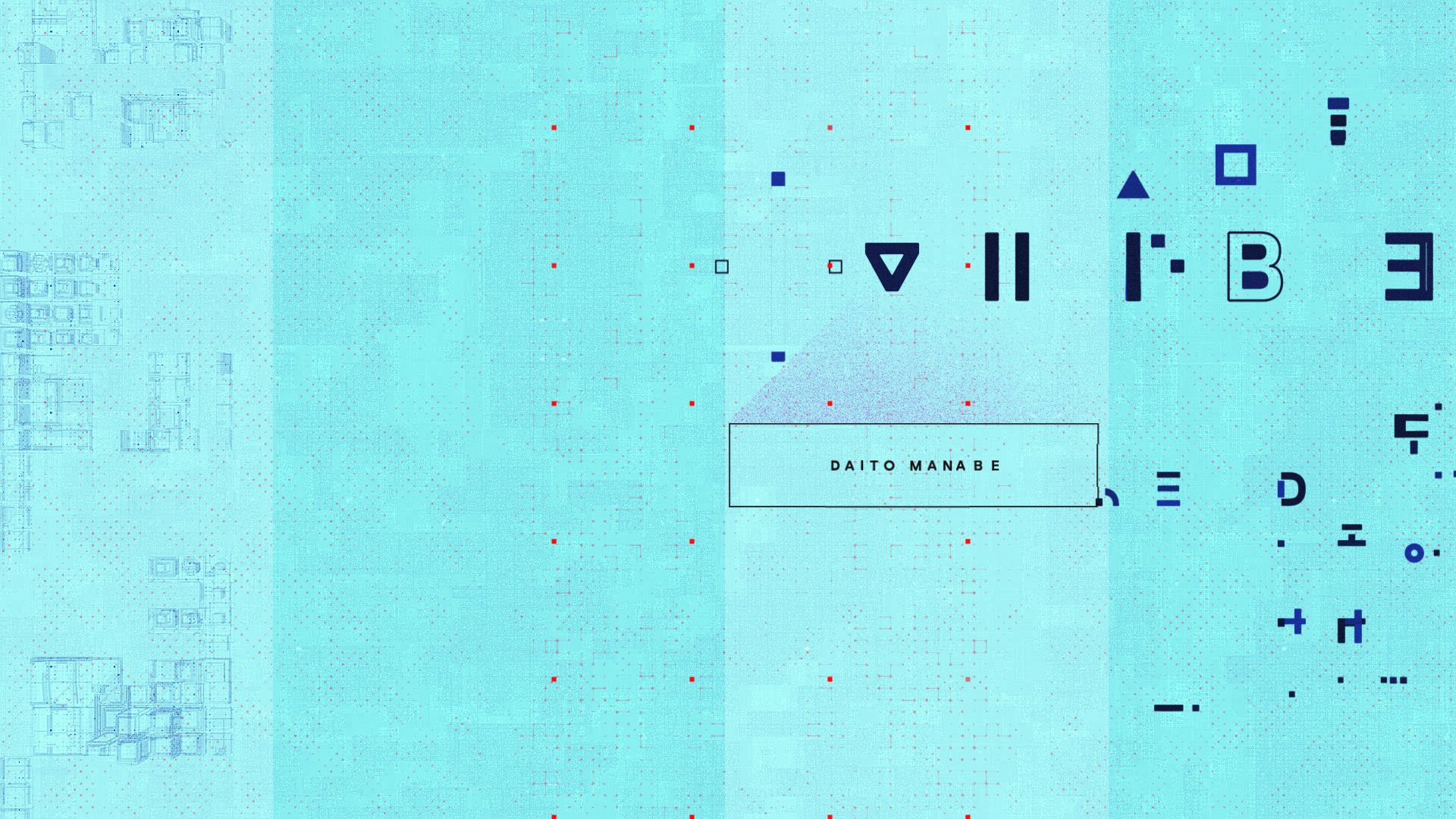
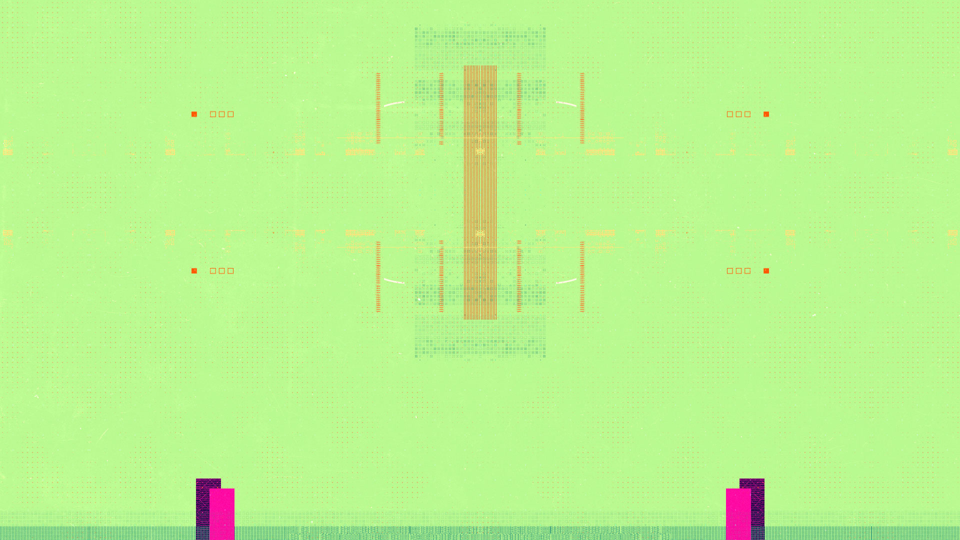
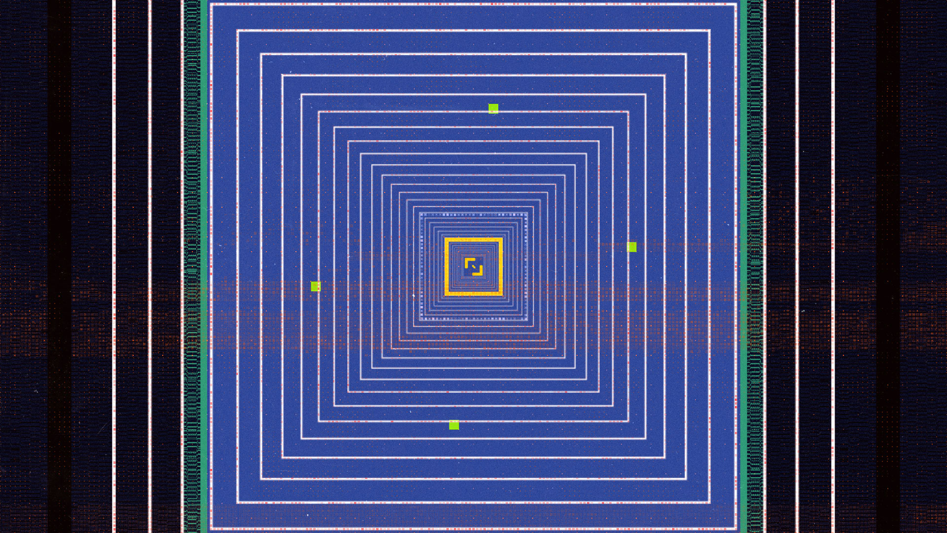
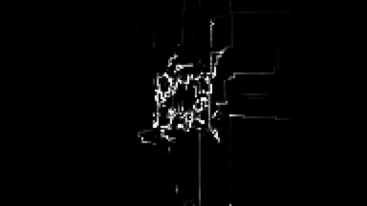
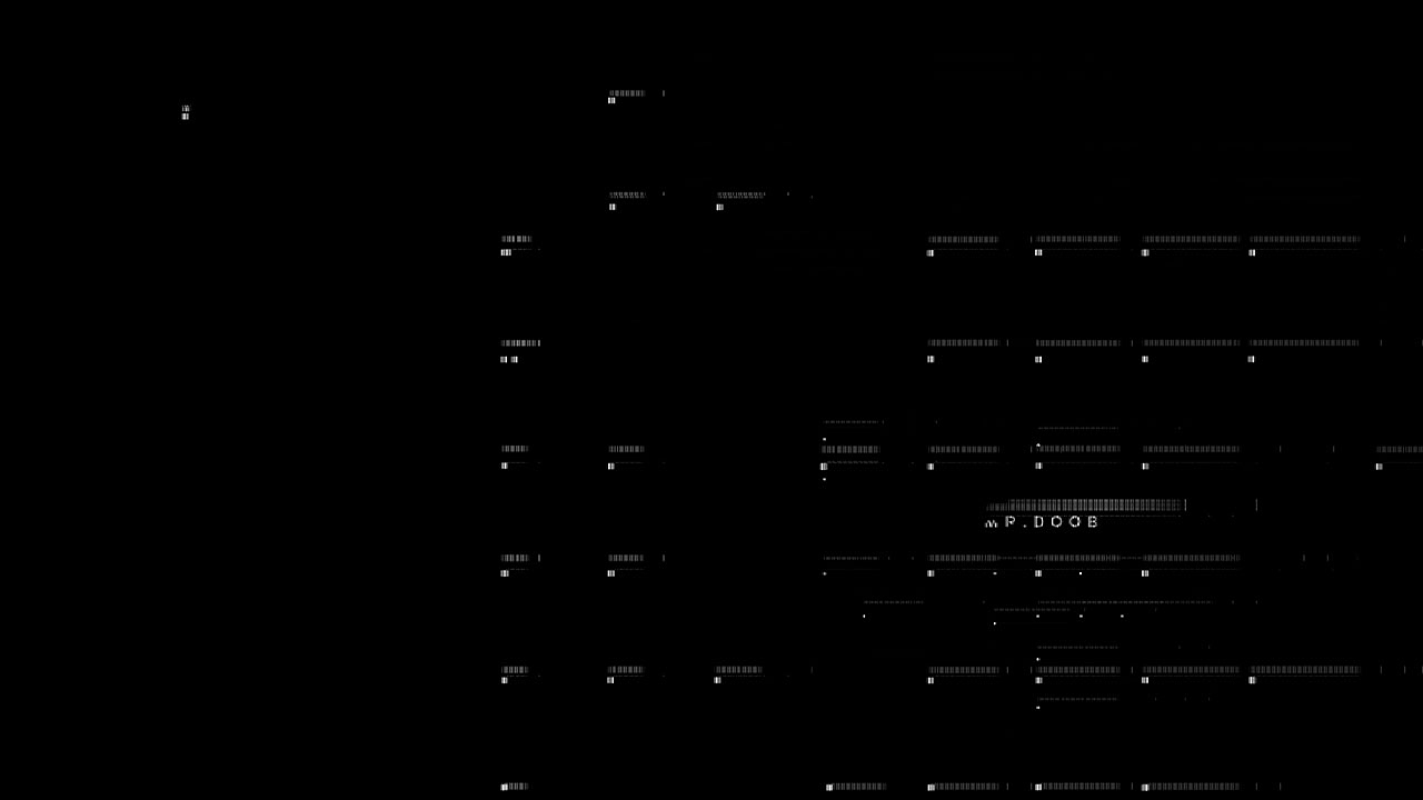
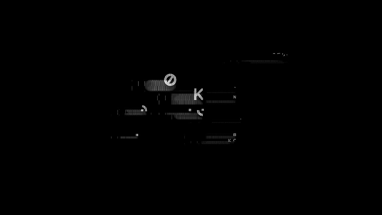
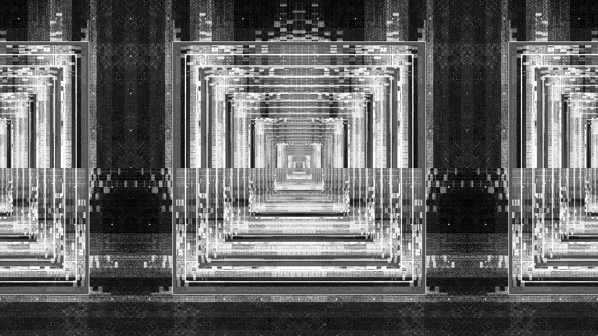
GENETIC GRIDS
Our team’s Computation Artist and Buck’s resident Creative Technologist, Albert Omoss, generated a variety of glitch effects for the spot. Prototyped in Processing and executed in Houdini with Python, Albert crafted a complex genetic grid system where our source text animations would drive the birth of particles, traversing the grid, spreading their genes, mutating and evolving.
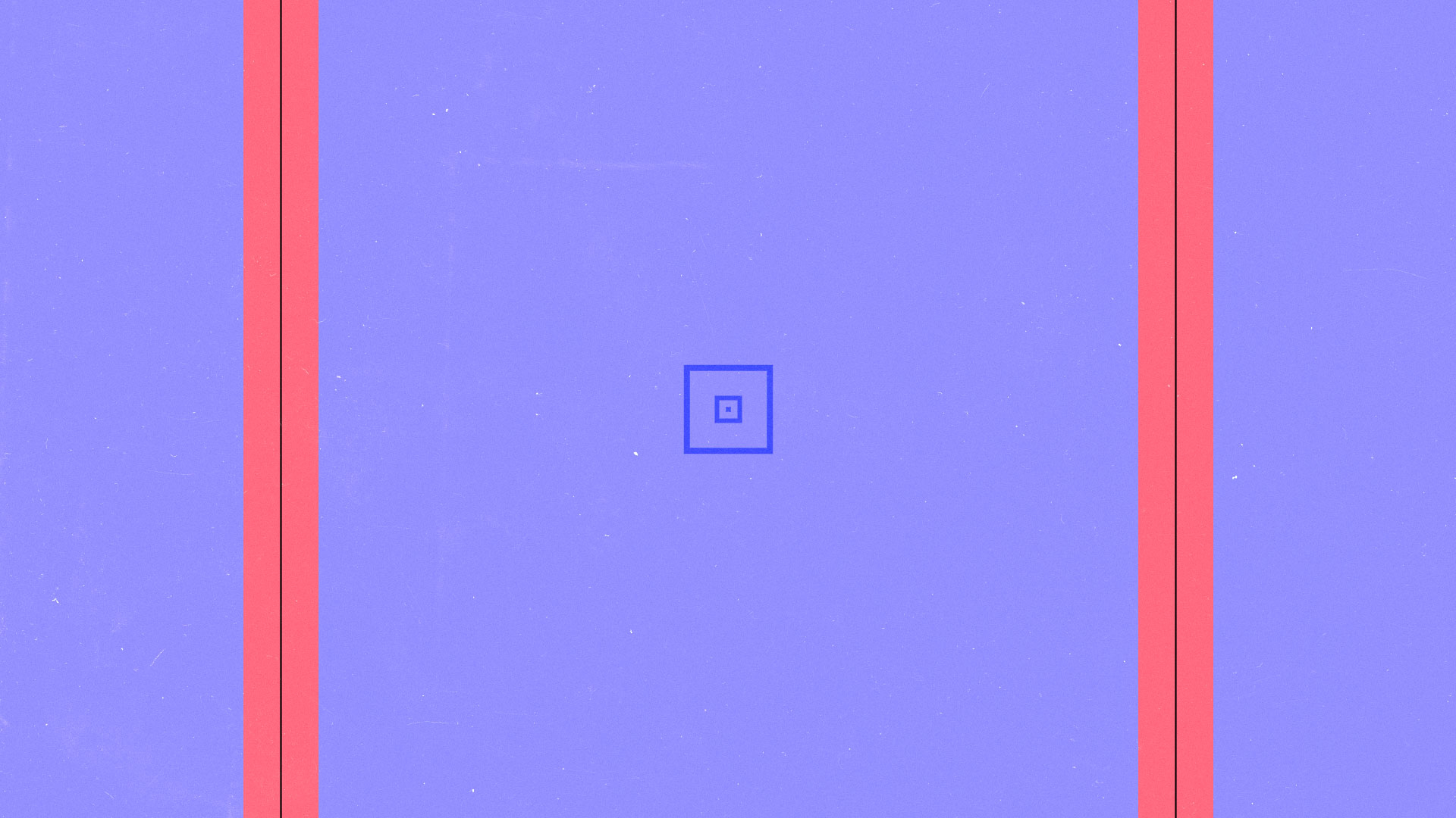
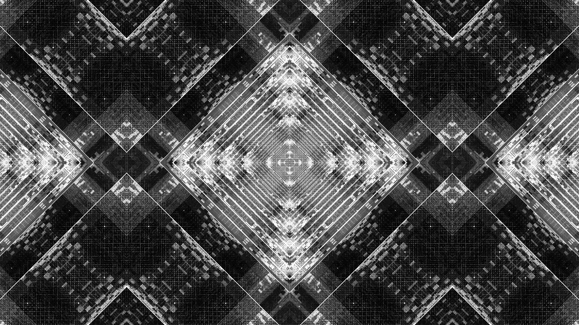
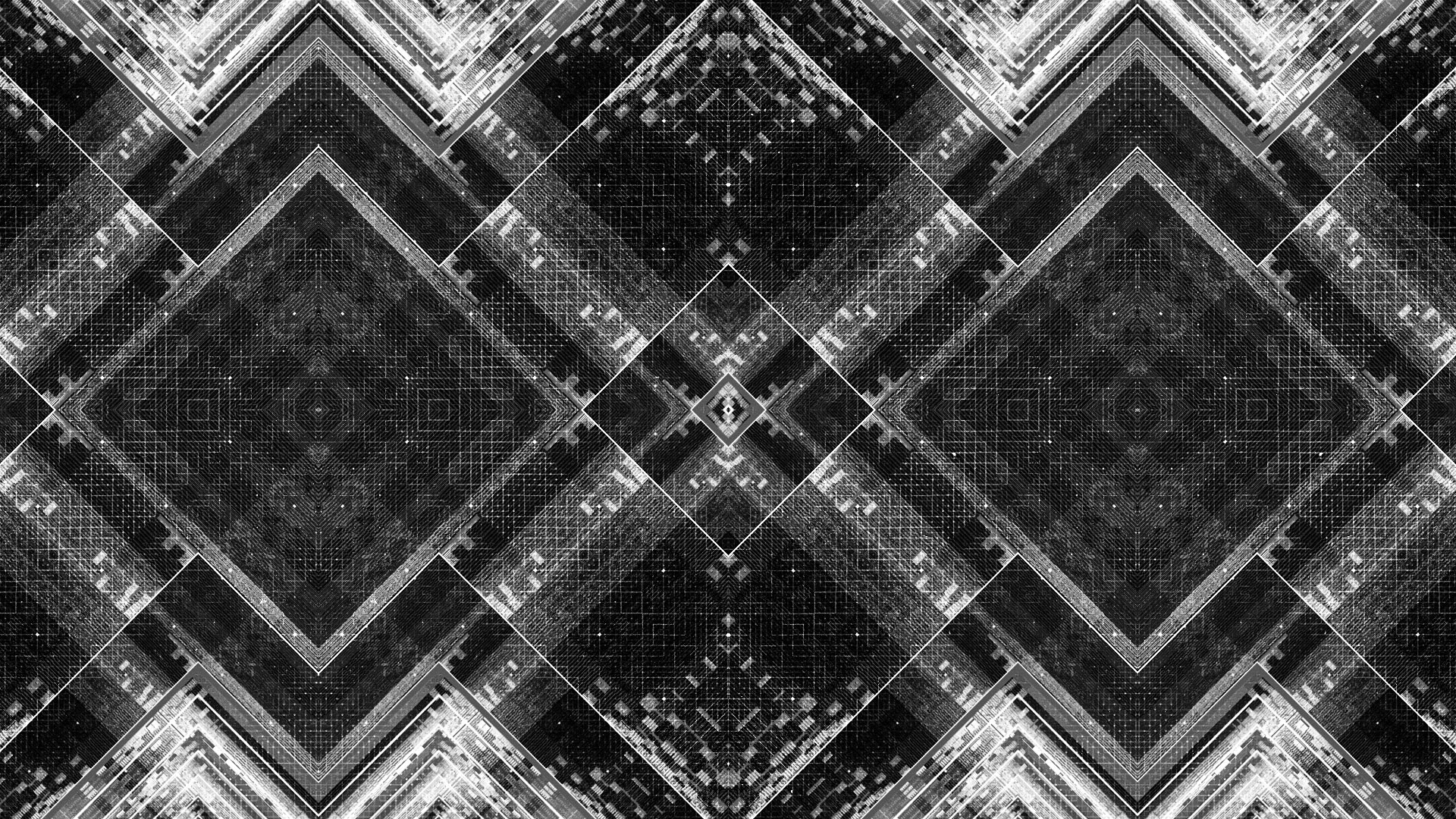
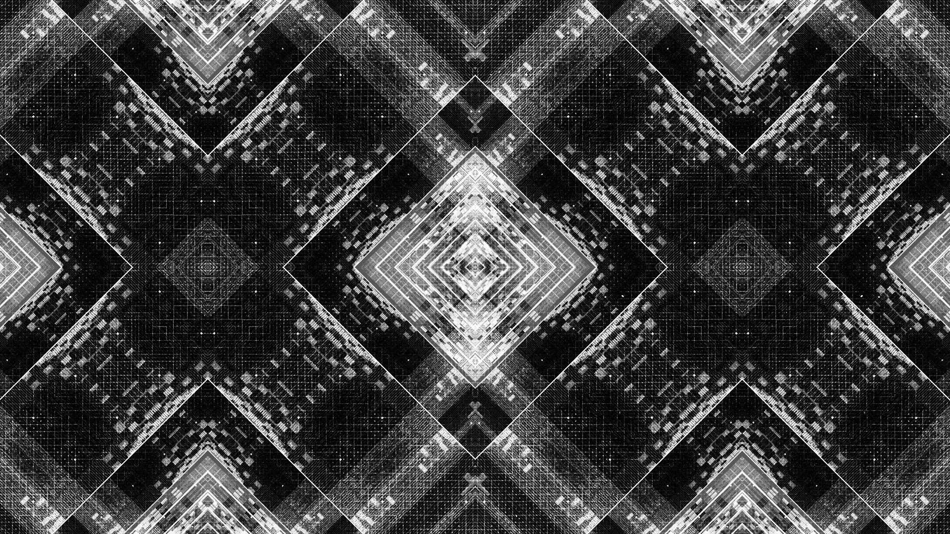
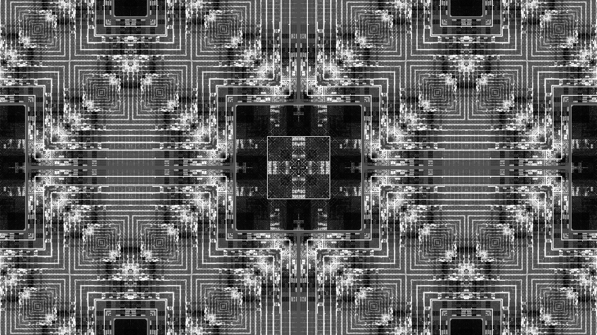
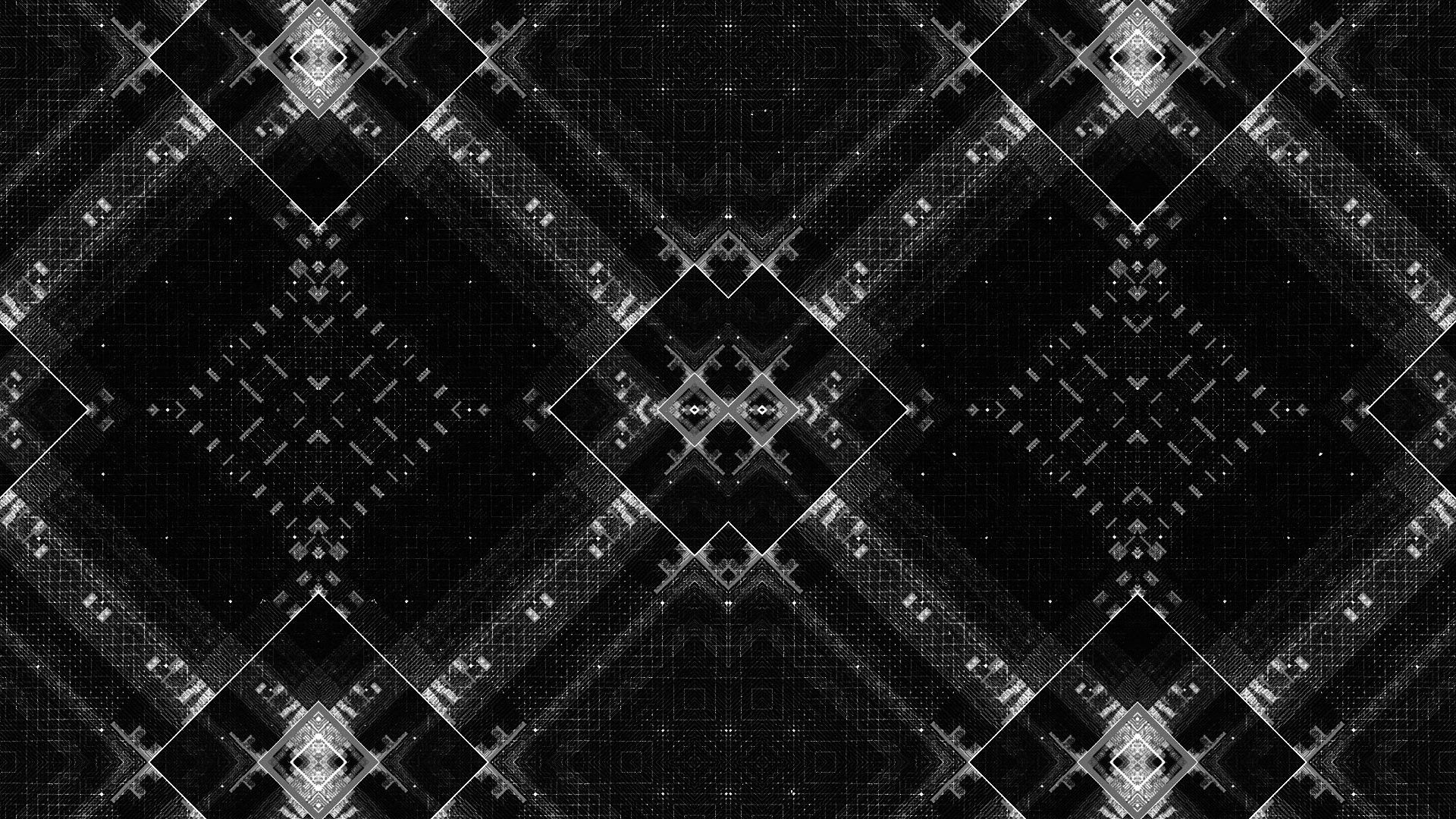
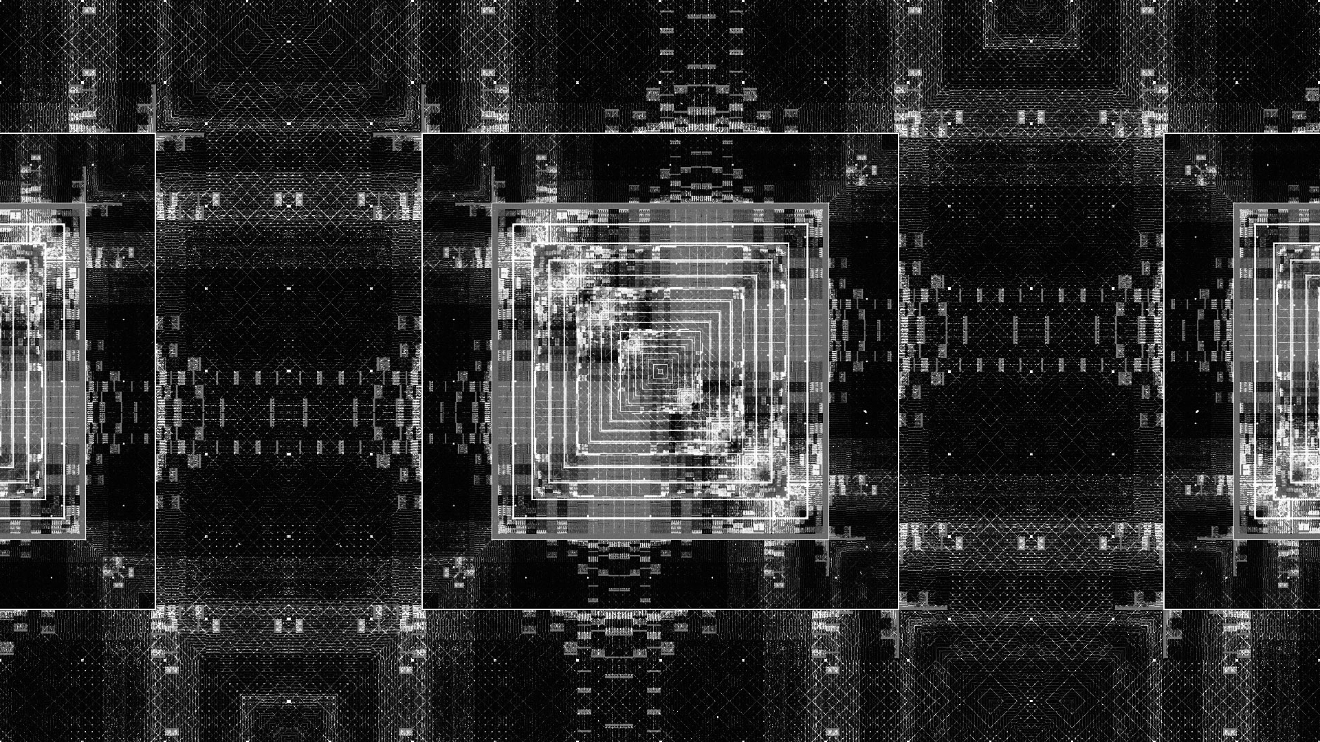
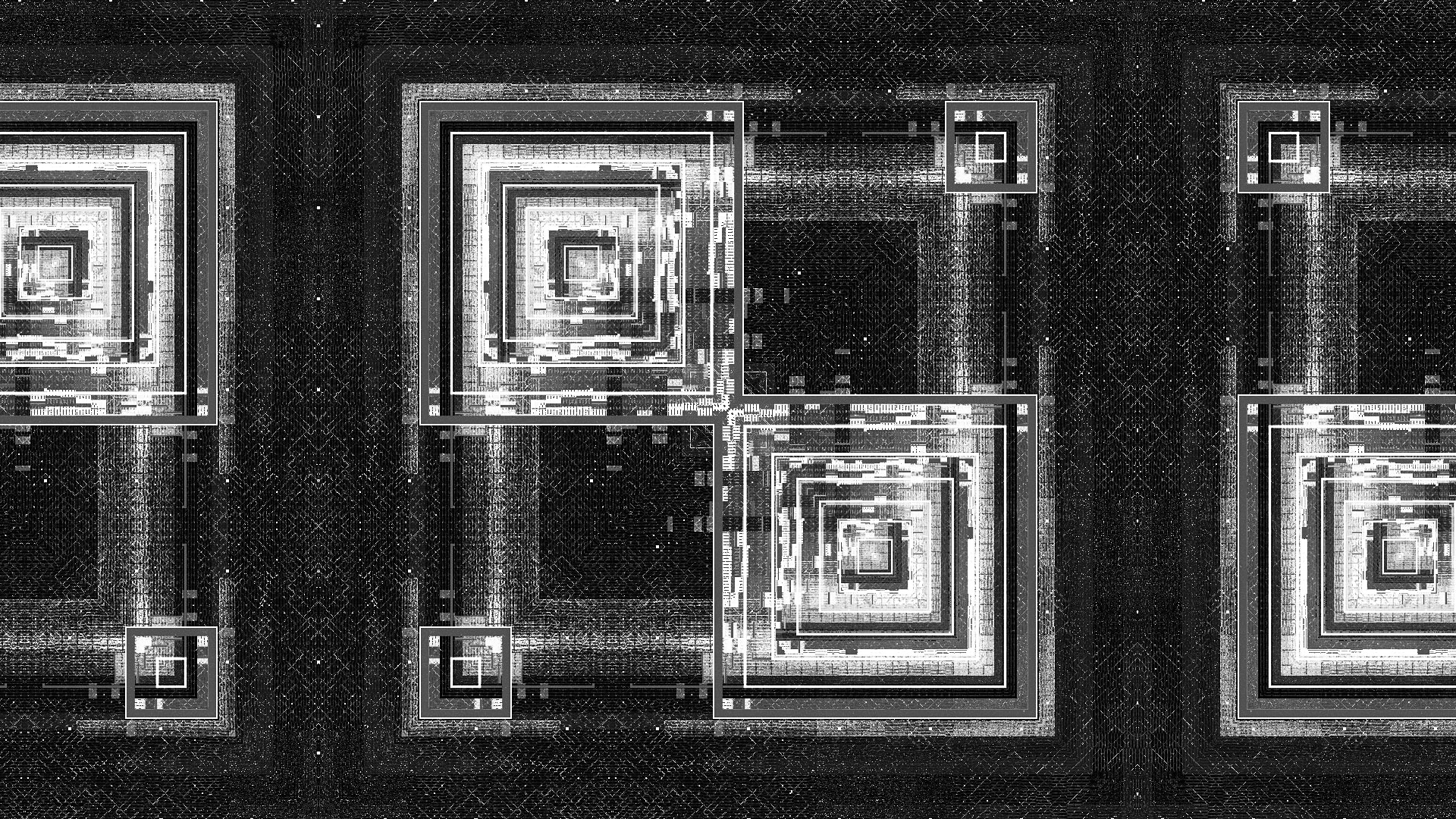
SYMMETRIES
Early on we were interested in developing symmetrical and kaleidoscopic glitch—seeing if we could layer together complexity in a way that would resolve to unified compositions. While few of these made it into the final sequence they served as a jumping off point for me during the design phase of the project.
PROCESS REEL
AWARDS + FEATURES
ADC Gold 2015, YCN Gold Bar 2015, Motionographer, Motion Served, Stash Magazine.