
BATTLEFIELD 2042
Hero title | hero title
MFR CREATIVE STUDIO | 2022 | CINEMATIC DESIGN | P3
Intro
A PROPER INTRODUCTION
P2 - A dystopian near future filled with raging natural disasters, deplenished resources, defunct nations, and two superpowers on the brink of global war. What unfortunate series of events led us to this?
We were tasked with the introduction to this world: to create a film that acquaints us with 2042, to provide context for our arrival here, and to leave one eager for immersion into the story.
This case study is broken up in 4 parts. Why? We made a stupefying amount of artwork for this project, a lot of which didn't make it into the cut. Part 1 (this page) focuses on the final film and the artwork that directly went into this edit. Parts 2-4 follow the design journey that led us here and includes the art direction evolution, network breakdown and an indepth look at the maps and user interface elements.
00 . Contents
Content
Content
Content
Content
CONTENT
Chapter Section
01.1 CHAPTER SECTION
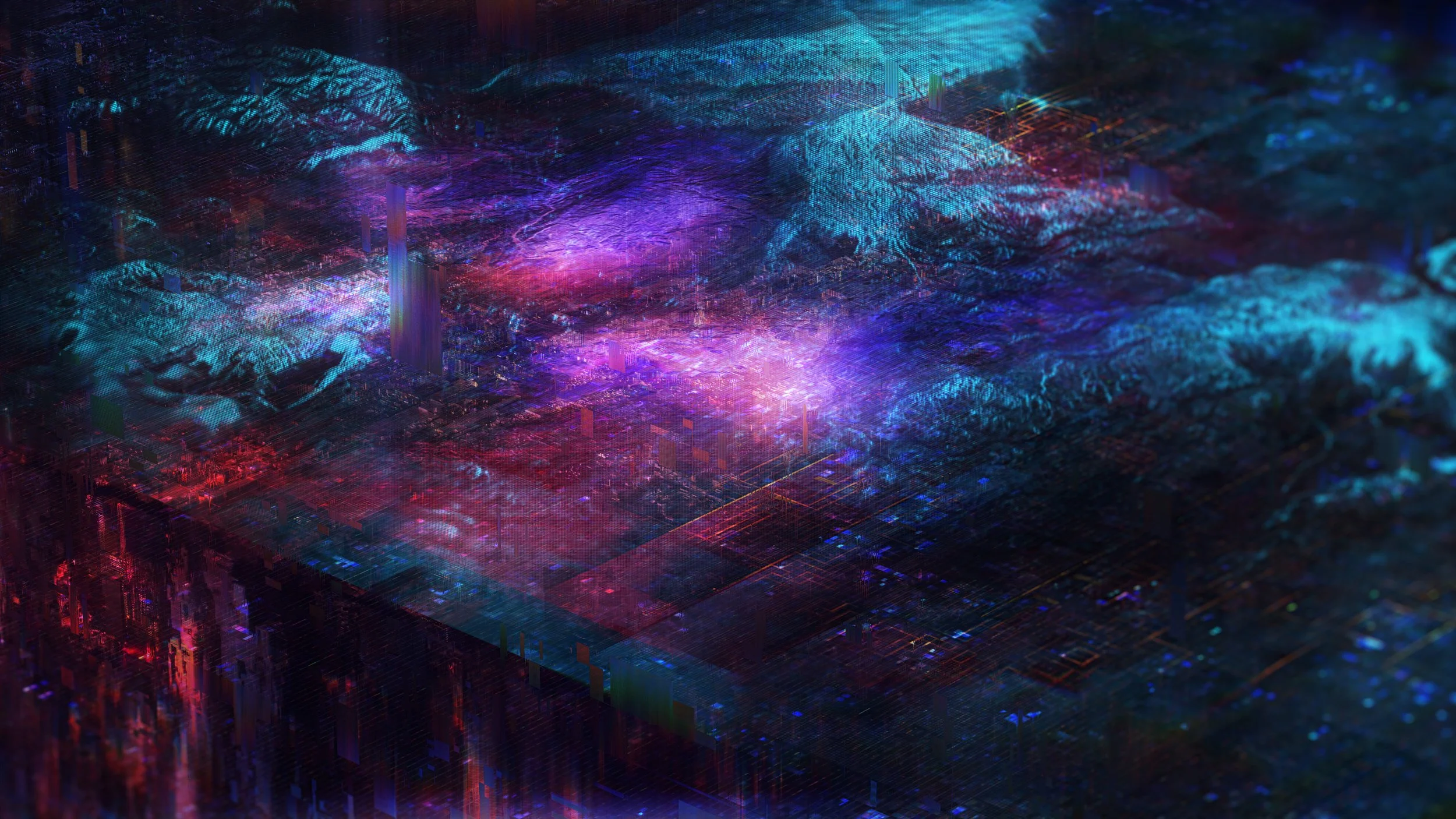
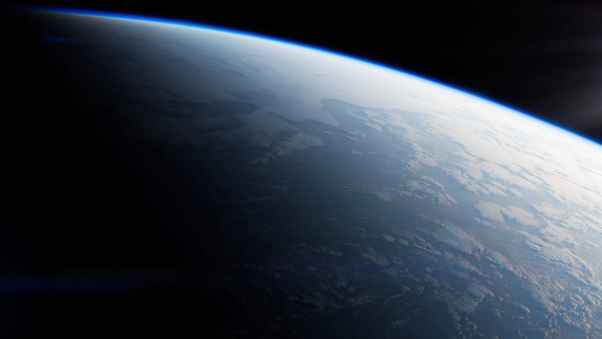
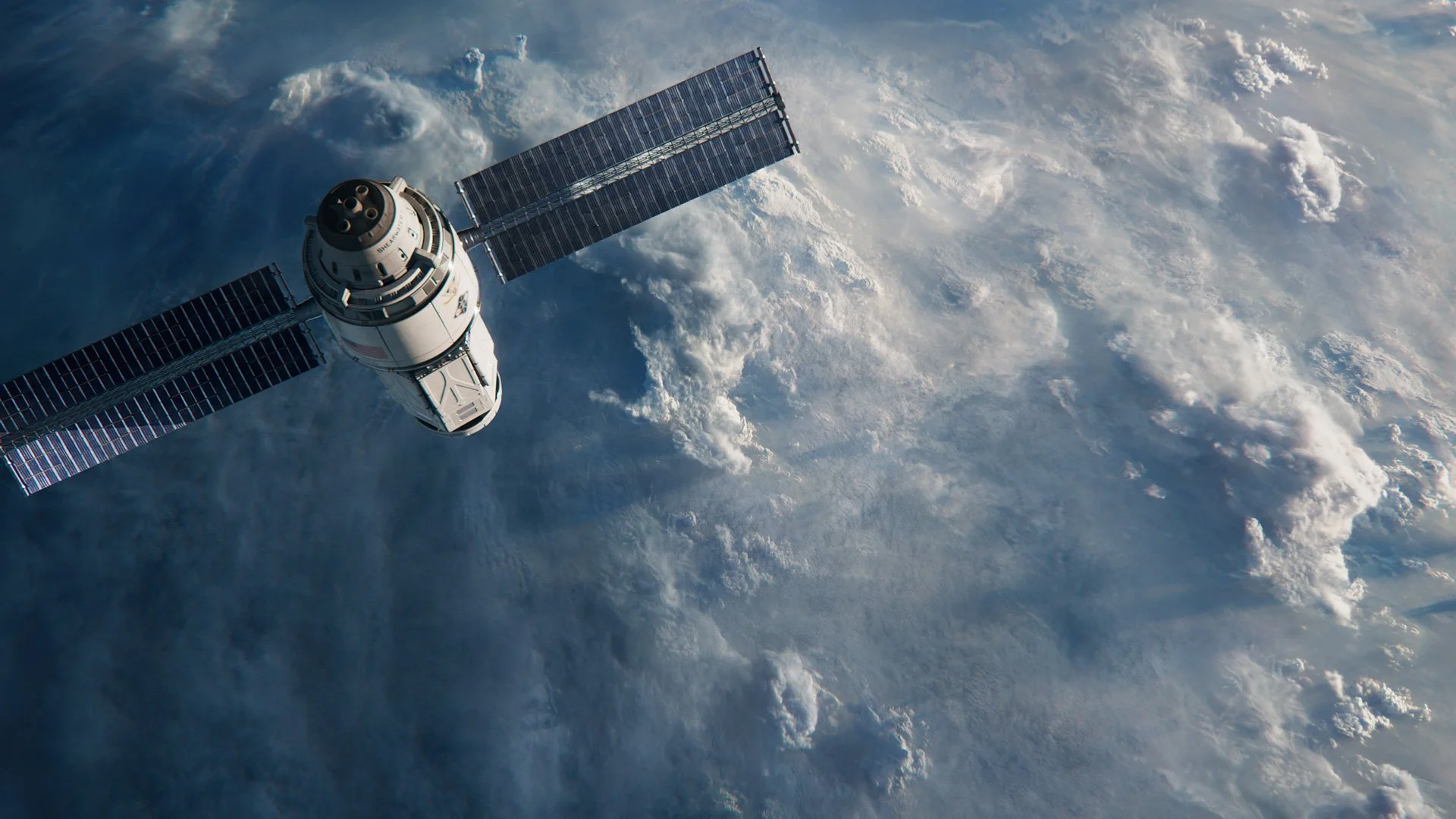
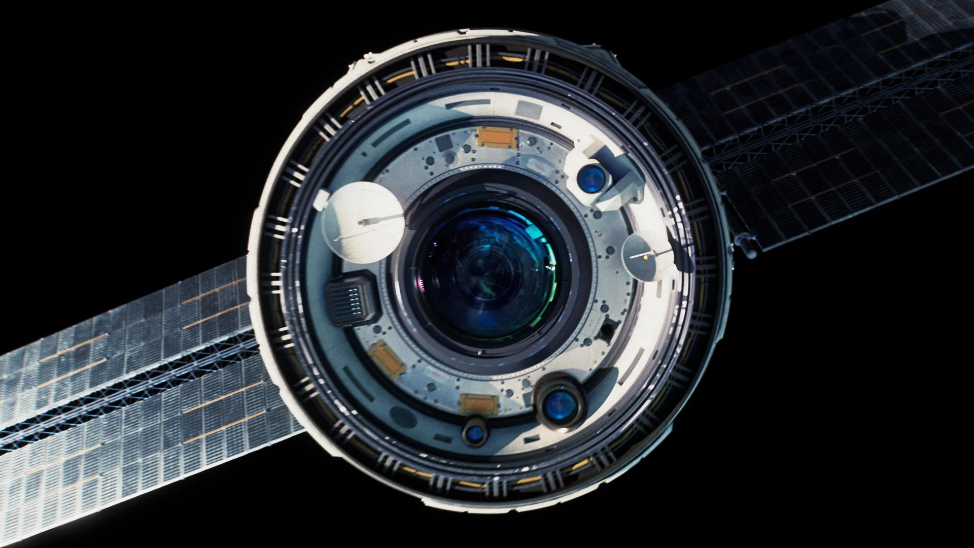
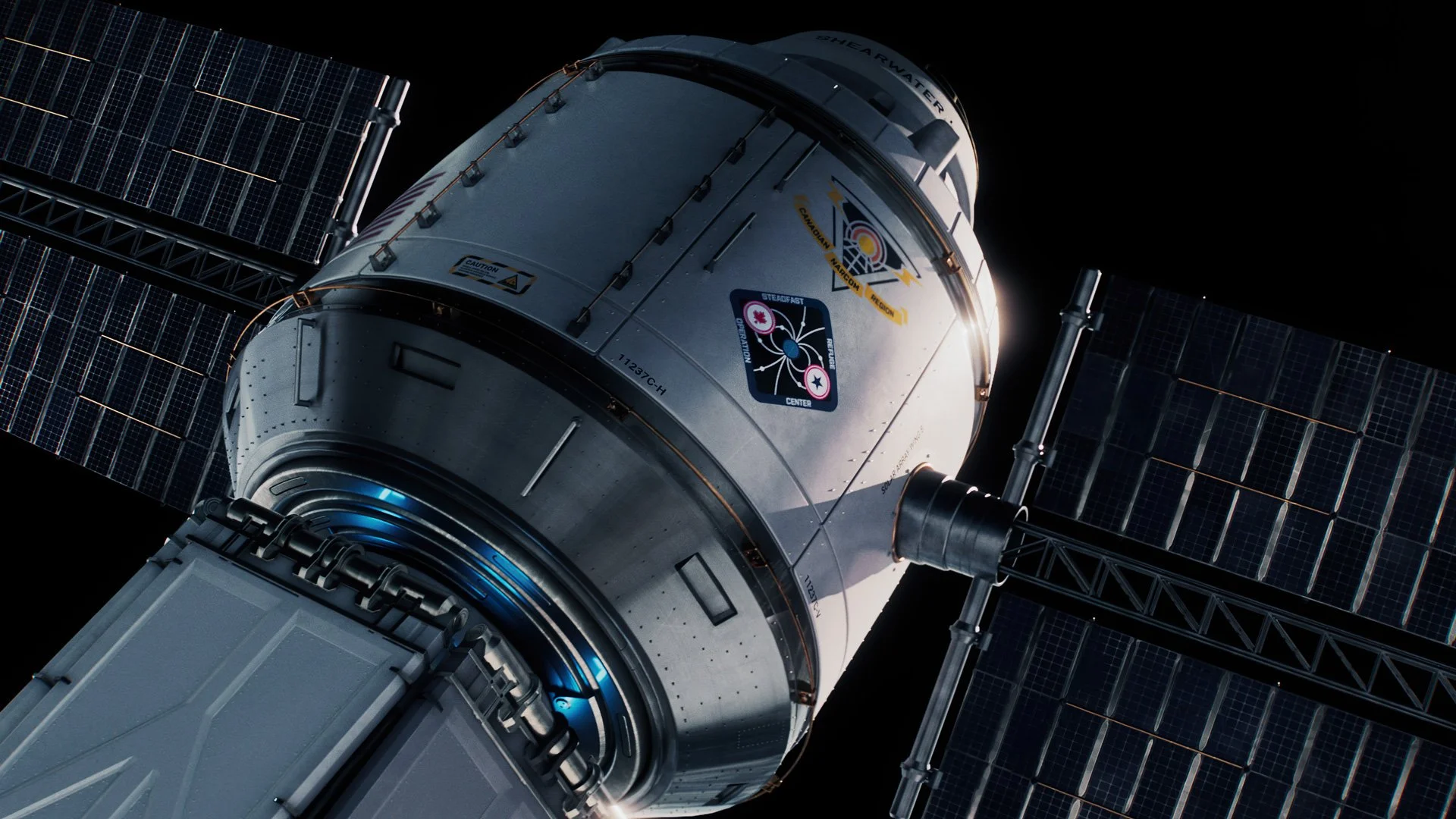
The sun breaks the horizon and spills over the surface of the planet. The earth is so peaceful, hopeful, awe inspiring. A satellite drifts into view and with it come the sounds of news broadcasts painting a different picture. A world where record breaking weather is the new normal. The satellite’s eye watches over the surface of the planet. We peer into it and enter The Network.
A mixture of 3D renders, digital matte painting and licensed NASA footage was comped together to create our opening planetary sequence.
Chapter Content
Chapter Content
The sun breaks the horizon and spills over the surface of the planet. The earth is so peaceful, hopeful, awe inspiring. A satellite drifts into view and with it come the sounds of news broadcasts painting a different picture. A world where record breaking weather is the new normal. The satellite’s eye watches over the surface of the planet. We peer into it and enter The Network.
A mixture of 3D renders, digital matte painting and licensed NASA footage was comped together to create our opening planetary sequence.
Quote Section
Quote Section
Is at purse tried jokes china ready decay an. Small its shy way had woody downs power. To denoting admitted speaking learning my exercise so in. Procured shutters mr it feelings. To or three offer house begin.
Credits
Credits
MICHAEL RIGLEY: ART DIRECTION + DESIGN, 2021
CREDITS | PRODUCTION
Client: Electronic Arts | DICE Stockholm | Criterion London
Production: Goodbye Kansas
Executive Producer: Anton Söderhäll
Producer: La-Rå Hinckeldeyn
Score: Hildur Guðnadóttir & Sam Slater
Sound Design: UHORT
Credits: GBK Graphics Team
CREDITS | MOTION GRAPHICS
Director: Will Adams
Art Director | Lead Design: Michael Rigley
Producer: La-Rå Hinckeldeyn
Lead UI Design: Steven Bussey
3D Animation: Michael Rigley, Will Adams
2D Animation: Michael Rigley, Guilherme Ferreirinha, Marcus Melin
UI Animation: Steven Bussey
Lead Glitch Animation: Guilherme Ferreirinha
Ending

Thank You
Ending title | Ending title
MFR CREATIVE STUDIO | 2022 | CINEMATIC DESIGN | P3
Hero Content Sections
Hero Content - Full Bleed
Hero Content - Half
VIDEO SECTIONs
Video - Full Bleed
Video - Inset
Video - Cinematic
Hero Image Sections
Hero Image - Full Bleed
Hero Image - Inset
Two Image Sections
Two Image - Full Bleed
Two Image - Inset
Two Image Pattern Sections
Two Image Pattern - LS (Large-Small)
Two Image Pattern - SL (Small-Large)
GALLERIES
3 Col - 16:9
(w/ SM 6px Gap)


3 Col - 3:4
(w/ LG 24px gap)
4 Col - 9:16
(w/ LG 24px gap)
6 Grid - 16:9
(w/ SM 6px gap)
4 Grid - 16:9
(w/ SM 6px gap)
Masonry Bento Style
(Every 8th item pattern, 2 col masonry mobile)
custom-section-class=”masonry”
data-mobile-stack=”2-masonry”


CONFIG EXAMPLES
Grid Gaps
SM - 6px gap
data-grid-gap=”sm”
MD - 12px gap
data-grid-gap=”md”
LG - 24px gap
data-grid-gap=”lg”
Mobile Carousel
data-mobile-carousel=”true”
(Compare Window on Mobile)
Switch Aspect Ratio on Mobile
3:4 → 16:9
data-mobile-aspect-ratio=”16:9”
(Compare Window on Mobile)
Switch Aspect Ratio on Mobile - 16:9 → 3:4 Carousel
data-mobile-aspect-ratio=”3:4”
data-mobile-carousel=”true”
(Resize Window)
Mobile Stack Options
Mobile Stack 2 Col
data-mobile-stack=”2”
data-mobile-carousel=”false”
(Compare Window on Mobile)